Case study · Fixa tenant web app · 2026
Rebuilding Fixa's tenant web app
Fixa tracks attendance and pays 8,500 casual and permanent workers across six tea estates, construction sites and warehouses in Rwanda. I led the redesign of the tenant web app, the desk where HR and payroll admins approve time and move money. It shipped as the new Fixa.
- Role
- Lead product designer · PM for Payments
- Surface
- Tenant web app (desktop)
- Scope
- 54 screens across 10 modules
- Status
- Shipped as the new Fixa
01 · Context
A product that worked, wrapped in a UI that made people nervous.
Fixa covers the whole loop for labour-heavy businesses: register a worker, record shifts and output, approve attendance, compute deductions and taxes, then pay out to mobile money or bank. Many of those workers are unbanked and paid by the day or by the kilo.
V2 did its job: it shipped, and admins ran real payroll on it. But it had grown to more than 800 frames of accumulated states, with each module solving the same problems its own way. It read as dated and dense. The bigger lesson was about risk: the moments that move money and approve people's time looked exactly like the moments that do neither, and that is where trust leaks away.
Who it is for
HR and payroll admins
At a desk, in long sessions. They approve attendance from many sites, build payrolls, top up the wallet, send money and file taxes. Mistakes cost real money and trust.
What was broken
Risky moments looked like routine ones
Approvals had no visible owner, a single bad row could block a whole import, and a payroll with failed transfers showed a generic error.
02 · Principles
The rules I checked every screen against.
- 01
Quiet by default
White surfaces, navy for structure, one orange accent. If nothing is urgent, the screen should feel like nothing is urgent.
- 02
Colour means something
Green is paid or approved, red is failed or declined, orange asks for a decision. No decorative colour on data.
- 03
Show the people
Every worker shows with initials or a photo, a trade and a site. Payroll is people getting paid.
- 04
Design the failure
Declined records, failed transfers and bad imports each get a screen of their own. A generic error tells an admin nothing they can act on.
03 · System
One quiet kit, built on the brand variables.
Every colour is bound to the Bihamye-Fixa brand variables, so engineering picks up tokens instead of hex codes. On top I defined a small set of parts: a slim navigation rail, page header with breadcrumb, stat tiles, status pills, filter chips, table cards, side panels and confirm dialogs.
Illustrations with a job
A muted navy library with one orange accent. They appear only in moments of transition (first run, empty, success, errors) and never next to live data. That one rule kept them charming instead of cluttered.

Deep dives
Module by module
Each module was redesigned around the question the admin is really asking when they open it.
- Dashboard
- Employees
- Attendance
- Leaves
- Payments
- Deductions
- Wallet
- Taxes
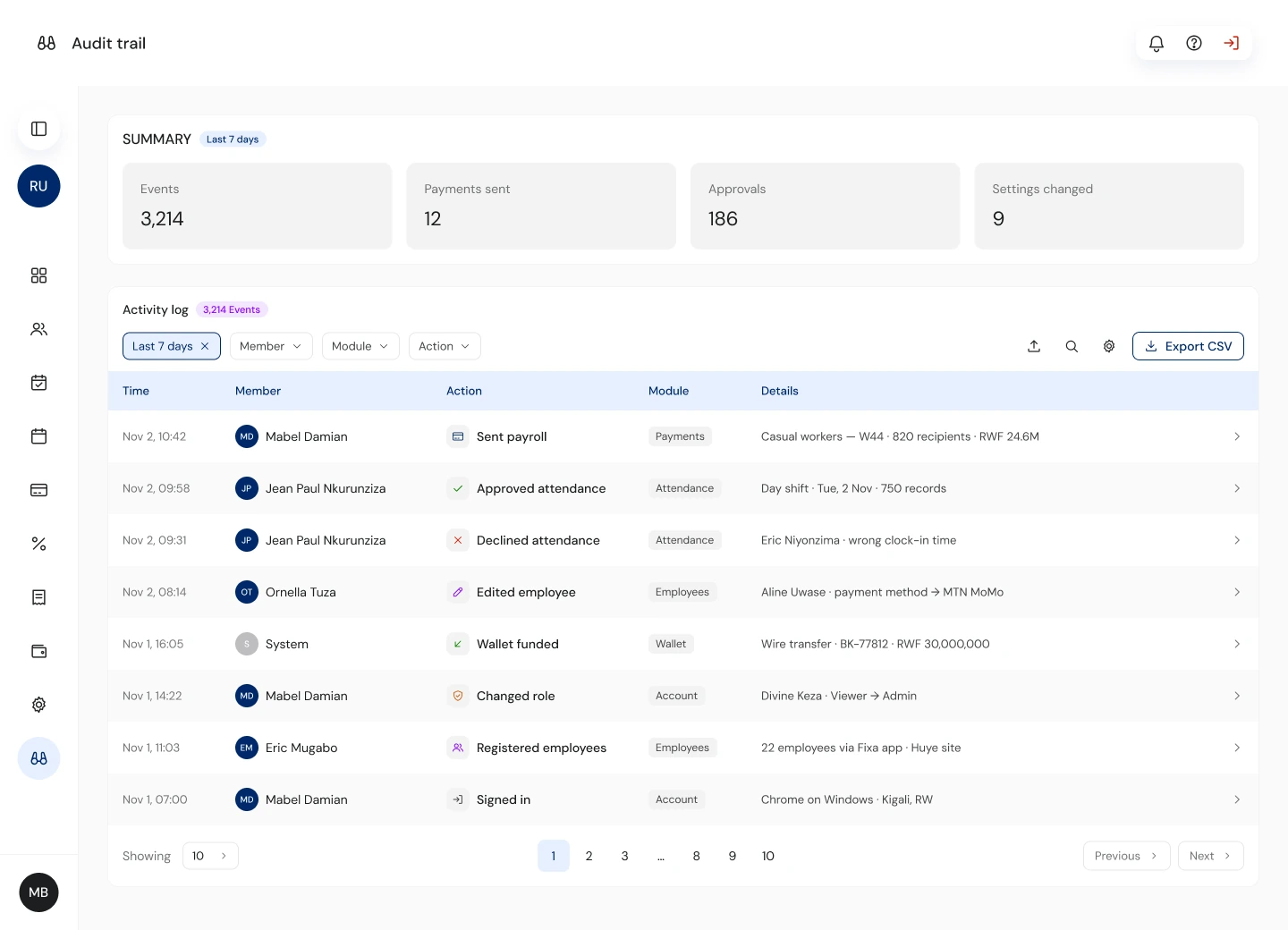
- Audit
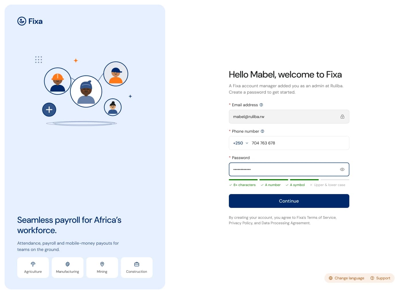
- Auth
W1 · Dashboard
From "here are some charts" to "here's what needs you".
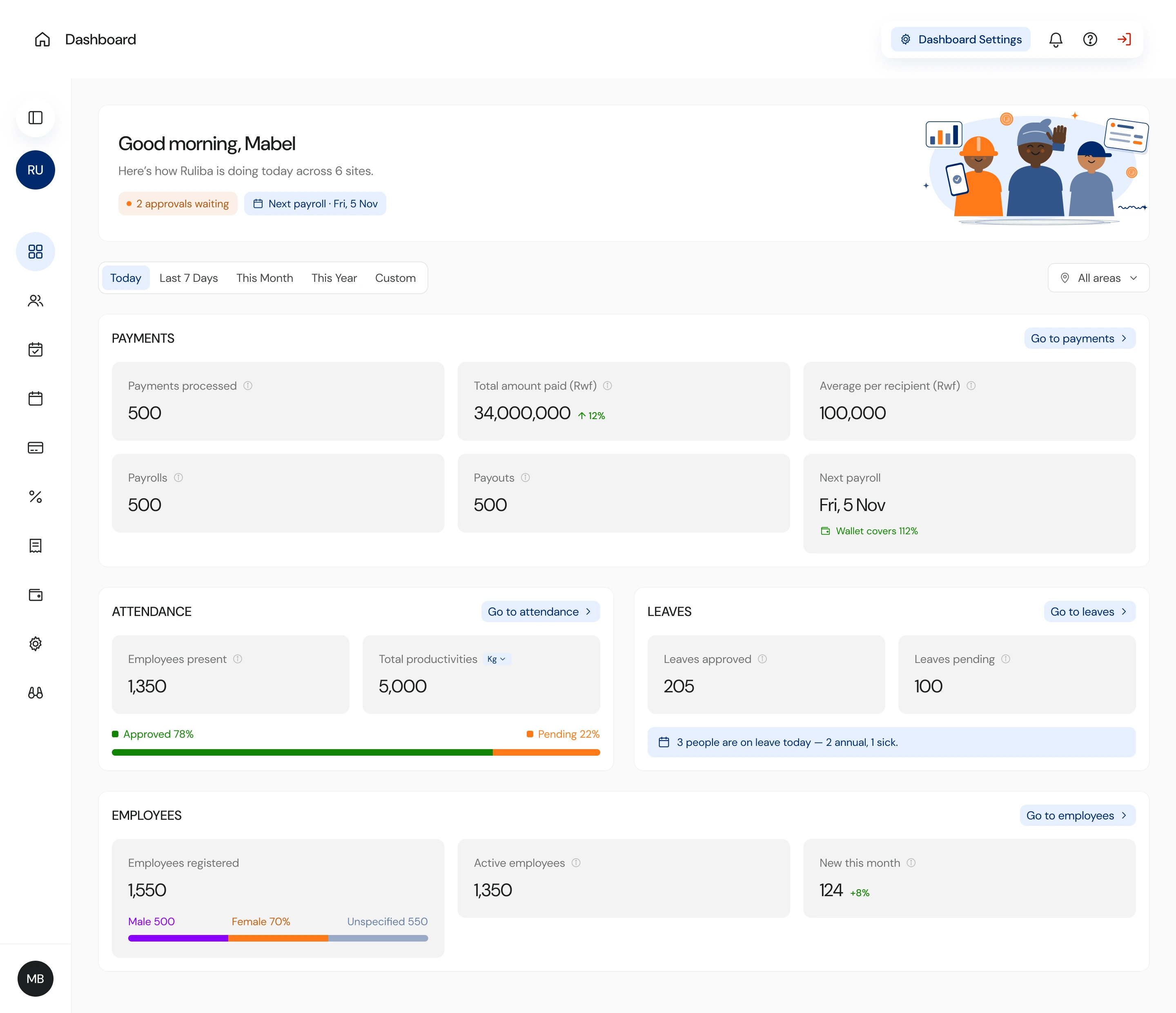
The old dashboard opened on donut charts, and the thing an admin actually came for, what was waiting on them, sat in a list further down. The new one starts there: approvals waiting and the next payroll sit in the greeting, and today's numbers are grouped by module underneath, each group one click from its task.
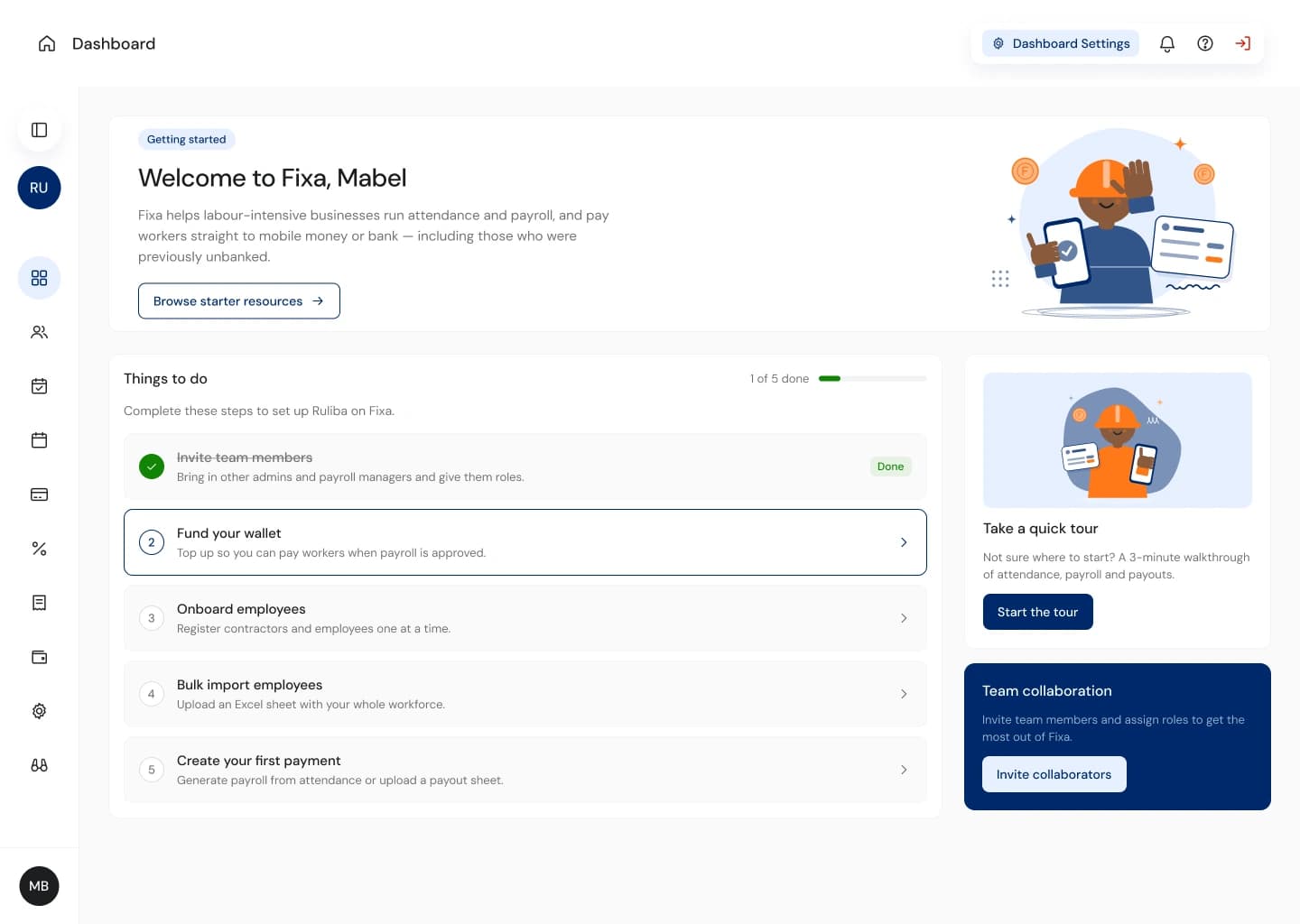
First-time tenants get a different screen. A dashboard full of zeros on day one says the product is empty, so they get a five-step setup checklist instead.
W2 · Employees
Fewer typos at the moment of entry.
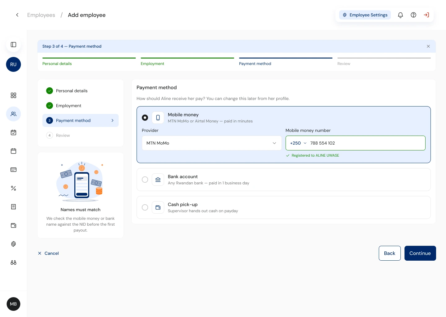
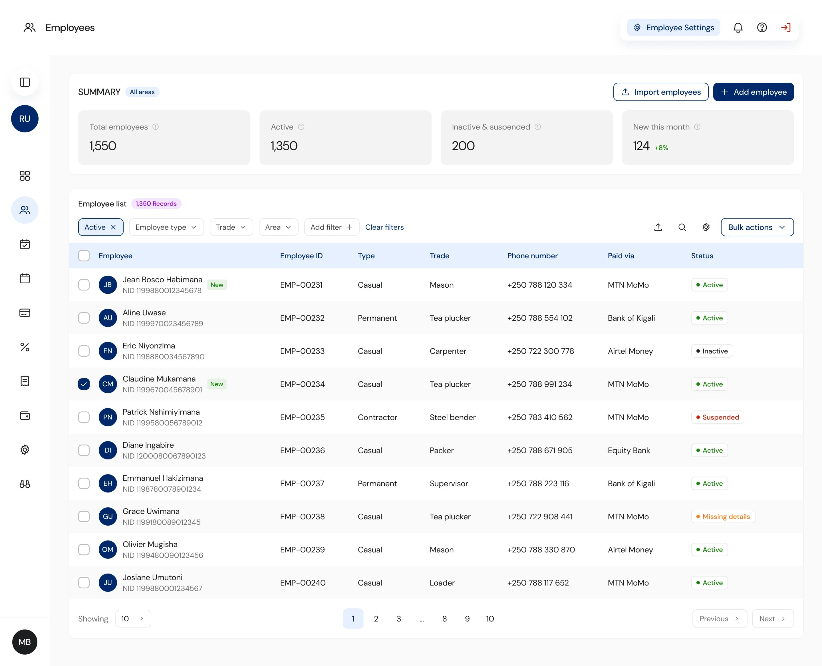
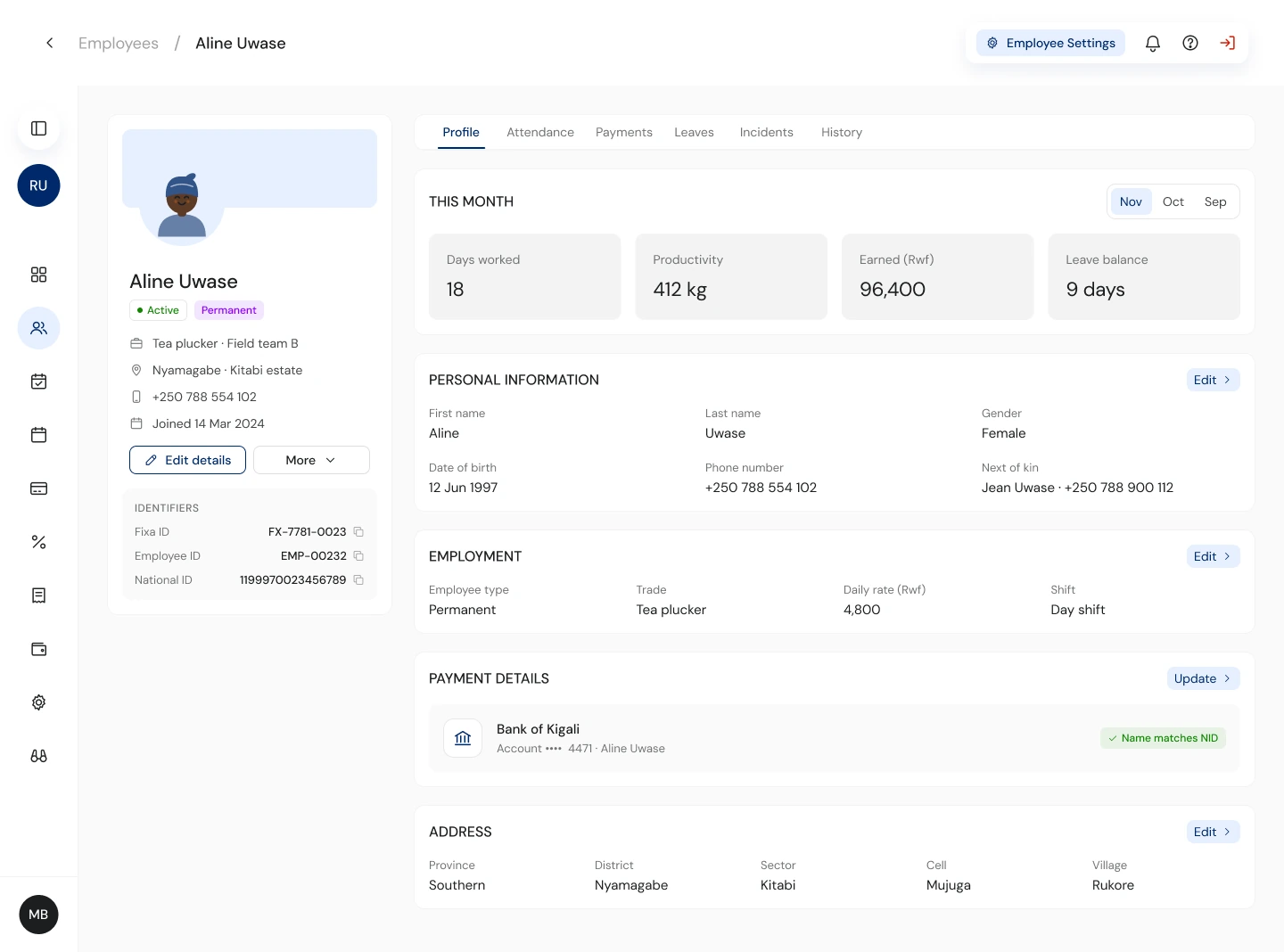
Bad worker data is the root cause of most failed payouts. The add-employee flow checks as you type: a national ID autofills the legal name, and the mobile money number is name-matched against it before saving. If the names don't match, the admin finds out while typing, rather than on payday.
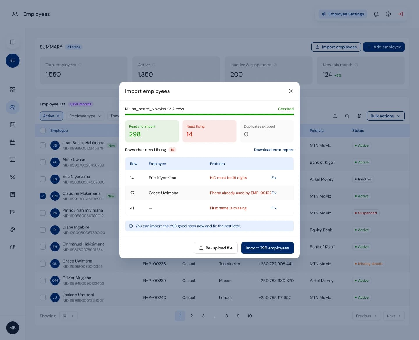
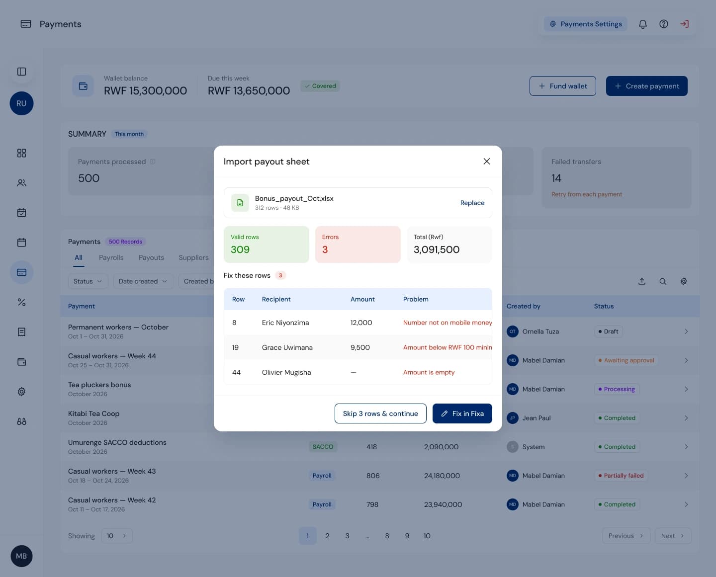
Bulk import no longer fails as a whole. It validates every row, imports the good ones and hands back a short list to fix.
W3 · Attendance
Make the approval chain visible.
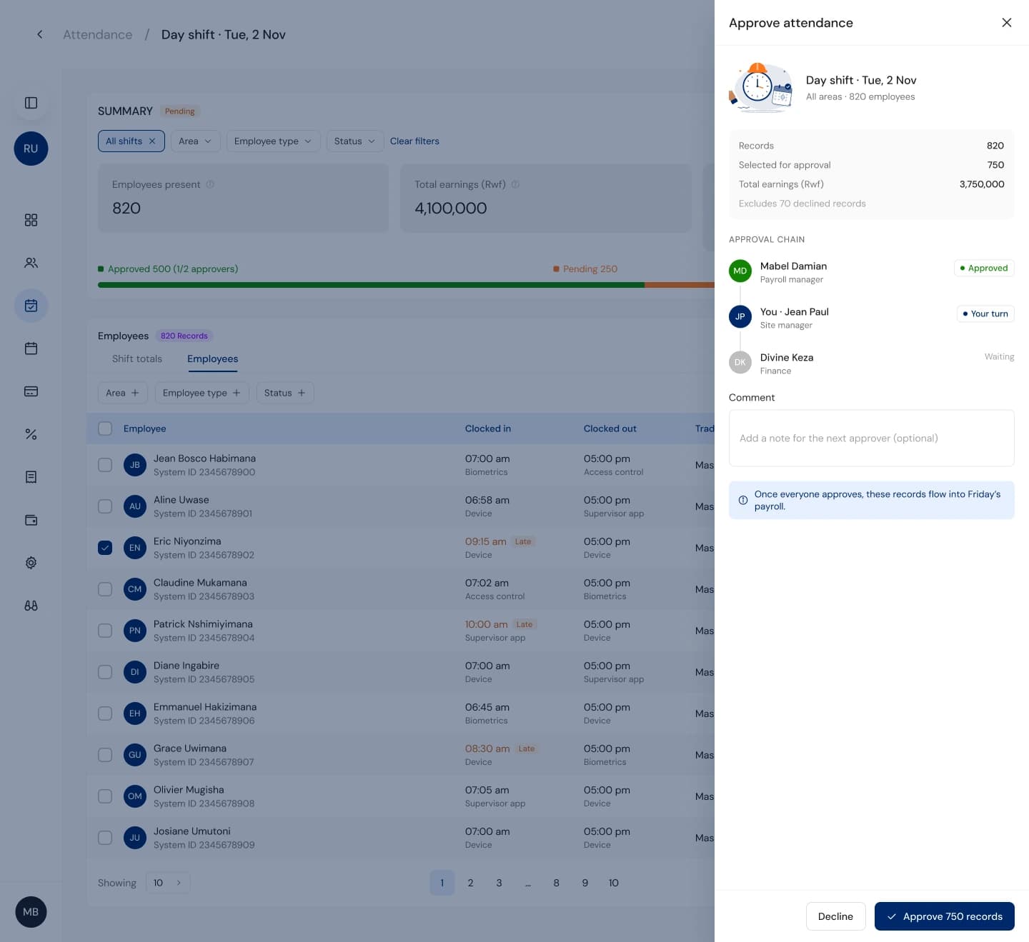
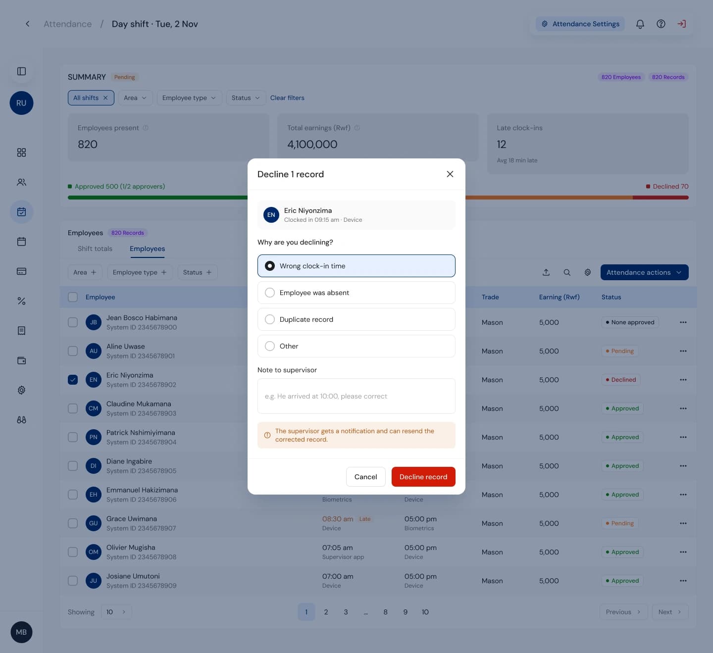
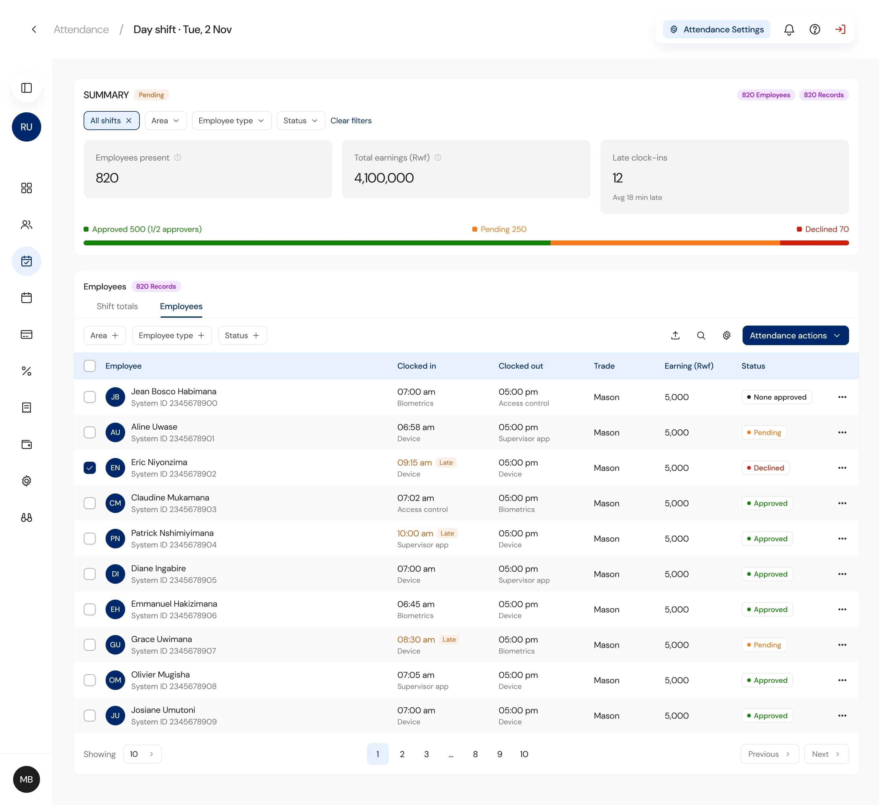
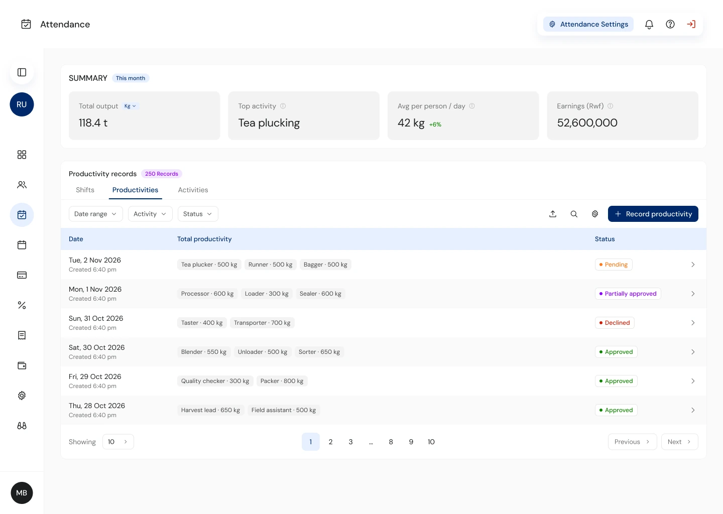
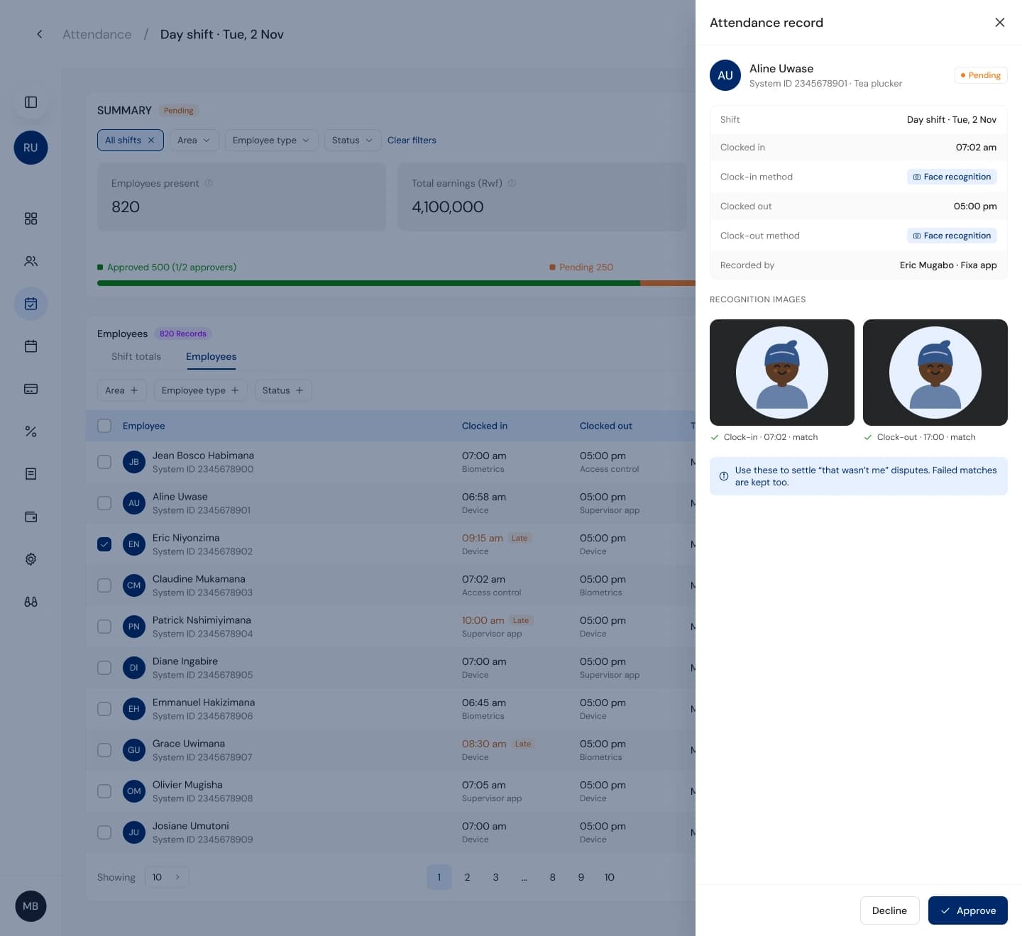
Records pass through supervisors, site managers and HR before they turn into pay. In V2 that chain was invisible, so admins couldn't tell who was holding a record up. Now every record shows its path and who acted, and approvals happen in a side panel without leaving the list.
Declining requires a reason, which goes straight to the supervisor's phone. They fix it and resend. Before, this whole conversation happened on WhatsApp, and nothing in the product knew about it.
W4 · Payments · the module I own as PM
Pay day, when something goes wrong.
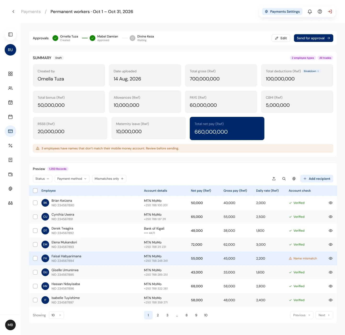
This is where trust is won or lost. Three changes:
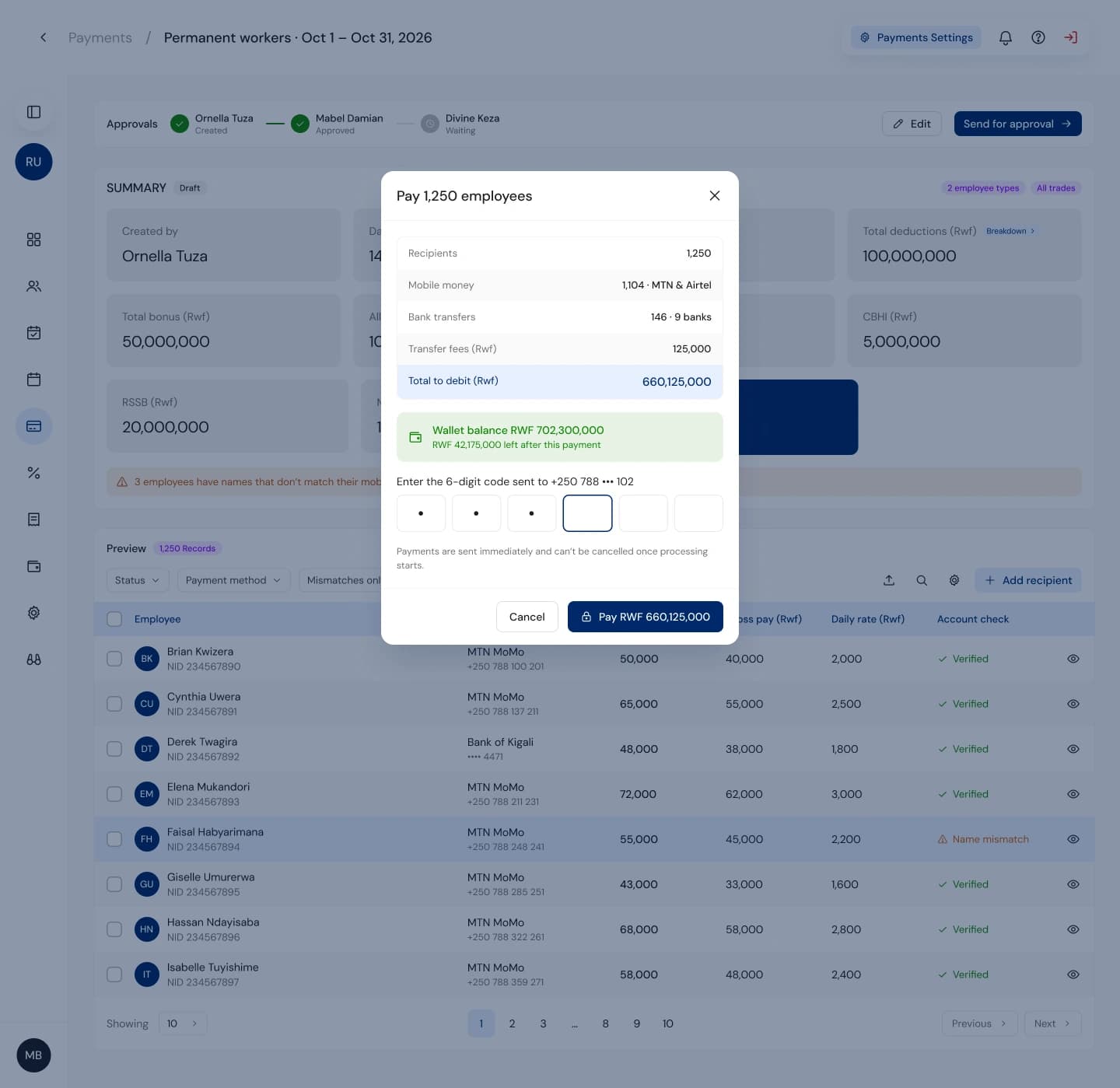
- Pre-flight checks. Account mismatches and unregistered numbers are flagged in the preview, with a “mismatches only” filter, before anything is sent.
- Coverage and confirmation. The confirm step shows whether the wallet covers the run and asks for an OTP. No surprises after you press pay.
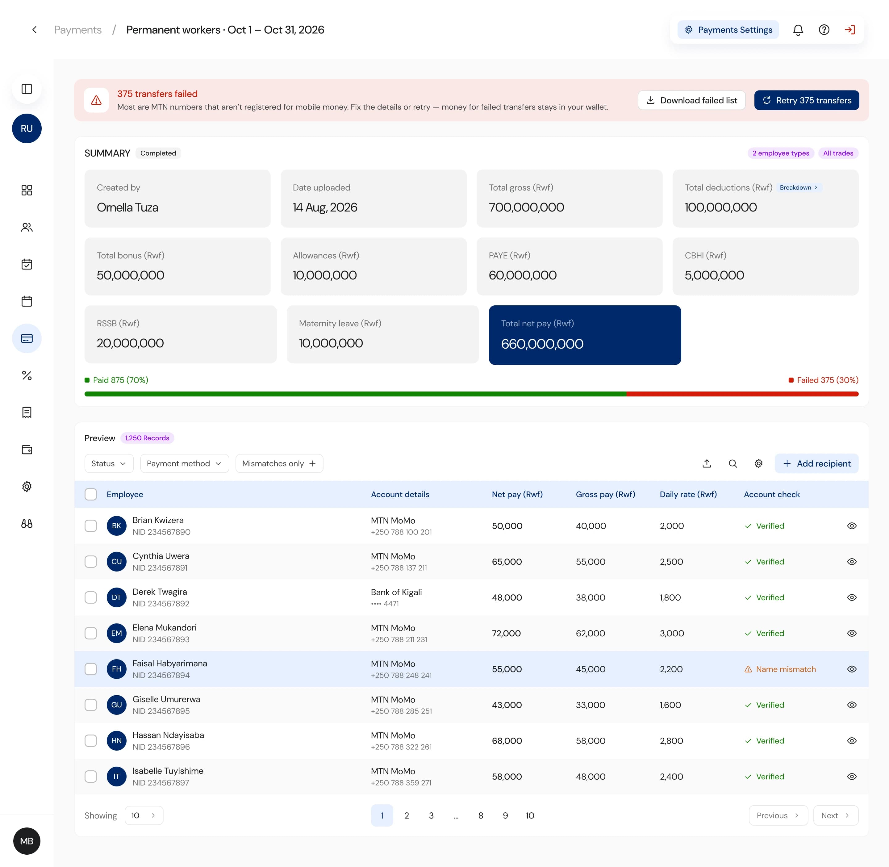
- Partial failure as a real state. If 375 of 1,250 transfers fail, the page says so at the top, explains the likely cause, keeps the money in the wallet and offers one-click retry.
W5 · Face recognition · web controls
HR sets the rules and sees the evidence.
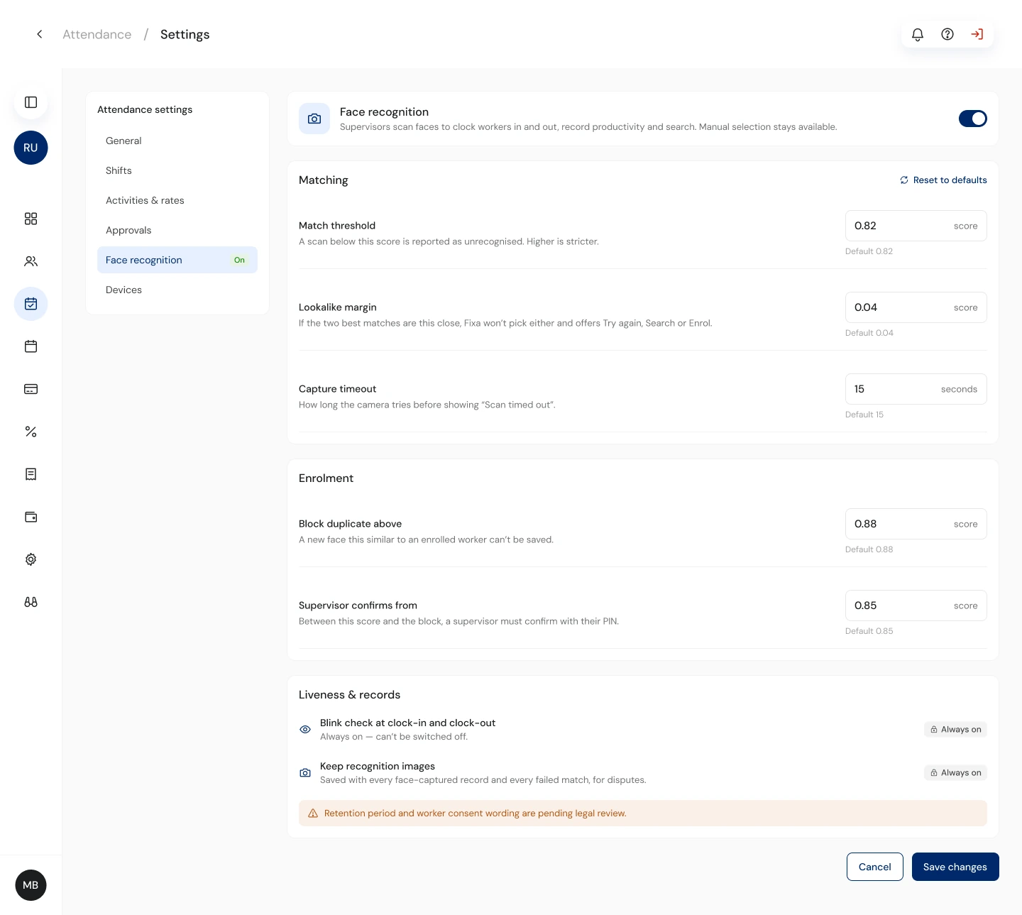
Face recognition lives on the supervisor's phone (see the mobile case study), but the rules live here. HR sets match thresholds and who can override, with safe defaults from the 2.0.40 matching rules.
Every attendance record keeps its recognition images, so when a worker disputes a shift, HR can look at the photo and settle it.
W6 · The rest of the app
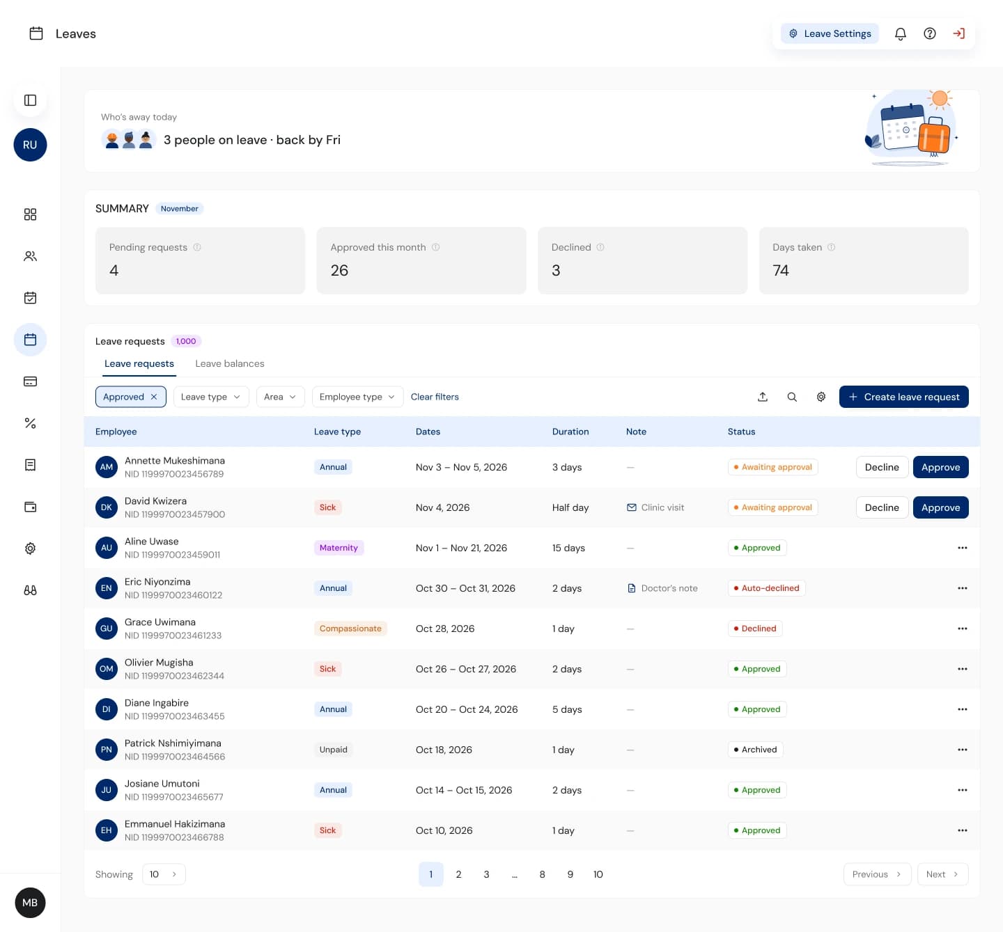
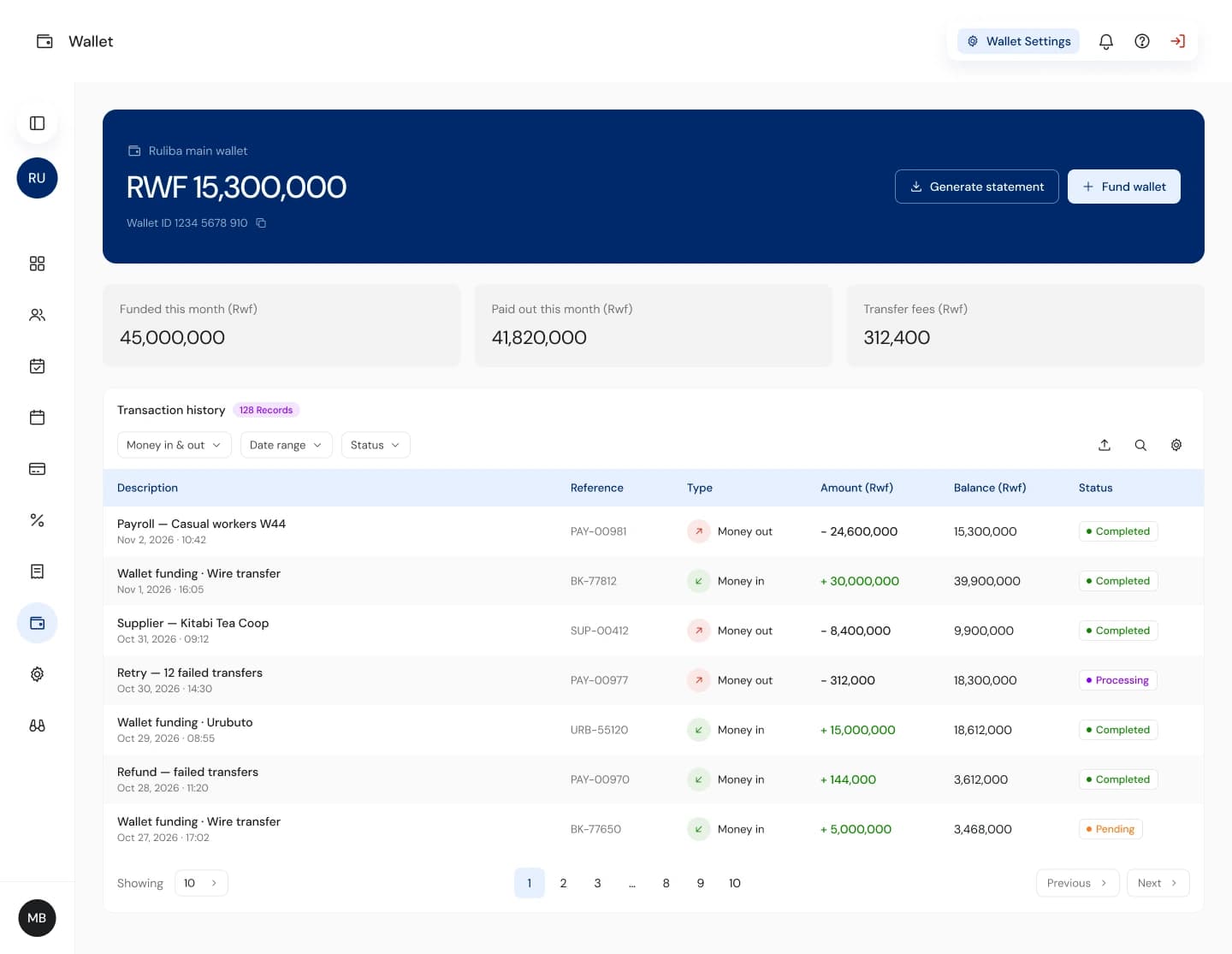
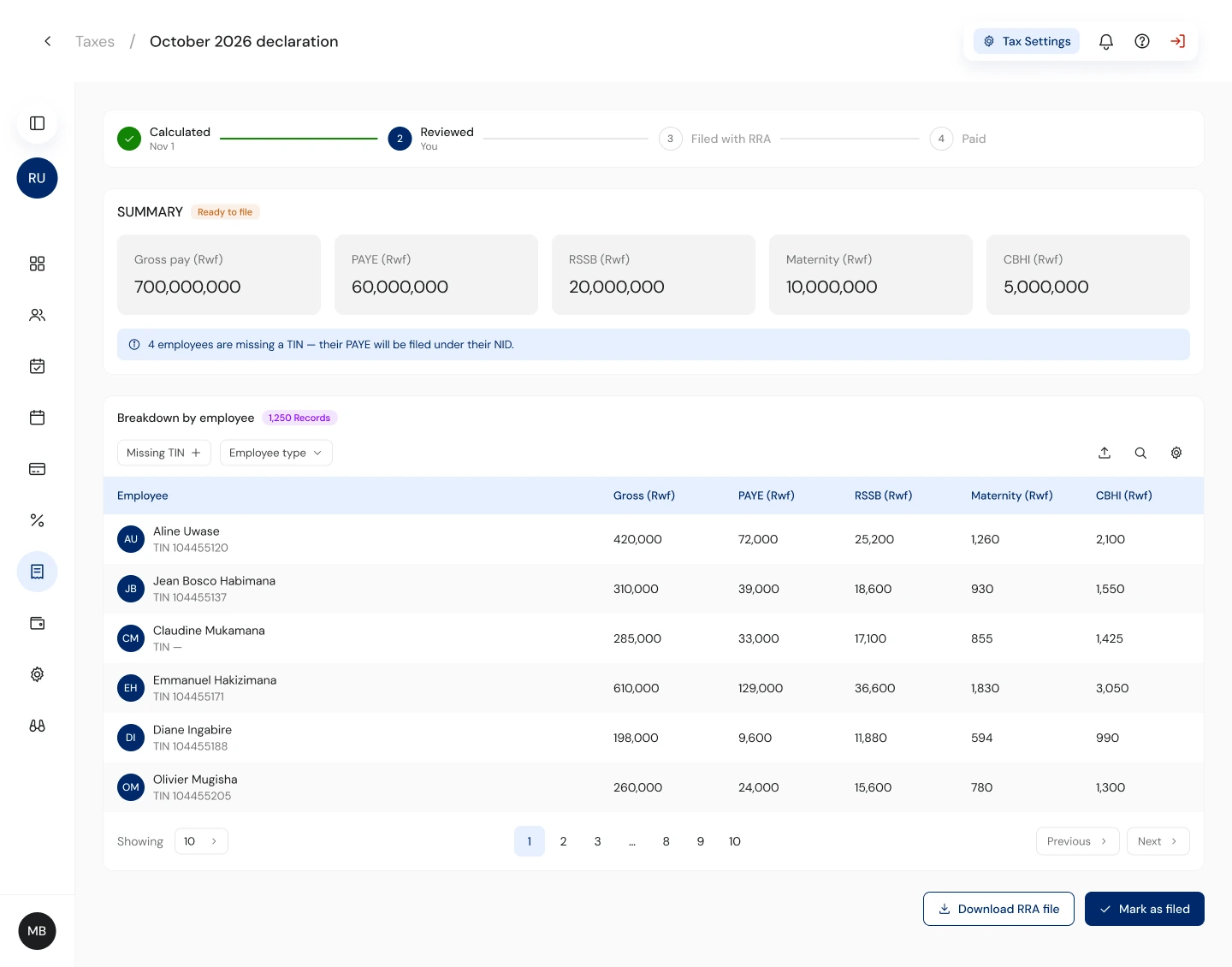
Same rules, every module.

04 · Trade-offs
What these choices cost.
Calm by default
Payroll screens stay quiet so the moments that need attention stand out. Red and orange are reserved for failures and decisions, so admins notice them straight away.
One typeface
DM Sans only. Weight and size carry the hierarchy, which keeps the web app and the mobile app reading as one product.
Partial success
Importing good rows and paying successful transfers adds states to design and build. Worth it: with all-or-nothing, one bad record holds up hundreds of people's pay.
Side panels over pages
Approvals and reviews open beside the list so admins keep their place in a queue of hundreds.
Results
What changed once it shipped.
- of transfers fail in a payroll run, down from about 25%
- Under 7%
- of transfers fail in a payroll run, down from about 25%
- payment complaints to support, down from about 46
- ~10 a month
- payment complaints to support, down from about 46
- to prepare payroll, down from a weekend
- 45 min
- to prepare payroll, down from a weekend
- imports needing a full re-upload, down from 1 in 3
- 0
- imports needing a full re-upload, down from 1 in 3
- failed transfers go through on the first retry
- 9 in 10
- failed transfers go through on the first retry
- workers paid across 6 sites, about RWF 100M every month
- 8,500
- workers paid across 6 sites, about RWF 100M every month
Before and after the redesign shipped.
05 · Reflection
What I'd tell myself at the start.
Start with the failure states. Designing the declined record, the failed transfer and the bad import first made the happy paths simpler, because every decision had already been tested against what goes wrong.
Payroll runs on trust. Every screen that moves money now answers four questions before the admin acts: how much, to whom, what could fail, and what happens if it does.
Next
- Measure payroll trust: retry rate after partial failures, and time from payroll created to sent.
- Hand off as components mapped to the brand variables, so the 800-frame problem doesn't come back.
- Test with admins on real payroll runs, watching where they still export to check.
Gallery
The rest of the desk
Wallet funding, roles, taxes and the quieter screens the story skips. Open any of them full size.