Case study · Fixa supervisor mobile app · 2026
Clocking in a crew, even with no signal.
Fixa pays thousands of casual workers on tea estates, construction sites and warehouses across Rwanda. Their supervisors record every shift and every kilo on a phone, outdoors, often offline. I led the redesign of that app, then designed face recognition into clock-in after a pilot put the wrong workers on the wrong records.
- Role
- Lead product designer
- Surface
- Supervisor app (Android, iOS)
- Scope
- 26 core screens · 25 face recognition screens
- Status
- Shipped · face confirm live



01 · Context
One person, a crew of two hundred, and a 7am start.
Site supervisors and weighing clerks use the app to clock workers in and out, record output by the kilo, register new hires with a national ID, and handle leave. They work one-handed, in sunlight, across Kinyarwanda, English and French, and signal comes and goes.
I travelled to sites to interview supervisors, ran usability tests in the field and used early prototypes to decide what got built. What we saw shaped every decision below.
What V2 got wrong in the field
- Half a screen of filters sat above every list, so supervisors scrolled before reaching the first worker.
- Status hid in small dots that are hard to read in daylight.
- Offline worked but was invisible, so supervisors didn't trust it and re-entered records.
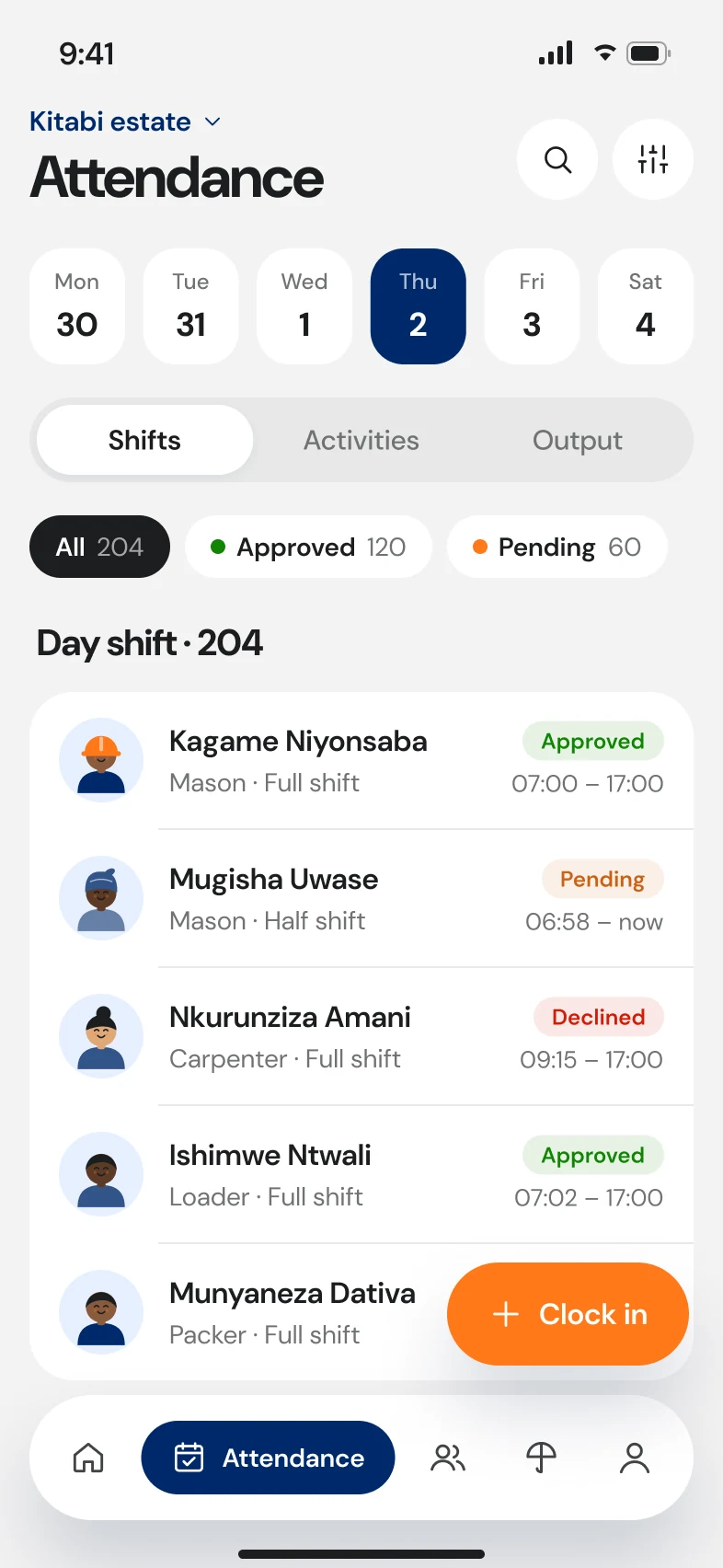
- Every flow started from a menu, while supervisors think in today's site and shift.
02 · Principles
Rules for a phone held up in a field.
- 01
Offline is a state, not an error
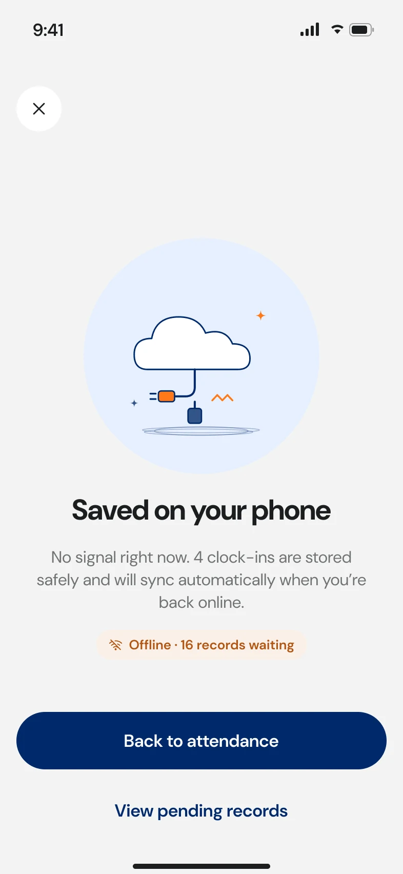
Every action saves to the phone first. The app shows what's waiting to sync, in plain words, all the time.
- 02
Today, this site, first
Home opens on the current site and shift. Everything else is one tap from there.
- 03
Big targets, short words
Built for gloves and sunlight: large touch targets, high contrast, copy read at arm's length.
- 04
Batch, don't repeat
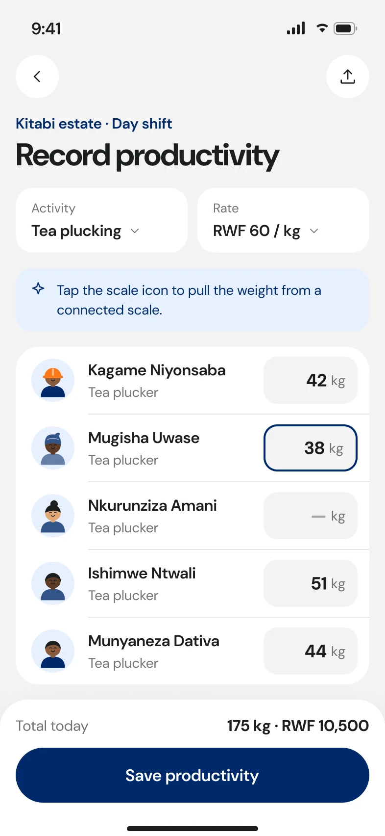
Clock in a whole crew at once, register hires back to back, enter weights down a column.
The visual system is shared with the web app: the same brand variables, DM Sans, status colours and illustrations. On top, mobile uses patterns people already know from their phones: large titles, grouped lists, a floating tab bar, bottom sheets and one primary action pinned to the thumb zone.
Part I · Core app
The everyday flows
What a supervisor does every day, from sign-in to the last weigh-in, redesigned around one site, one shift and a phone that may be offline.
- Onboarding
- Home
- Attendance
- Productivity
- Employees
- Leaves
- Rates
M1 · Onboarding
Set expectations before the first shift.
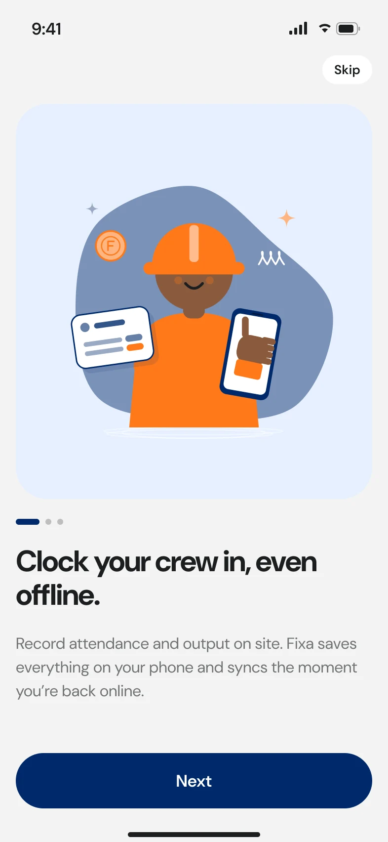
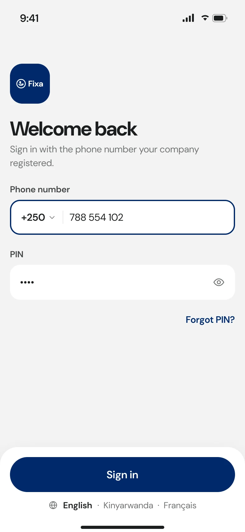
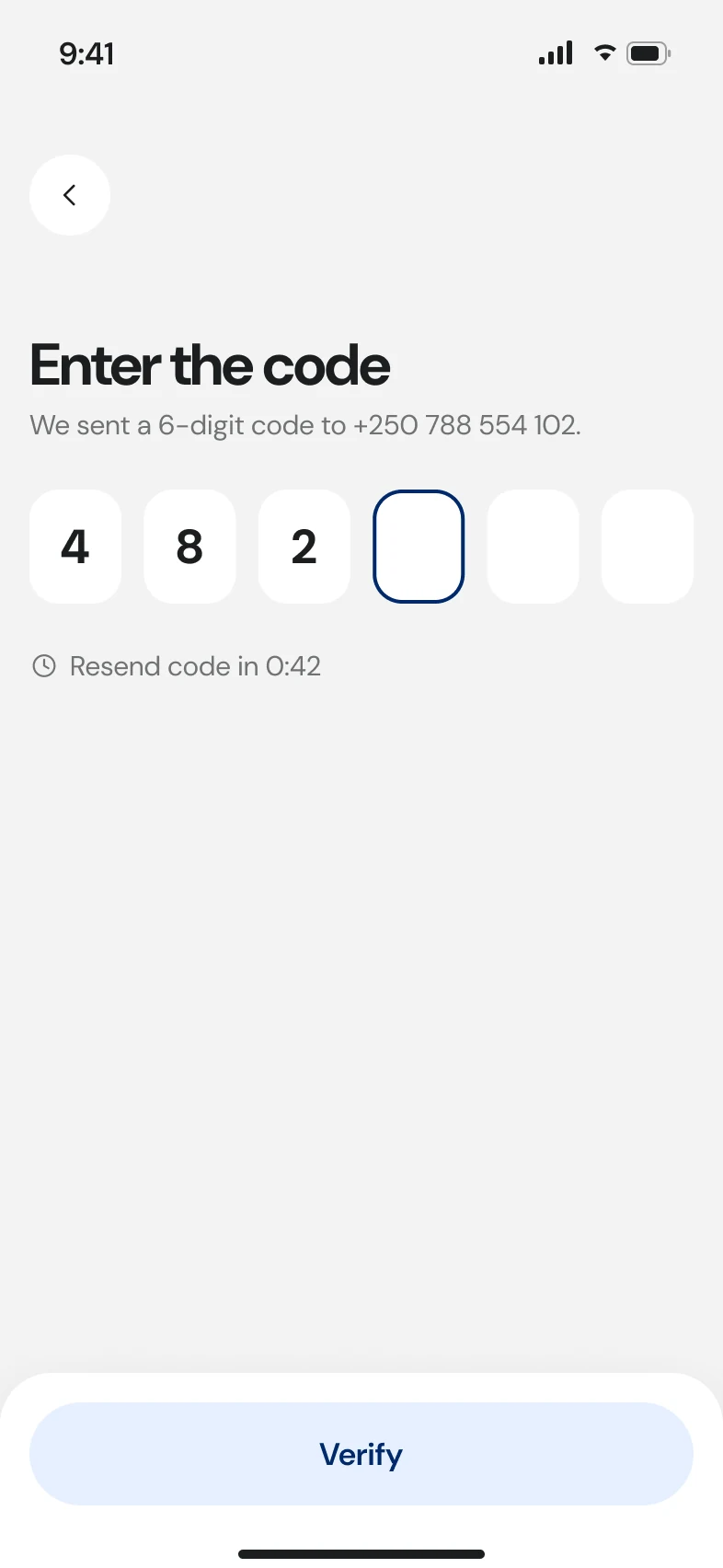
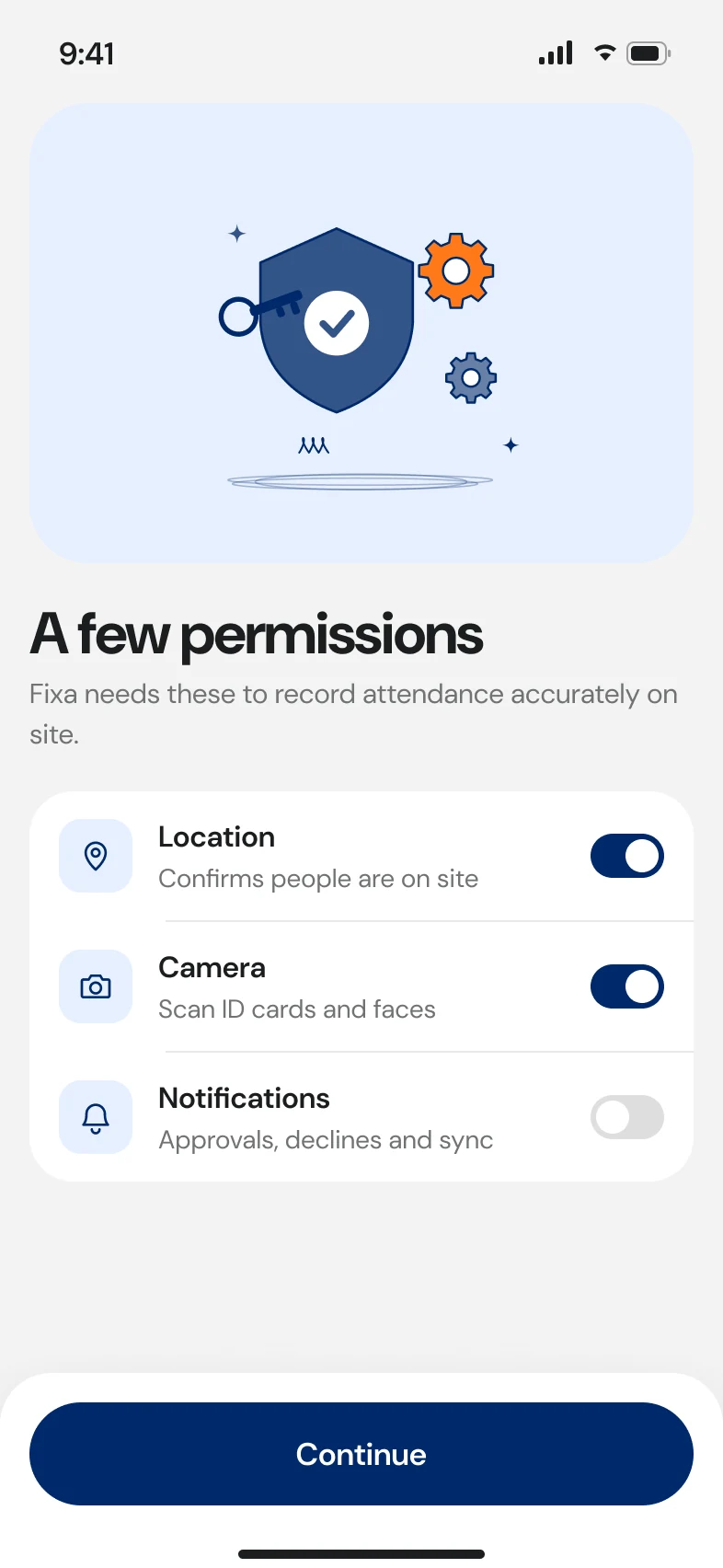
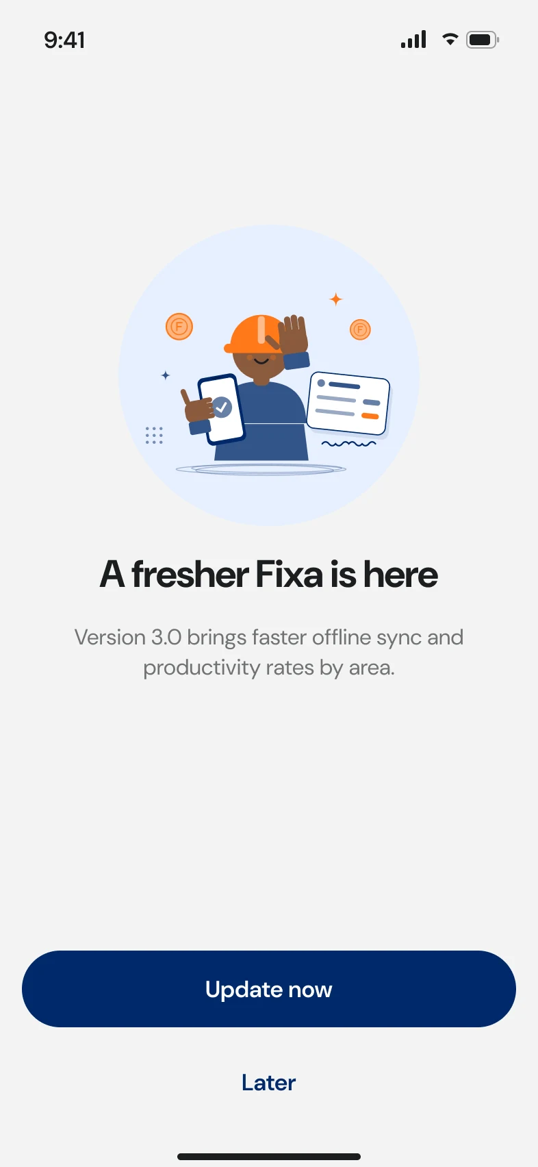
Short intro screens say the one thing a supervisor needs to hear: clock your crew in, even offline. Then phone and PIN sign-in, an SMS code, and a permissions screen that explains why each permission is needed.
The language switcher is on the very first screen. Someone who can't read the default language won't find it in settings.
M2 · Home
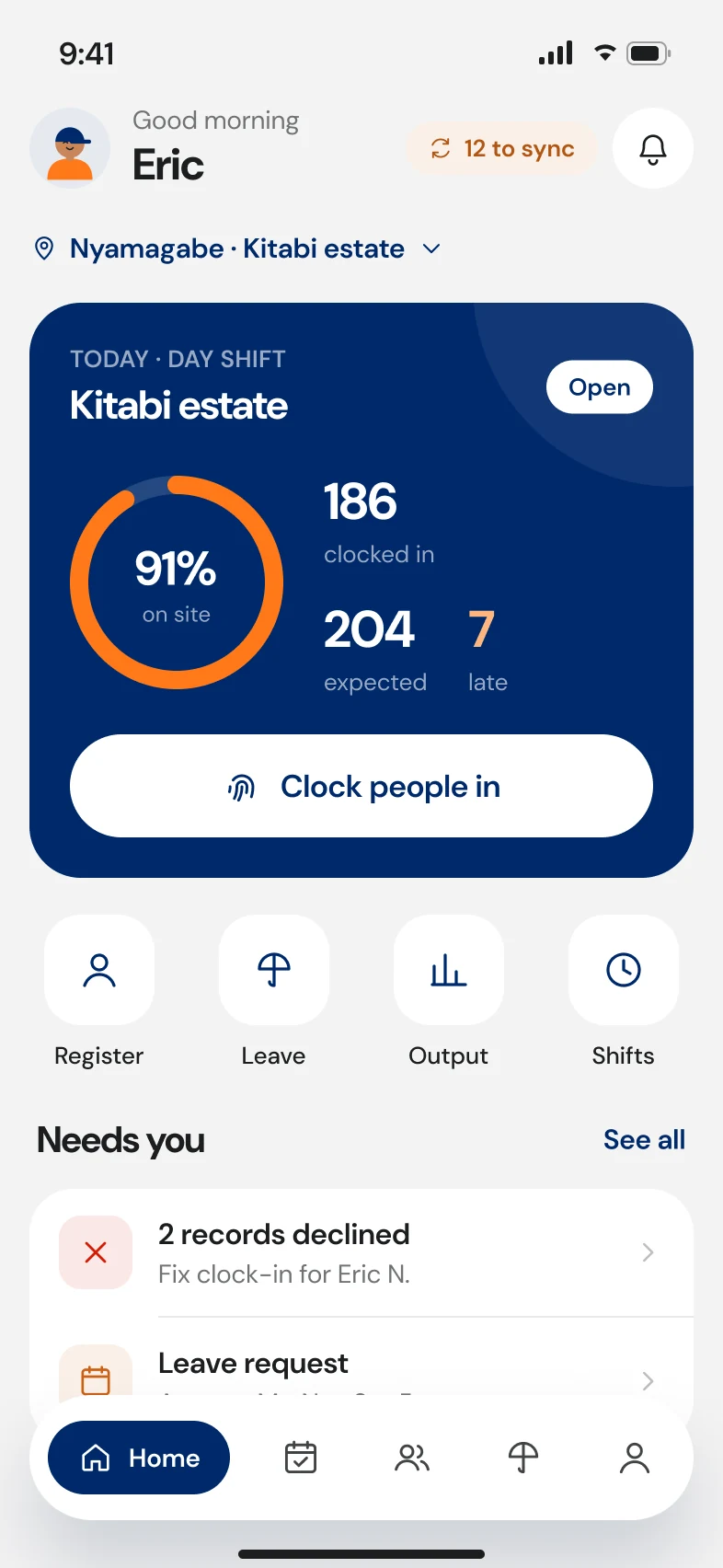
Today, this site, what's waiting.
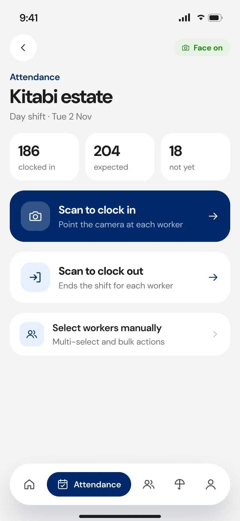
Home opens on the current site and shift, clocked-in against expected, and four big actions. A sync banner shows exactly how many records are waiting to upload.
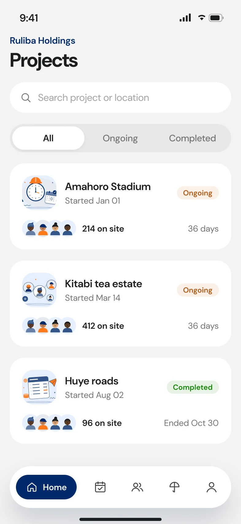
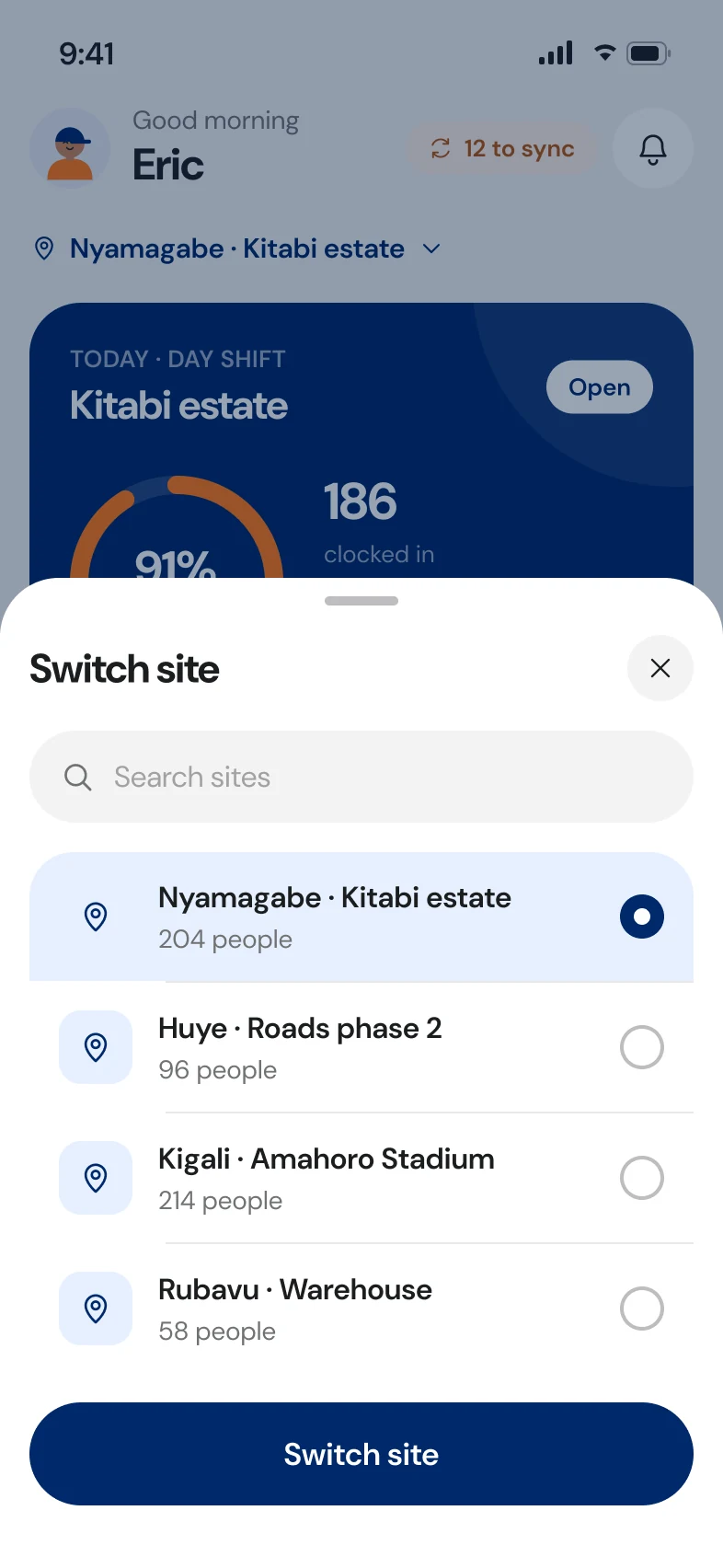
Switching site is a bottom sheet, because supervisors often cover two or three.
M3 · Attendance and productivity
Saved on your phone.
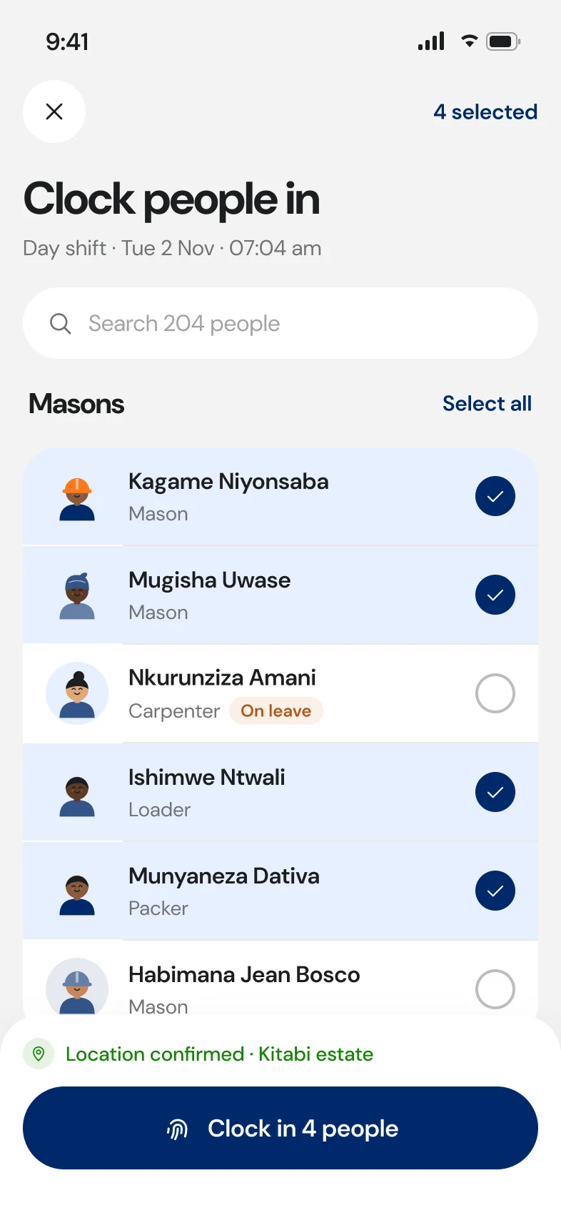
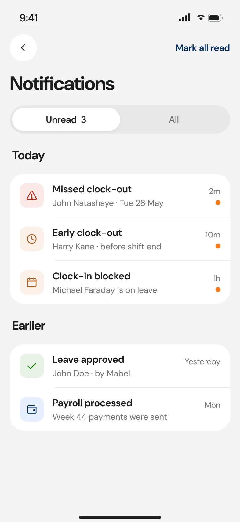
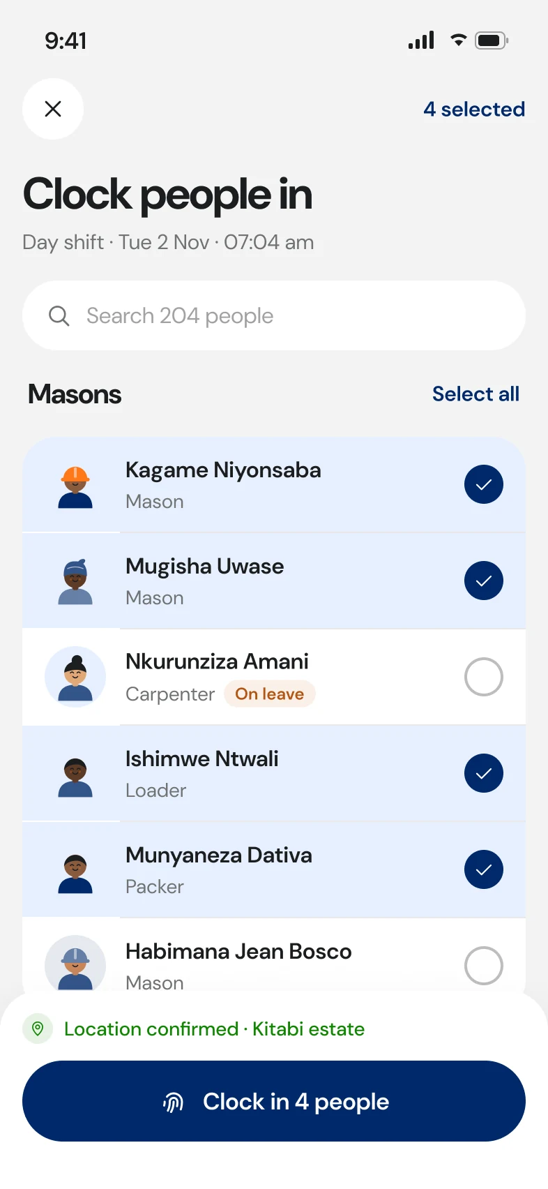
Clocking in is multi-select: tick the crew, confirm the location, clock everyone in at once. With no signal, the app says “saved on your phone” with a count and an illustration, never a red error.
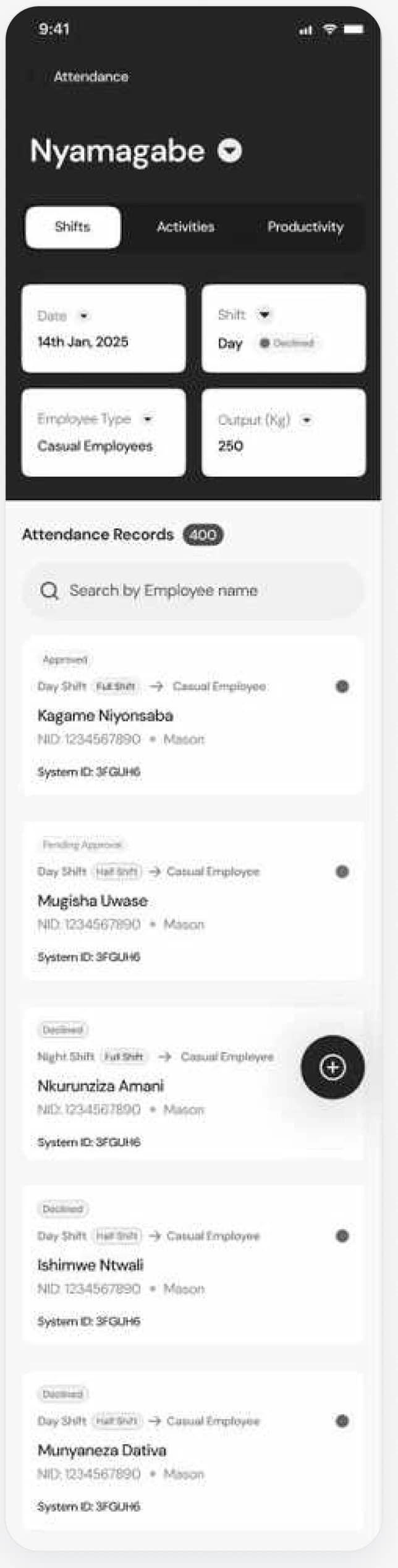
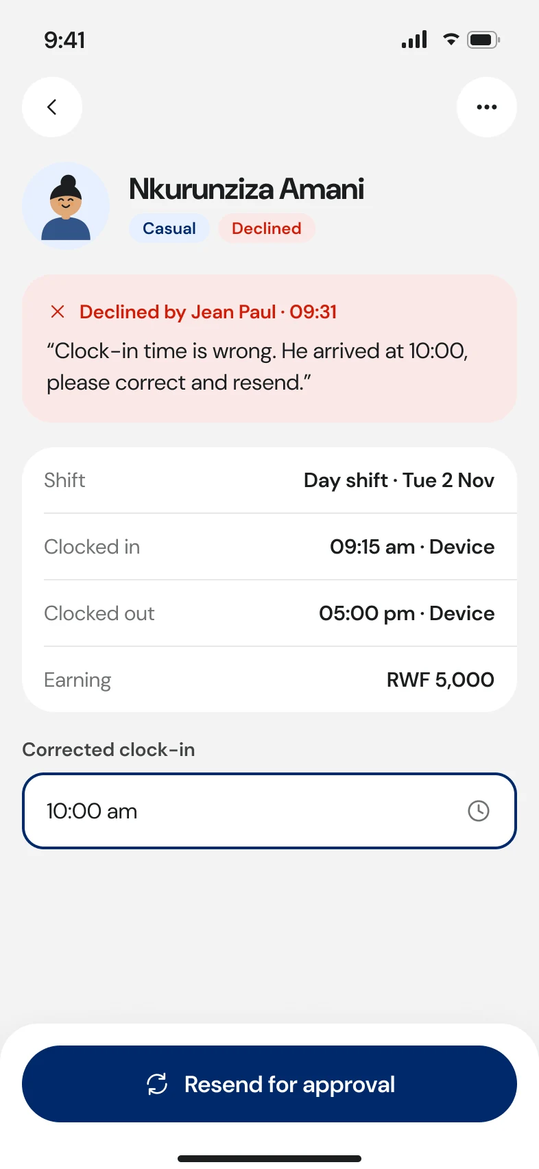
When HR declines a record on web, the reason lands here. The supervisor corrects the time and resends from the same screen.
M4 · Employees
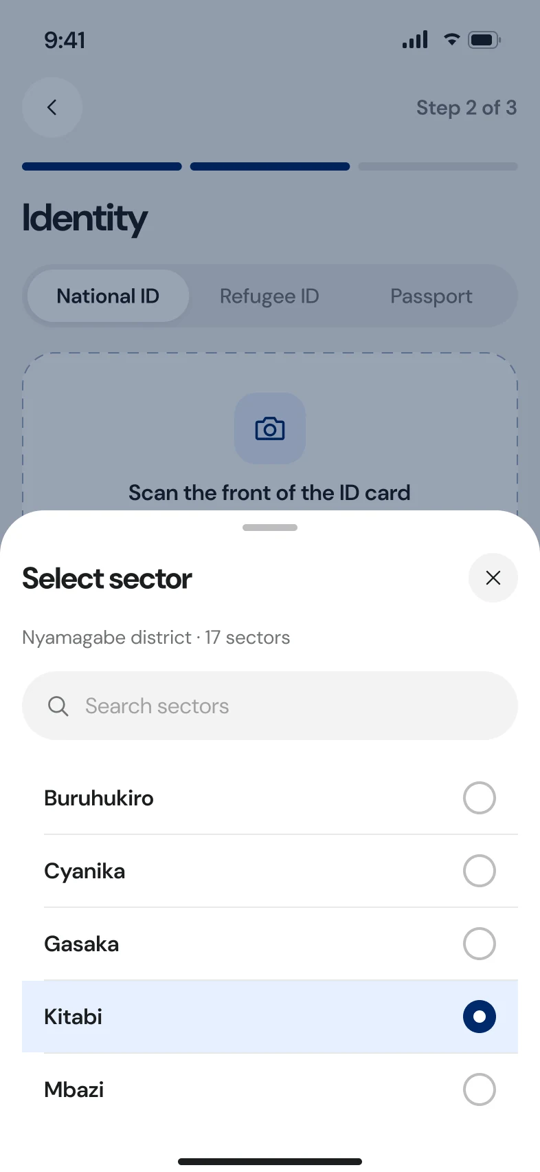
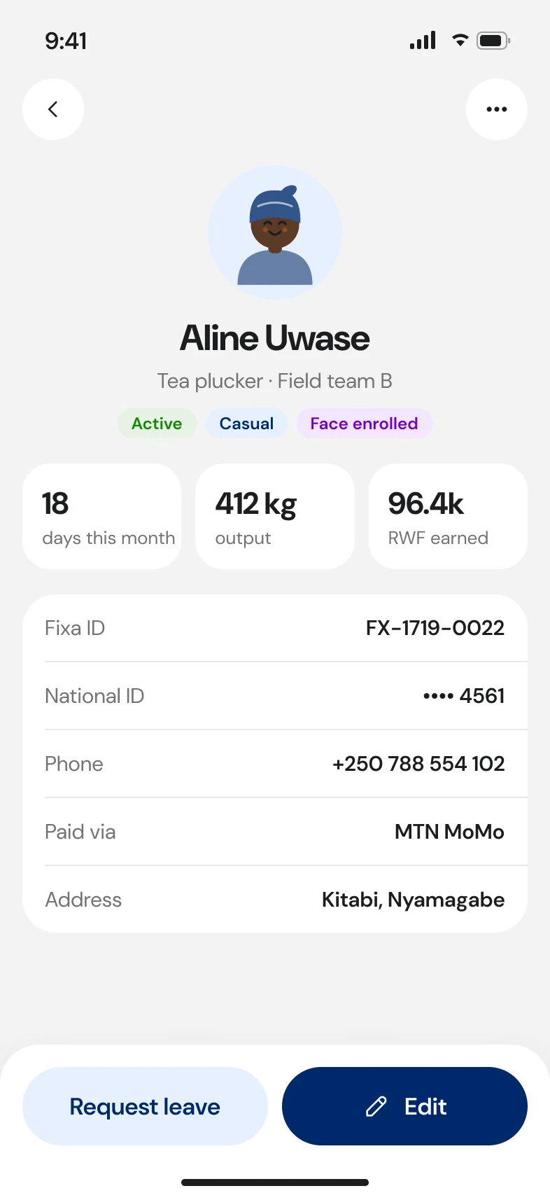
Register a worker in under a minute.
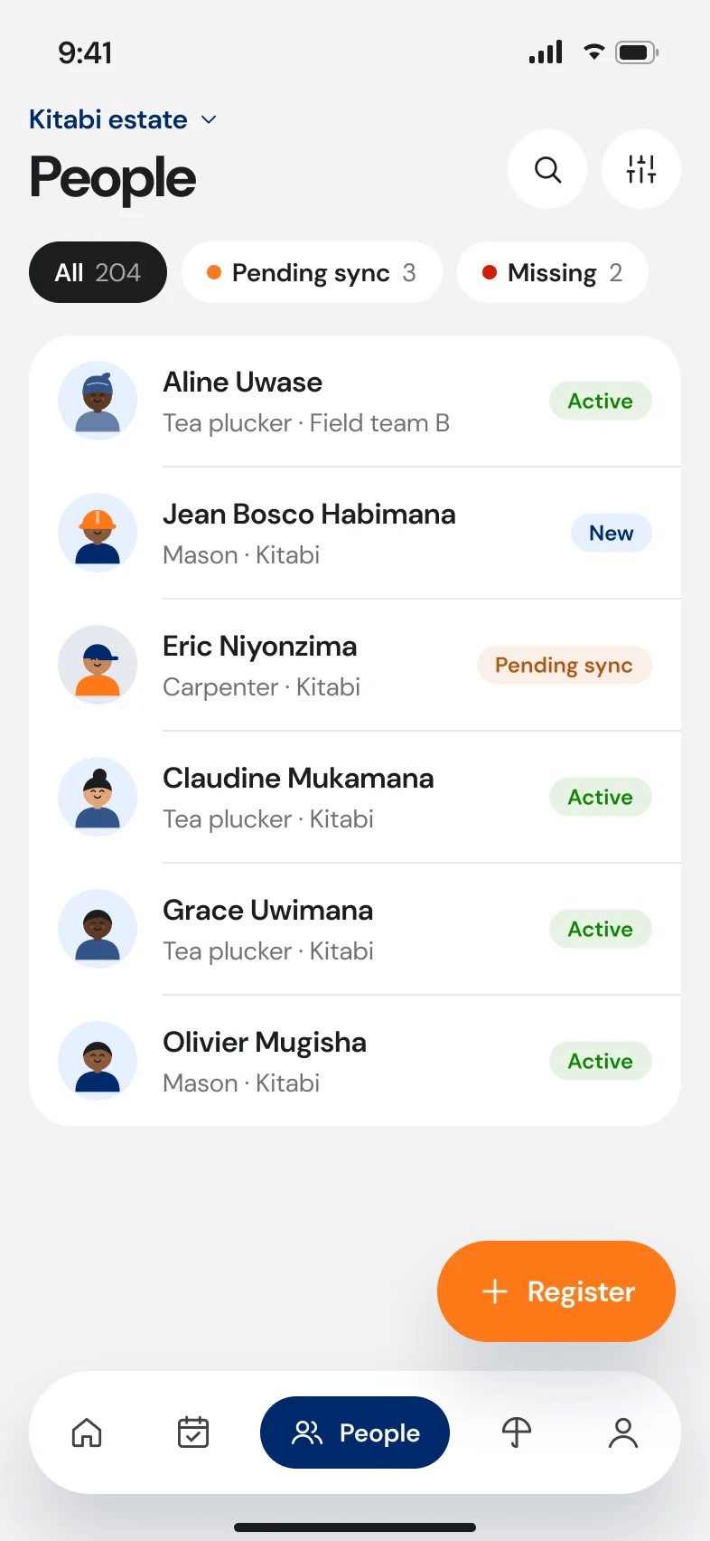
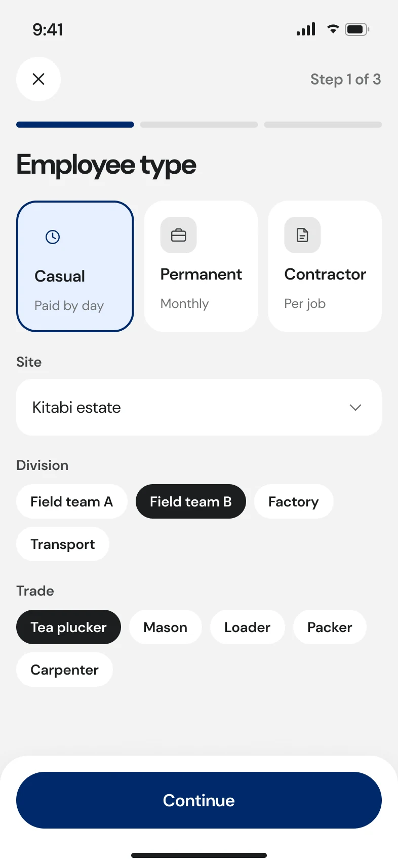
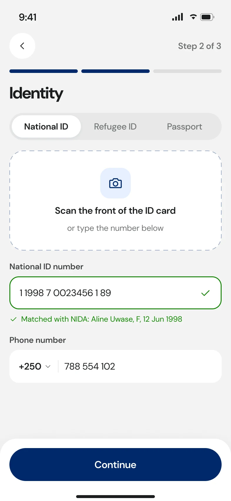
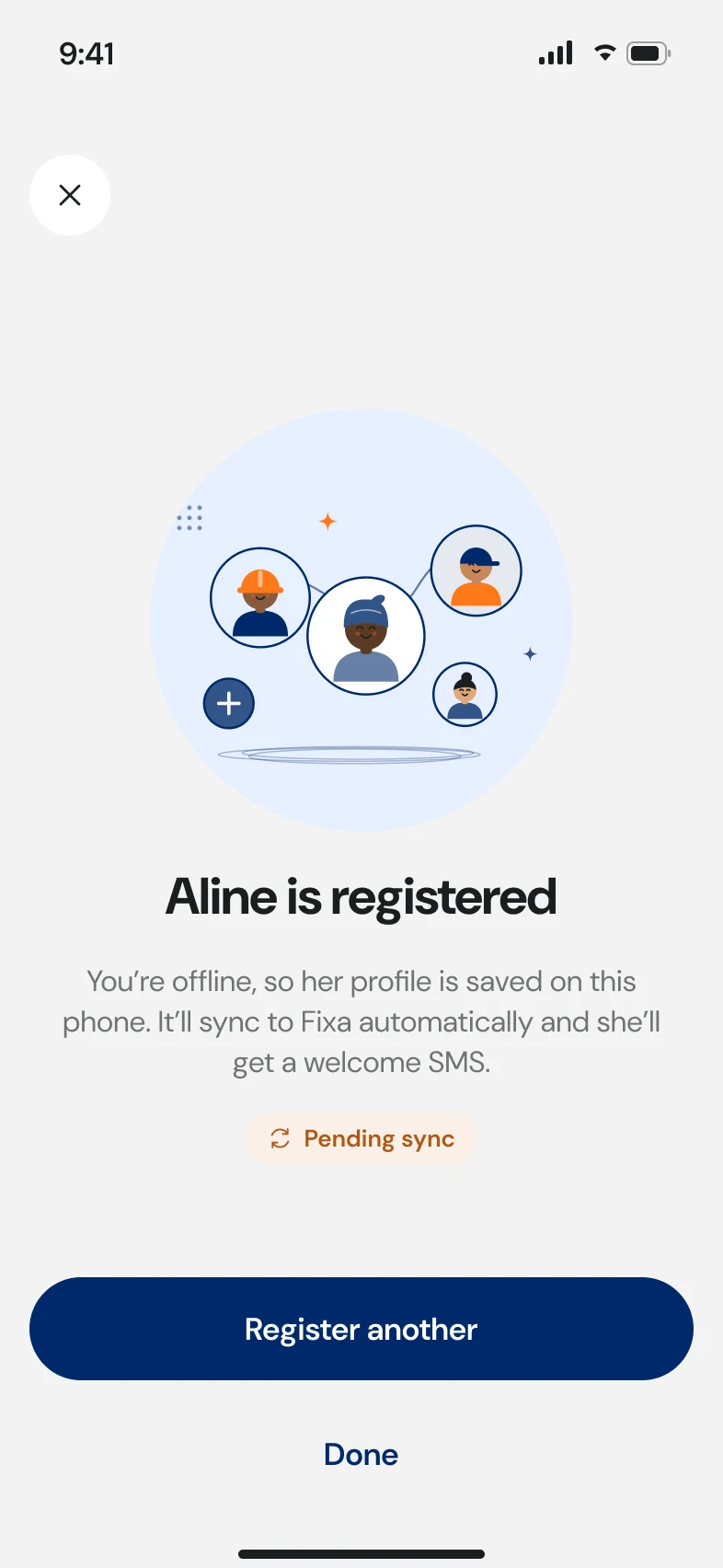
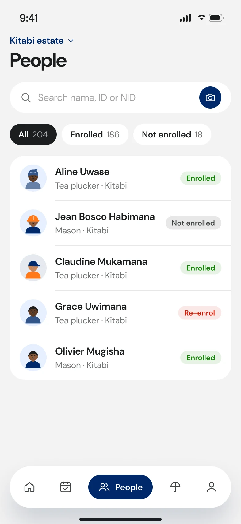
Three steps: type and placement, then a national ID scan with a live NID match, then phone. Offline, the worker is saved locally and marked “pending sync”.
The success screen offers “register another”, because hires come in batches.
M5 · Leaves and rates
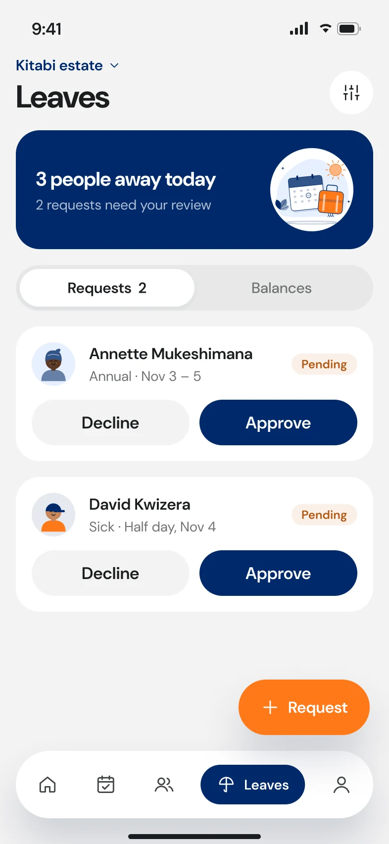
Small tasks, finished in a few taps.
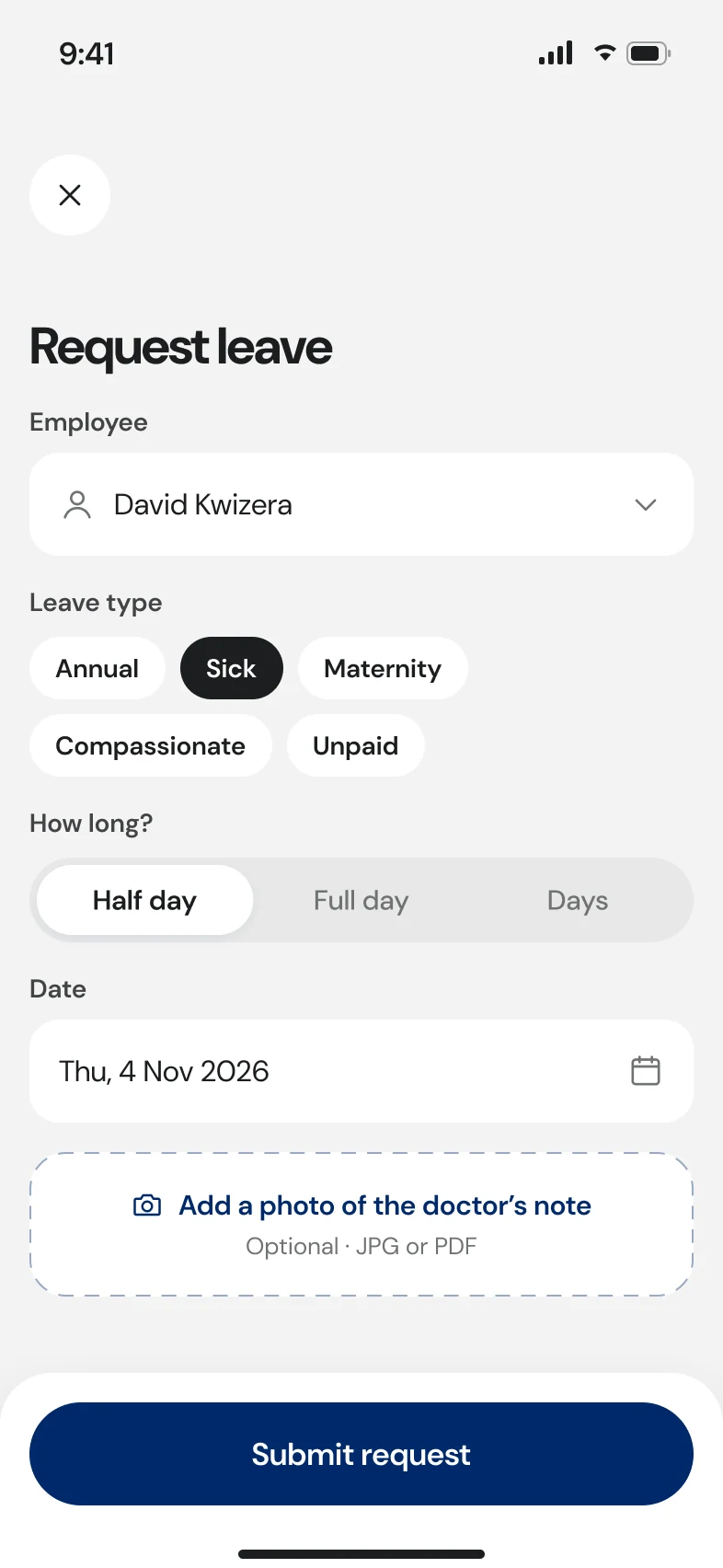
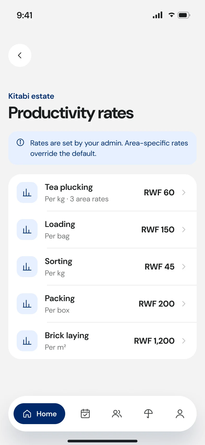
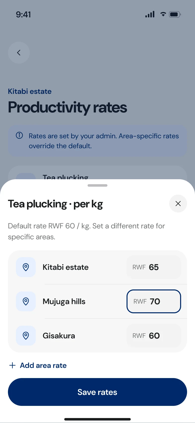
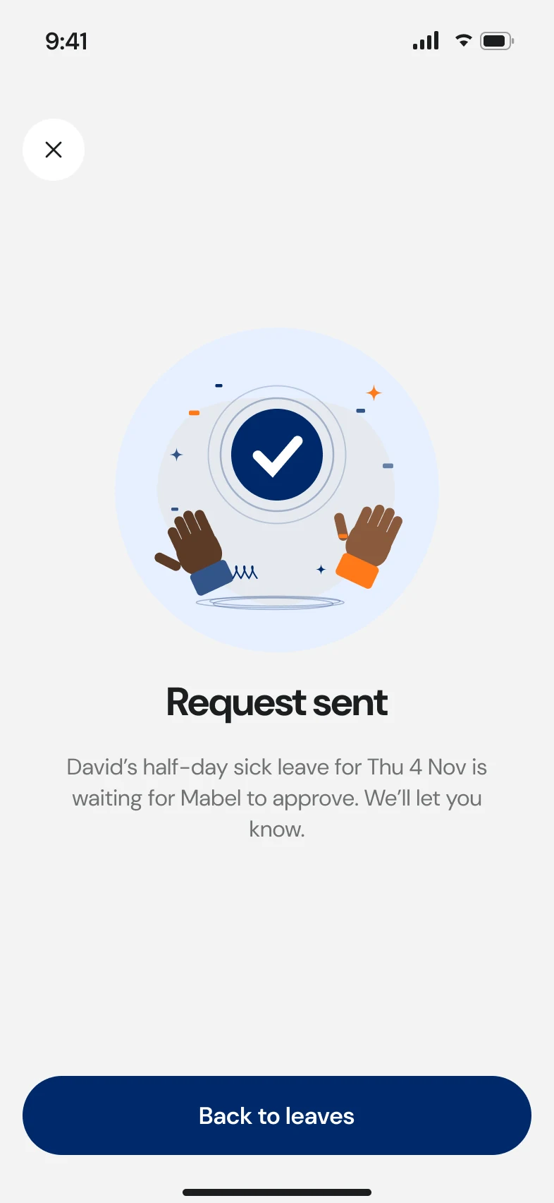
Approve or decline leave from a list, request leave on someone's behalf with a photo of a doctor's note, and adjust per-area productivity rates in a bottom sheet.
Part II · Biometrics
Face recognition at clock-in
Mid-project, the product added face recognition to attendance. The highest-stakes work in the app: getting it wrong means paying the wrong person.
- 12 scan states
- Clock in & out
- Lookalikes
- Manual fallback
- Enrolment
- Duplicate review
B1 · Why it mattered
A pilot at Mushubi showed what a confident wrong answer costs.
- productivity records saved to the wrong worker
- 70+
- productivity records saved to the wrong worker
- enrolments wrongly flagged as duplicates
- 5 of 13
- enrolments wrongly flagged as duplicates
- workers whose onboarding was paused
- ~1,700
- workers whose onboarding was paused
- root cause: the app auto-assigned its best guess
- 1
- root cause: the app auto-assigned its best guess
The model wasn't the main problem. The UX was: when a match was uncertain, the app picked someone anyway and moved on. In a payroll product, a confident wrong answer is worse than no answer.
B2 · The core decision
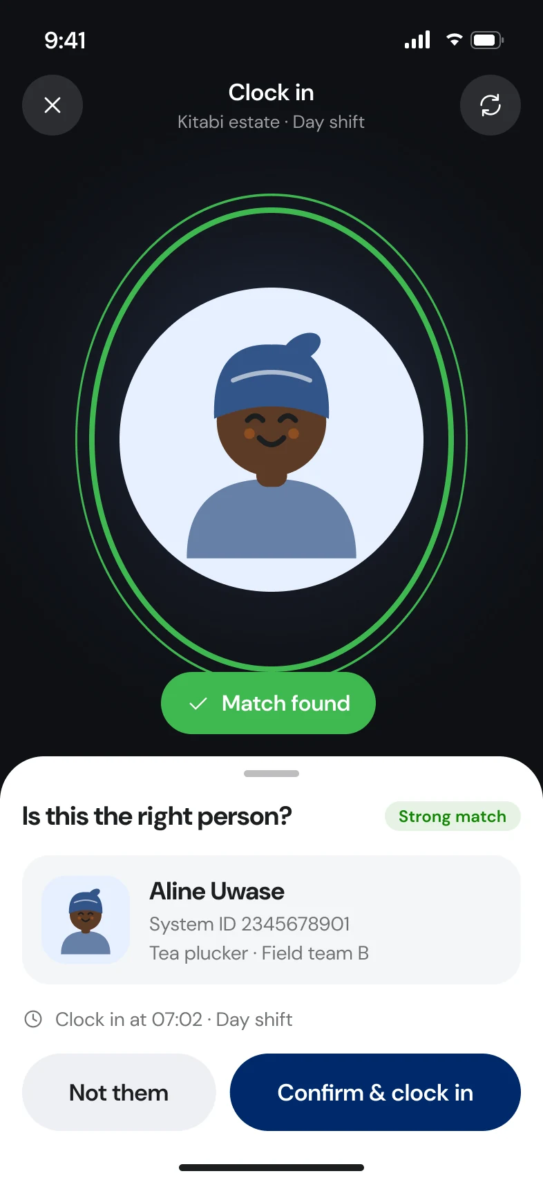
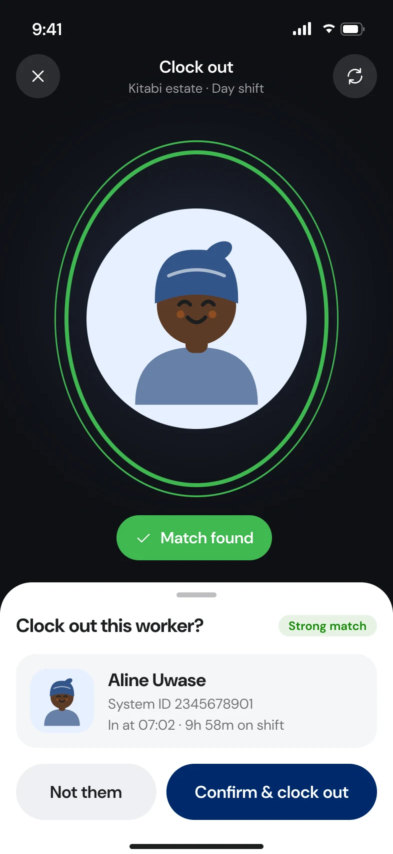
Never auto-assign. Show the person, let a human confirm.
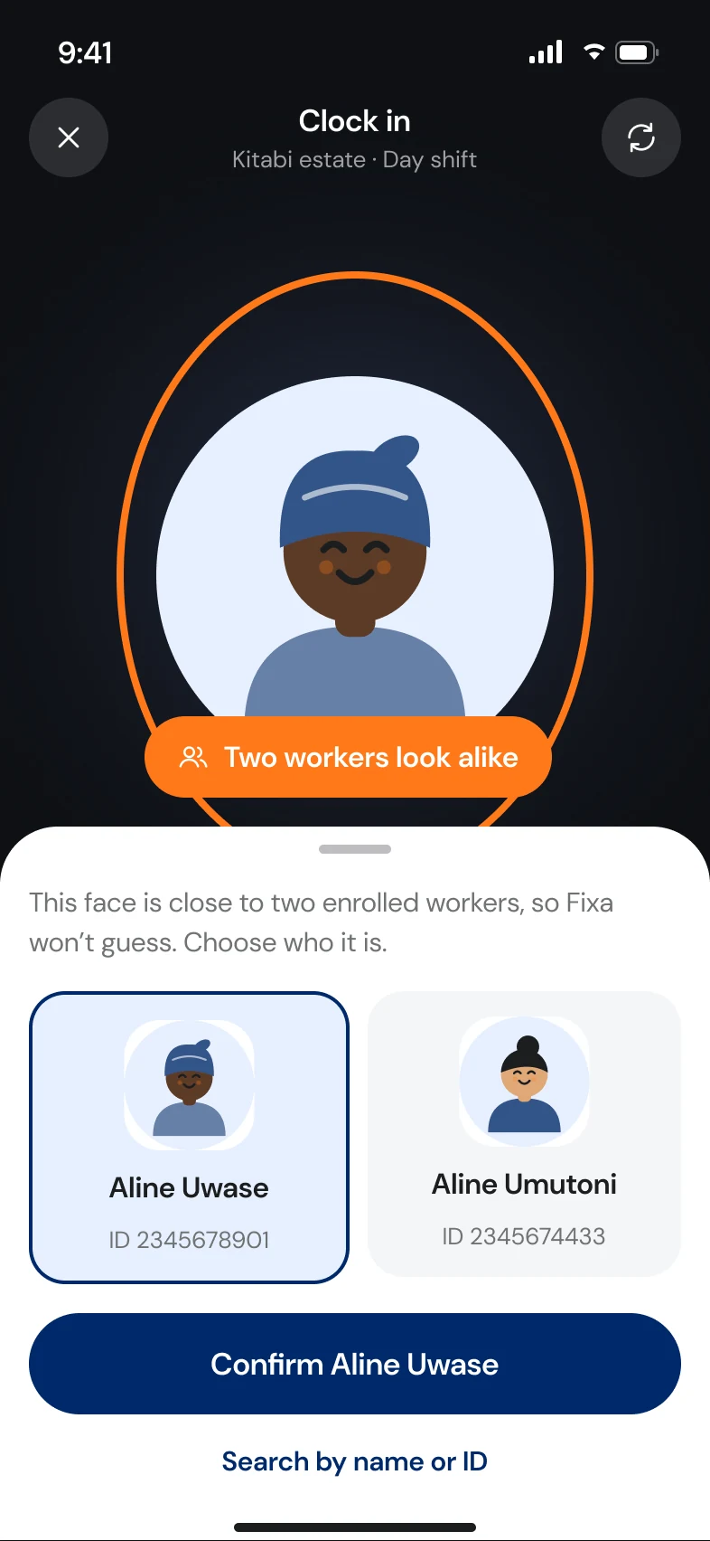
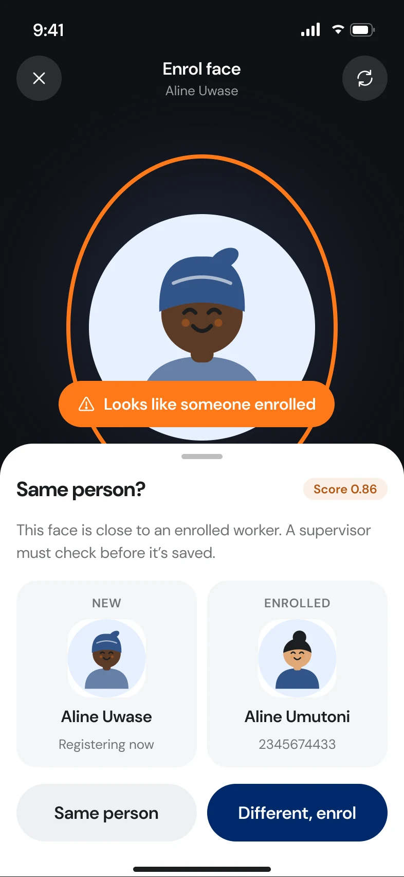
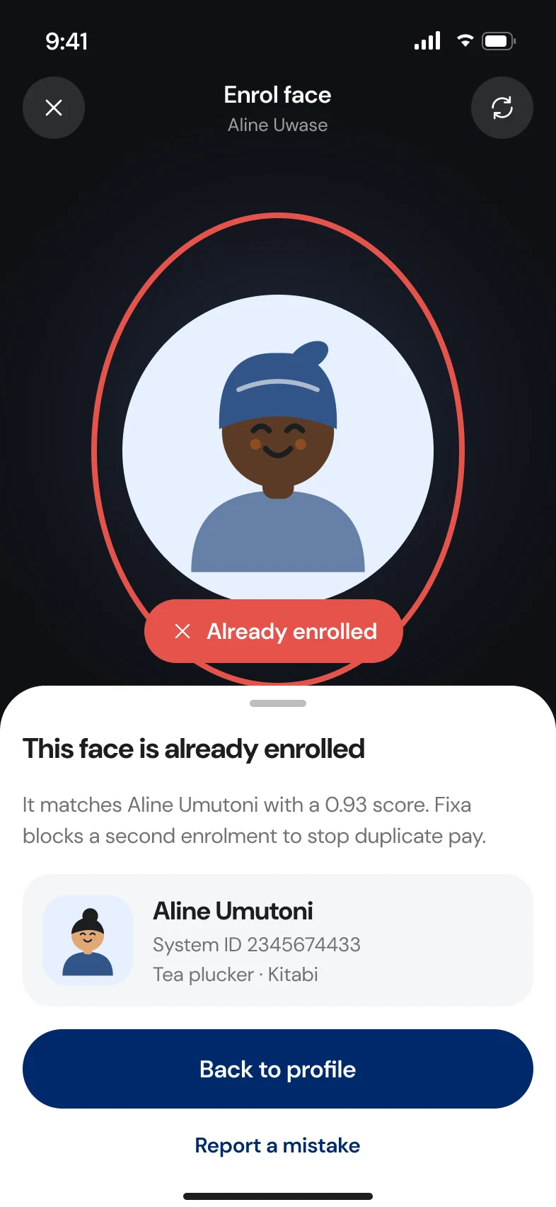
Matching follows the 2.0.40 rules. Above 0.82 with a clear 0.04 margin over the next lookalike, the app shows the matched person for a one-tap confirm. Between 0.85 and 0.88 against an existing enrolment, a supervisor must review. Above 0.88, a new enrolment is blocked as a likely duplicate.
Identity is confirmed with a photo, name and system ID, never the national ID number, which shouldn't be on a shared screen in a field.
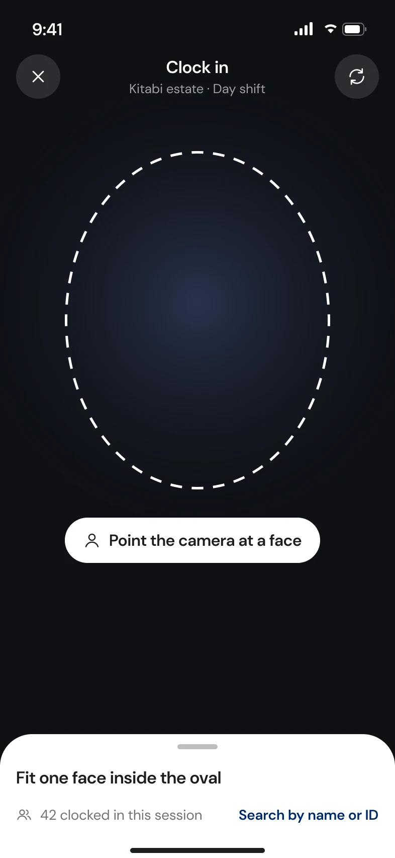
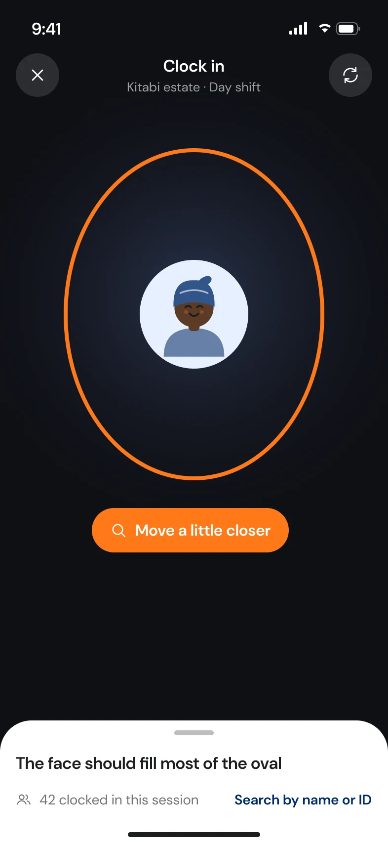
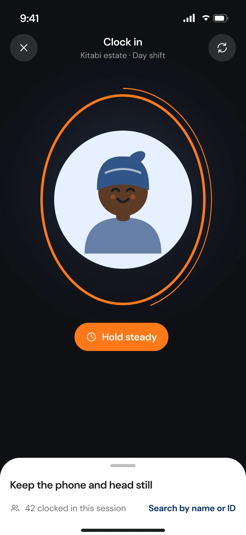
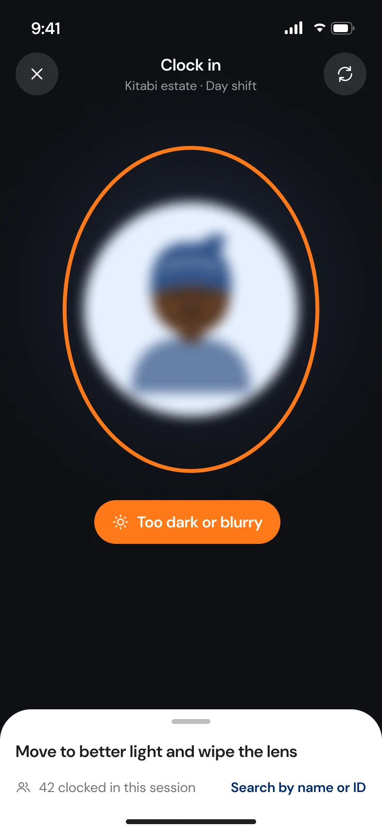
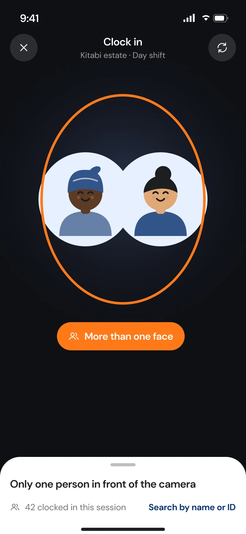
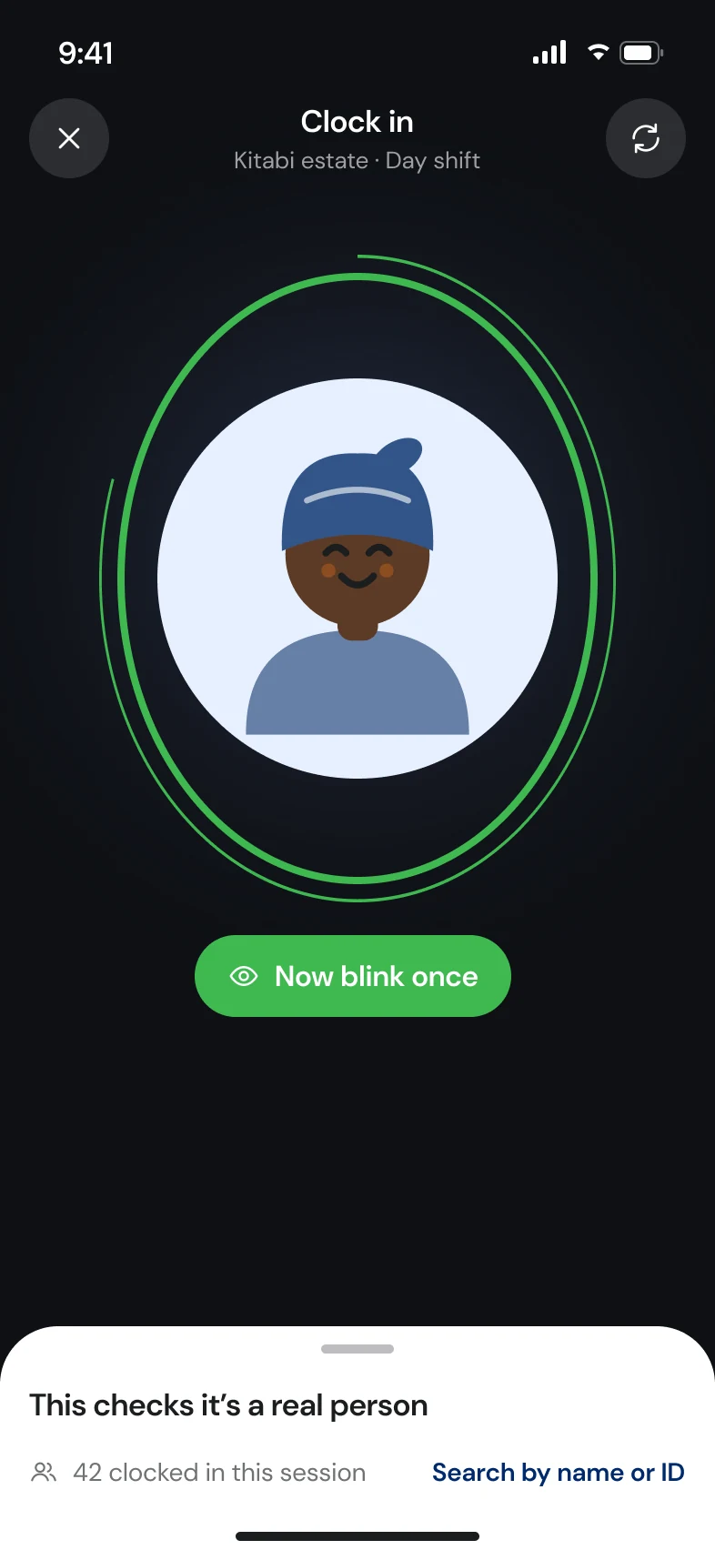
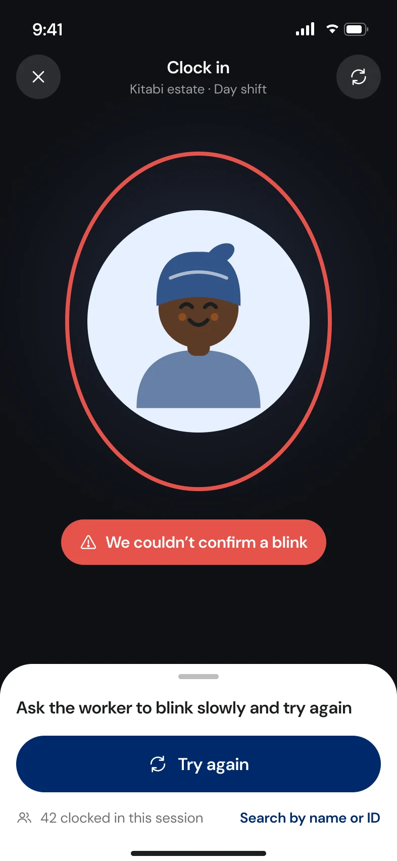
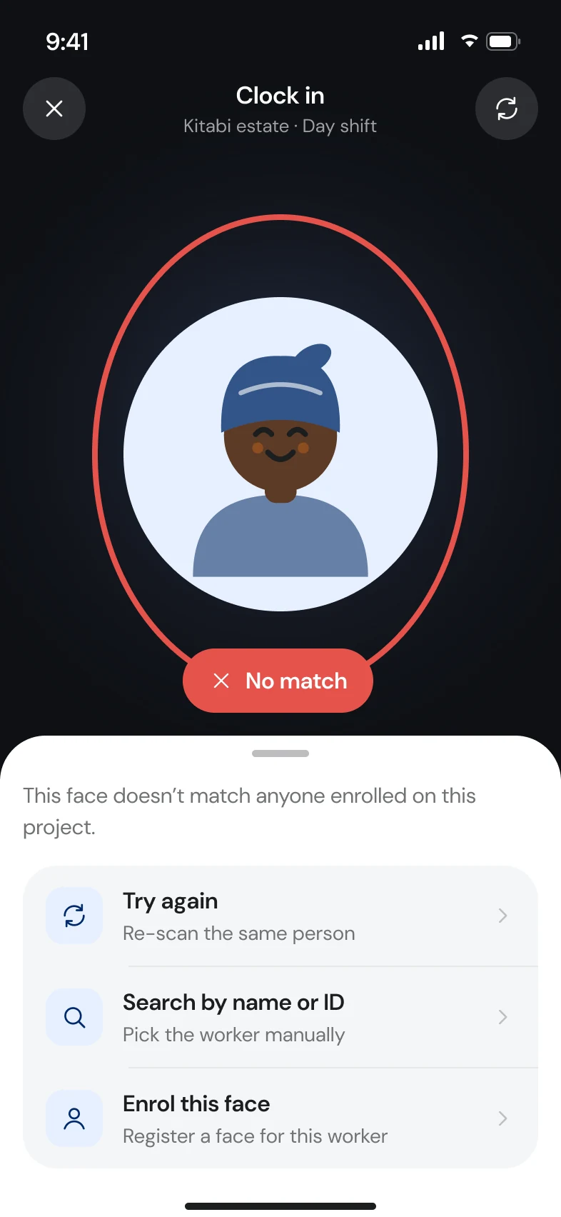
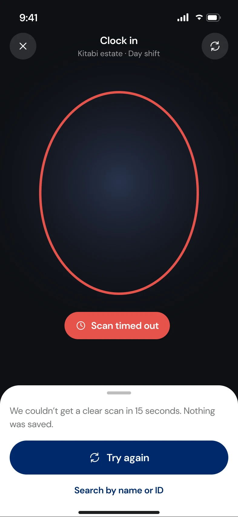
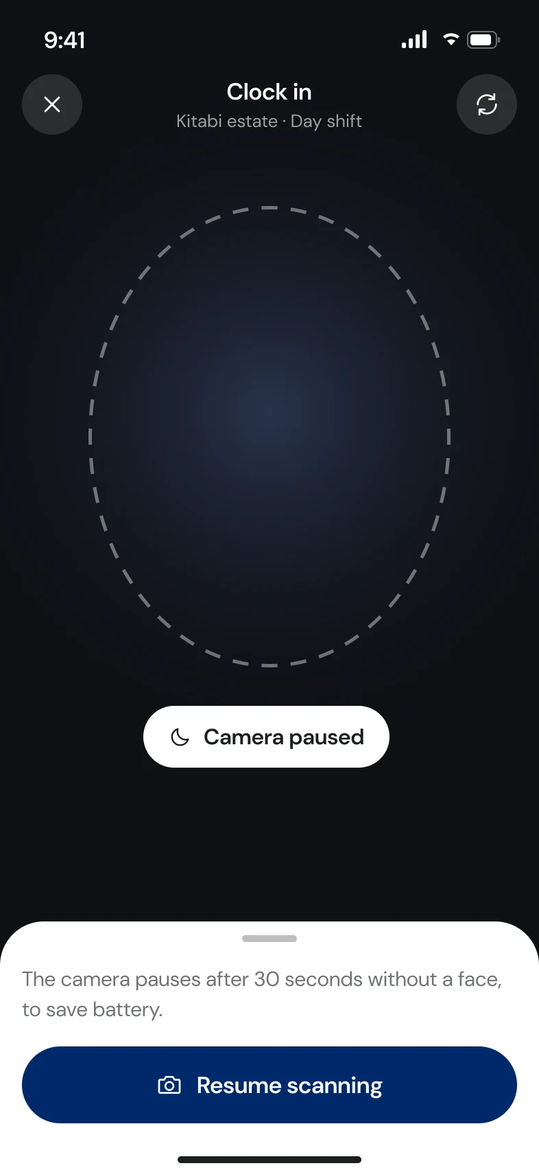
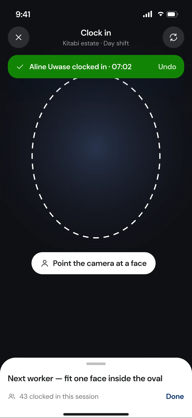
- One shared scan screen. Clock-in, clock-out and enrolment use the same camera view with twelve defined states.
- Lookalikes are a first-class state. When two people are within the margin, both appear side by side and the supervisor picks.
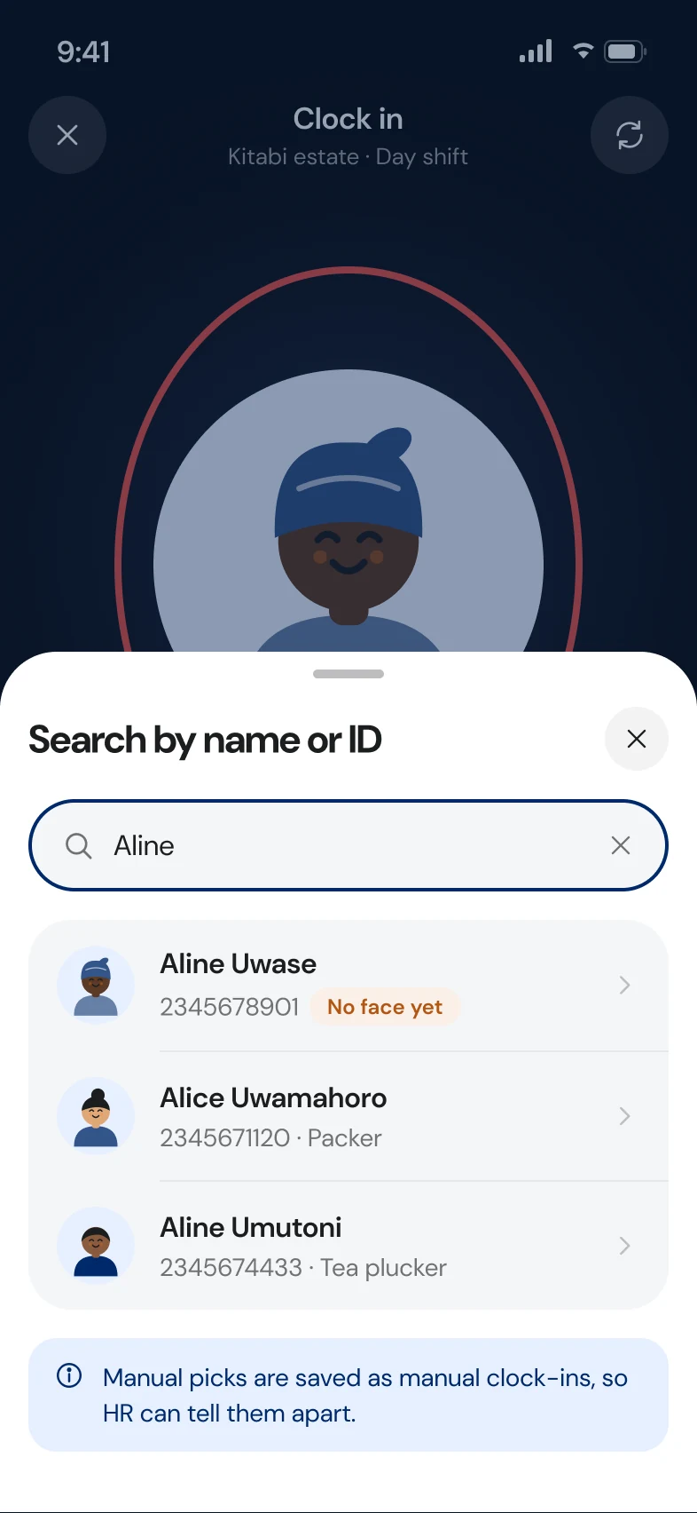
- Fallback is always visible. Search by name or ID is one tap away, so a bad camera never blocks a shift.
- Evidence travels with the record. The recognition image is stored with each record and visible to HR on web.
B3 · Scan states
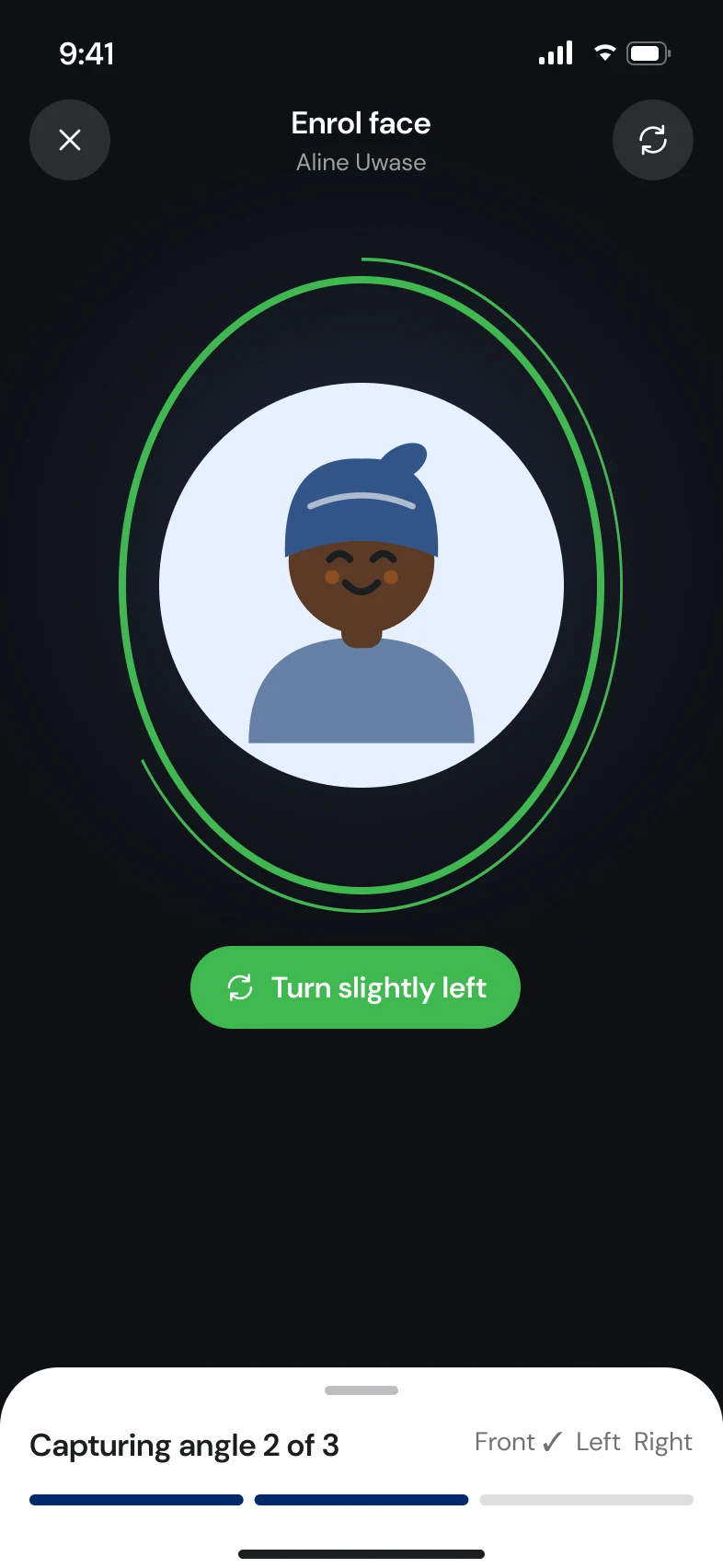
Twelve states, one camera.
I designed every state the scan can be in before designing any flow. Copy is short and plain, because it's read at arm's length while holding a phone up to someone's face.
B4 · Flows
Built from those states.
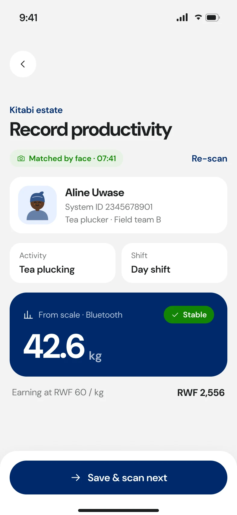
A confident match, saved and ready for the next person. Clock-out. No match, with manual search. Output recorded against a face-matched worker. And finding an employee by face.
B5 · Enrolment
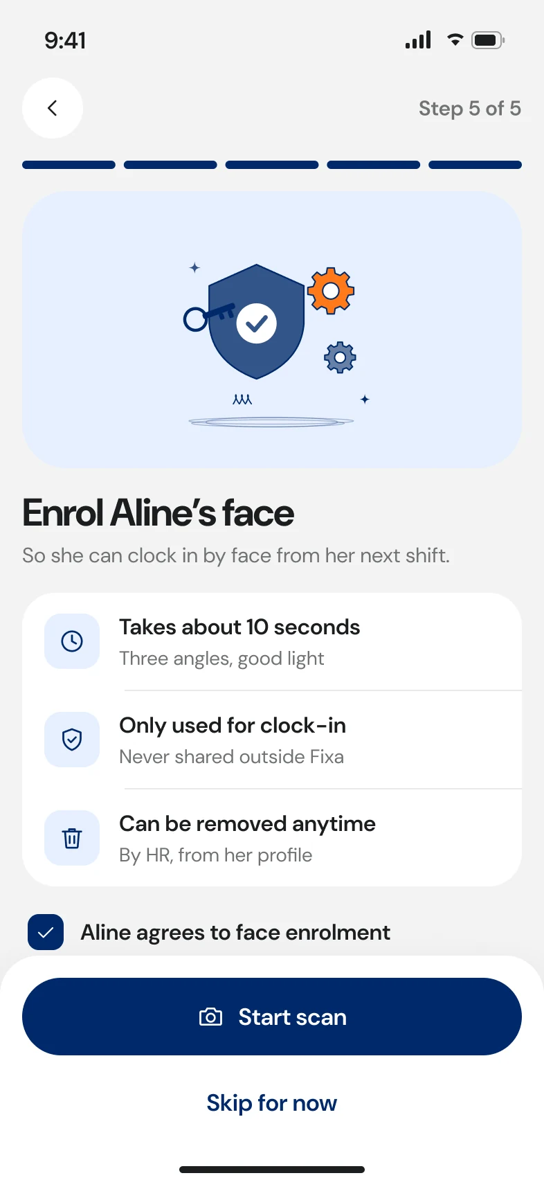
Consent first, duplicates caught before they spread.
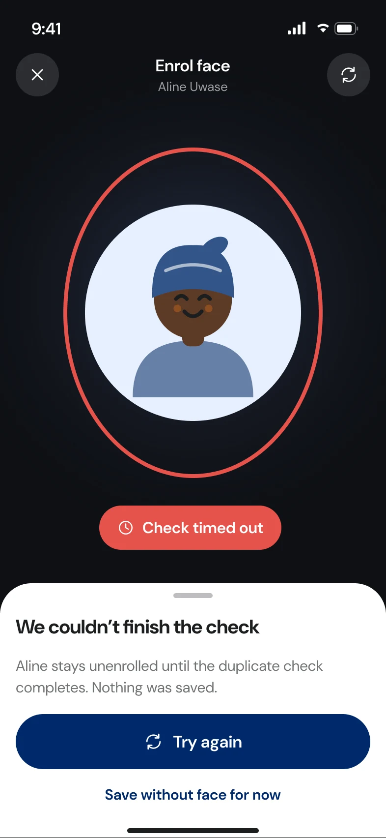
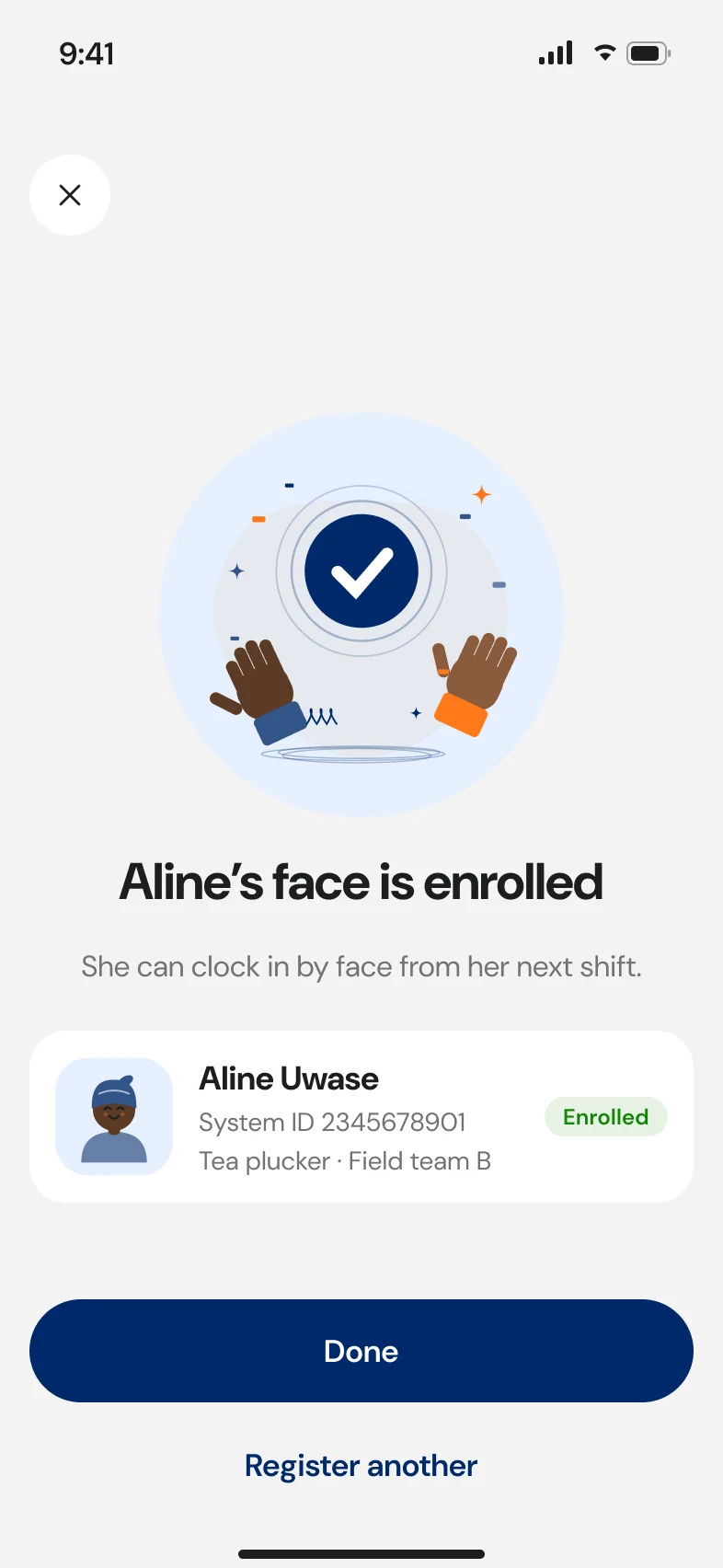
Enrolment is step five of registering a worker. It starts with consent, captures the face, then checks for duplicates. A close score sends it to a supervisor; a very high one blocks it.
A timed-out duplicate check never silently passes. The worker stays unenrolled until the check completes.
B6 · Targets
What we said success would look like.
These were the PRD targets going in. The results below are what we measured after launch. Scan-to-saved came in just over target, at 3.2 seconds.
- records saved to the wrong worker
- 0
- records saved to the wrong worker
- median time from scan to saved
- <3s
- median time from scan to saved
- app freezes during scanning
- 0
- app freezes during scanning
- paused workers to resume onboarding
- ~1,700
- paused workers to resume onboarding
Results
What changed once it shipped.
- wrong-worker records in the first two weeks of face confirm, down from 70+ in the pilot
- 0
- wrong-worker records in the first two weeks of face confirm, down from 70+ in the pilot
- to clock in a crew of 50, down from about 40
- Under 10 min
- to clock in a crew of 50, down from about 40
- duplicate records from re-entry after the sync banner
- 72% fewer
- duplicate records from re-entry after the sync banner
- median time from face scan to saved
- 3.2 s
- median time from face scan to saved
- of the ~1,700 paused workers back in onboarding within a month
- 1,450
- of the ~1,700 paused workers back in onboarding within a month
- supervisors and clerks interviewed across 6 sites, plus 12 usability sessions in the field
- 32
- supervisors and clerks interviewed across 6 sites, plus 12 usability sessions in the field
Before and after launch.
03 · Trade-offs
What I traded away.
Friction in biometrics
A confirm tap on every match is slower than auto-assign. Against 70+ wrong records, I'll take one tap. We revisit once wrong-worker records hold at zero.
Offline as default
Saving locally first adds sync states to design and build, but supervisors stop re-entering records when they can see their data is safe.
System ID over NID
Showing a national ID would make matching easier to verify, but it doesn't belong on a shared phone in a public field.
Kiosk mode
Left open. Shared-tablet kiosks would speed big crews but change who holds the device and who is accountable. Out of scope for Phase 0–1, but still on the table.
04 · Reflection
What the field taught me.
The best decisions here came from watching supervisors work rather than from the brief. A sync count on the home screen did more for trust than any explanation of how offline works.
With face recognition, the hardest call was to make the app less confident. Designing the uncertain states first (lookalike, no match, timed out) is what made the confident ones safe.
Next
- Ship biometrics Phase 1 and track wrong-worker records and scan time weekly against the targets.
- Field sessions in Kinyarwanda focused on offline sync and the lookalike state.
- Resume onboarding for the paused workers once enrolment holds up in the pilot.
Gallery
Up close
Single screens at full size, including the face enrolment card on a worker's profile.