Side project · Product design + build
Roomy
A realtime whiteboard that sorts itself.
Tidy turns a wall of sticky notes into labelled themes in one click, and you preview the result before anything changes for your team.
A six-day experiment: how far can one designer take an idea in a week, with Claude writing the code? I designed it from a brief, without research sessions with facilitators, and the case study says so where that matters.
- Role
- Product designer: framing, design system, every screen and state, motion, accessibility. Built alongside an AI engineer (Claude).
- Timeline
- Six days · 31 Oct – 5 Nov 2026
- Tools
- Figma (variables, components, prototypes), Dev Mode, Claude
- Live
- roomy-six.vercel.app
Part 1 · Design
Designing a board that sorts itself
I designed Roomy end to end in Figma, from the design system to every screen and state, and it shipped as a working product on 5 Nov 2026.
01 · The problem
Whiteboards are great until the meeting ends
Filling a wall with ideas is easy; the useful part, finding the themes and writing down what was decided, still happens by hand, usually by one person after everyone has left.
I framed the product around four moments where existing boards let people down. They became the landing page's “Sound familiar?” section.
| Moment | What goes wrong | Roomy's answer |
|---|---|---|
| After the workshop | One person stays behind for an hour dragging notes into groups | Tidy groups and labels the wall in one click |
| When the team joins | Cursors stutter, notes jump back, “just refresh” | Smooth live cursors, follow mode, a fast canvas |
| When the wifi drops | Edits are lost on a train or at a client site | Keeps working offline and merges on reconnect |
| When someone presses ⌘Z | A teammate's work vanishes, and trust goes with it | Undo only ever takes back your own changes |
The brief kept scope tight: one AI feature done well, two roles (owner and editor), and no video, templates marketplace or extra permission levels.
02 · Design principles
The rules I gave myself.
- Nothing changes without consent. AI previews, never acts. Tidy, transcript import and photo to board show their result first, and one undo reverses any of them.
- AI is always recognisable. One colour (orchid) and one mark (a four-pointed sparkle) belong to AI and nothing else.
- The room comes first. Presence, the shared timer and “bring everyone to me” are designed for the facilitator and the whole room.
- Every state is a screen. Loading, empty, offline, reconnecting, error and no-access are designed as carefully as the happy path, in light and dark.
03 · Designing Tidy
Designing Tidy so it asks first
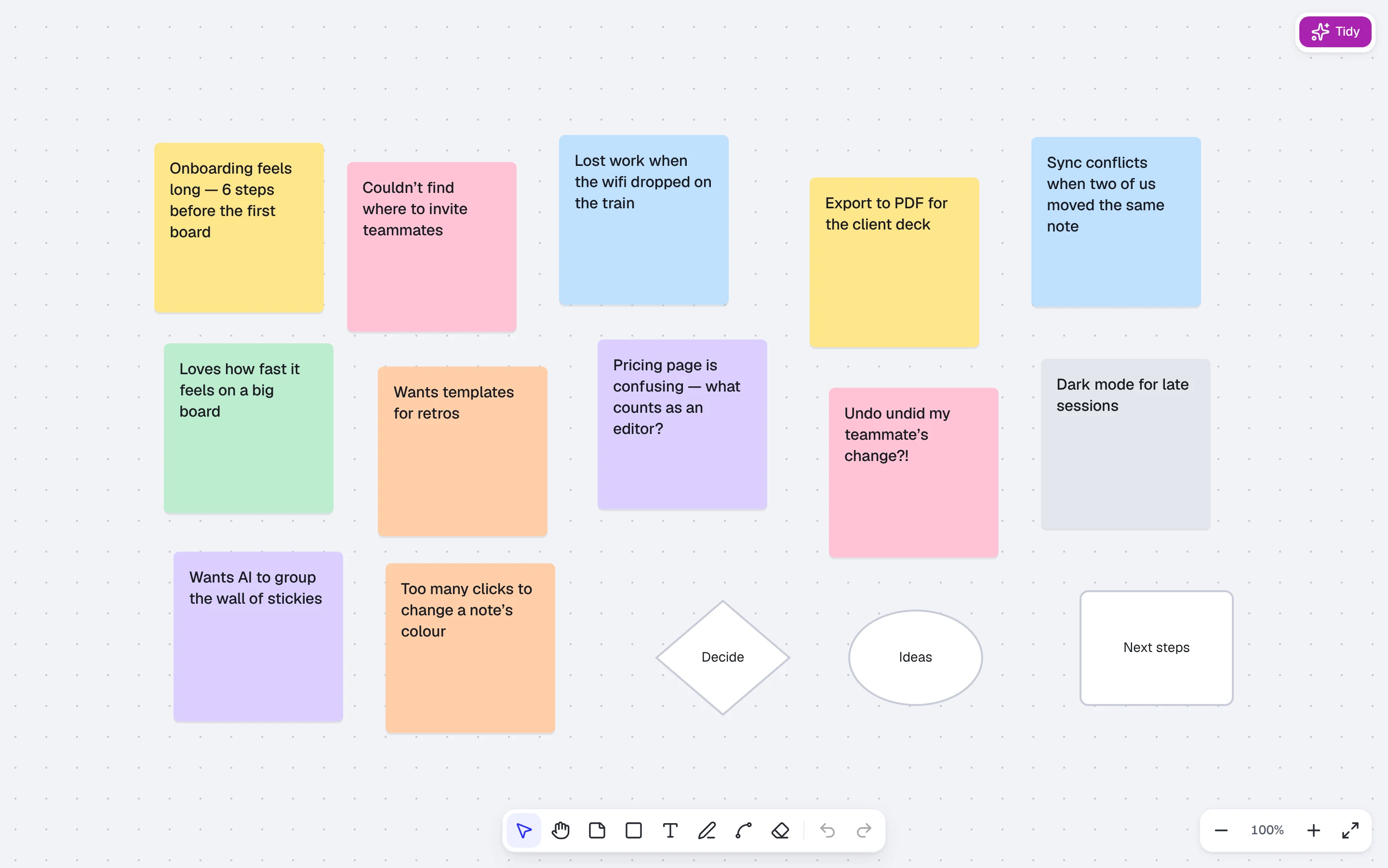
Nobody wants to come back to a board that rearranged itself while they were away. So every decision about Tidy protects the person's sense of control.
Preview before change
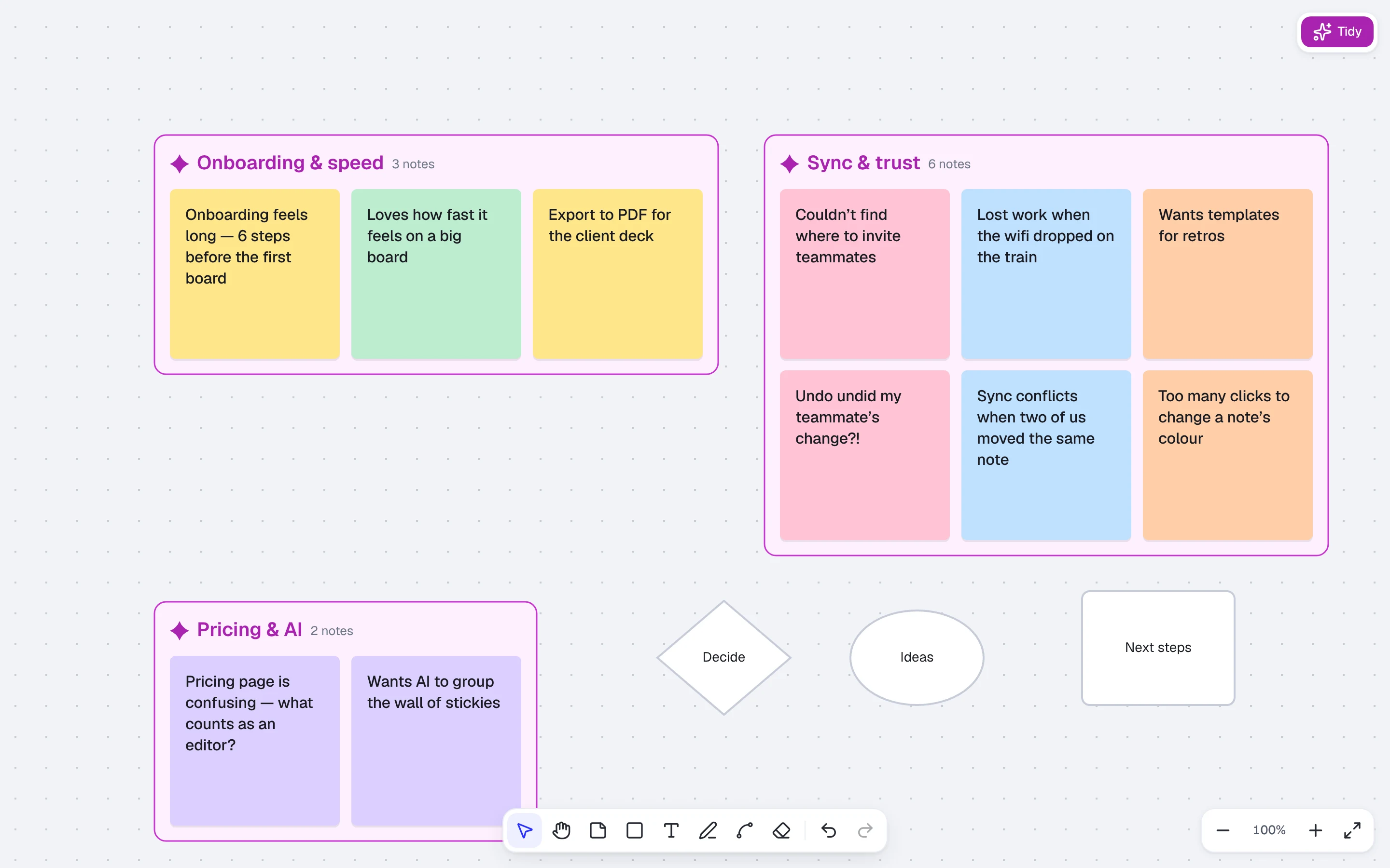
Pressing Tidy shows a proposal first. Notes move into dashed frames with suggested labels, and a bar says “Preview only — nothing is saved until you accept”, with Revert and Accept. Focus lands on Accept, so keyboard users can decide straight away. After accepting, the bar offers Undo, and one undo reverses the whole thing.
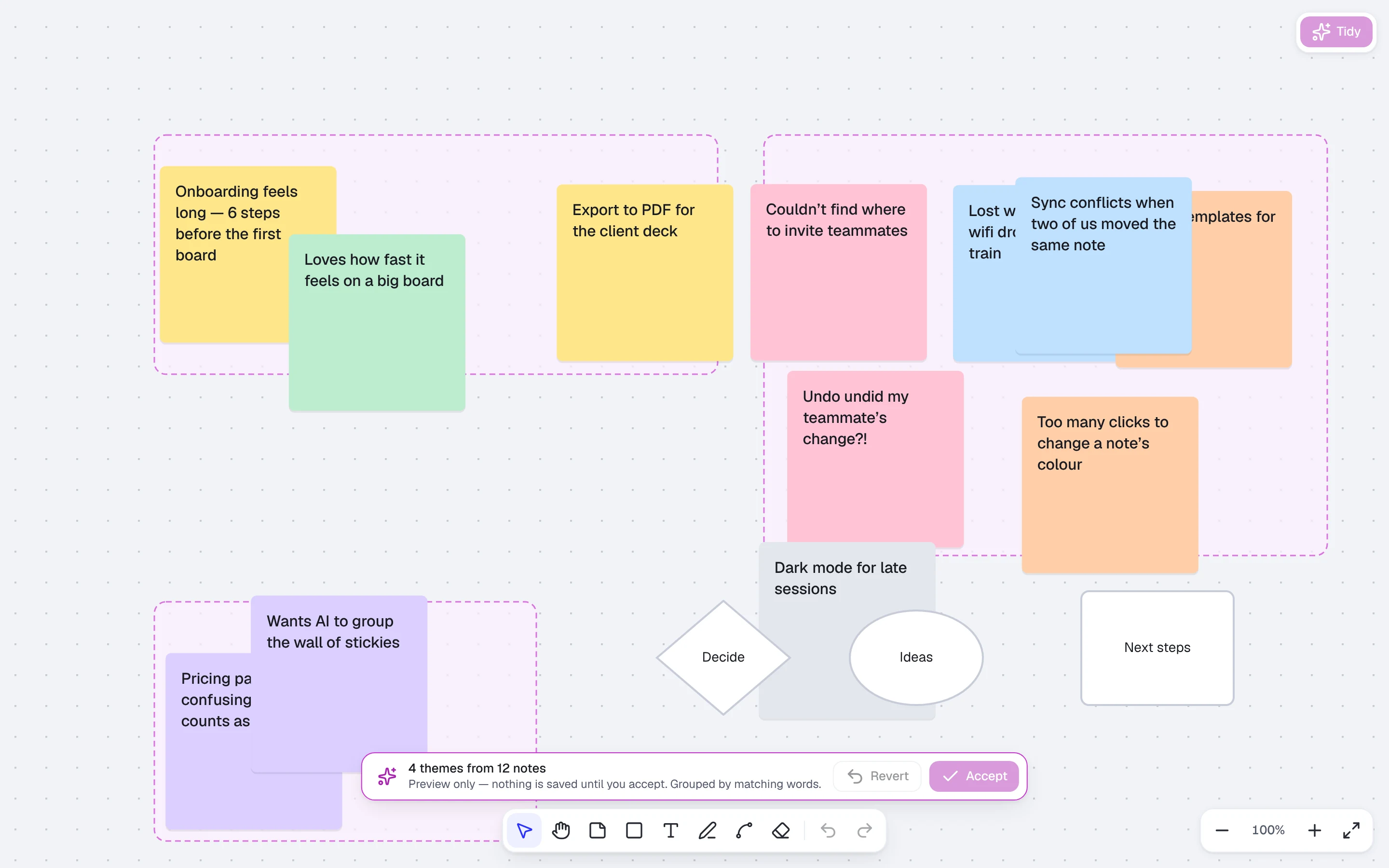
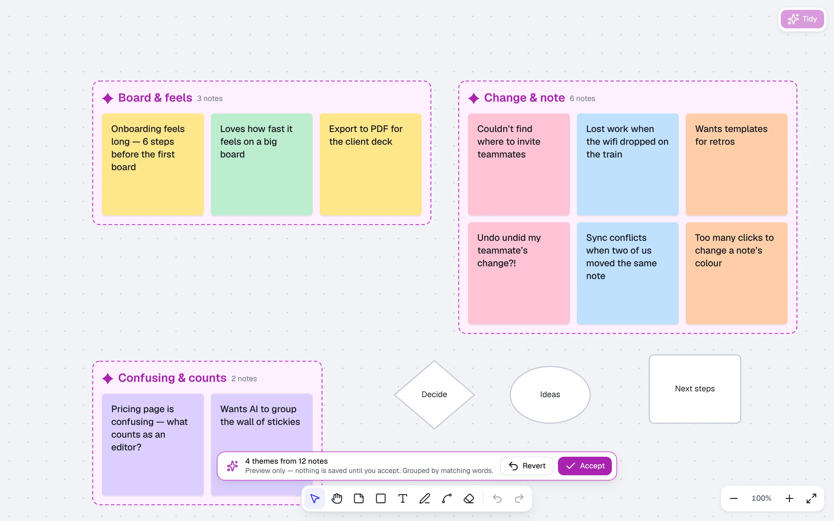
- The preview is private. Only the person who ran Tidy sees it, so collaborators never watch a half-decided layout jump around.
- Edits during the preview. If someone changes the board mid-preview, the bar asks “Re-run Tidy?” instead of silently applying a stale plan.
- Clear scope. Tidy works on the selection, or on every sticky note when nothing is selected. Shapes and drawings never move.
- Honest limits. It needs at least 6 notes. Below that the button is disabled, and its tooltip says why and how far you are: “Add at least 6 sticky notes (3 so far)”.
A motion storyboard
The motion explains what happened, so it was storyboarded in Figma before any code.
| Time | What happens |
|---|---|
| 0–120 ms | Notes lift to 104%, so you see they're about to move. |
| 120–700 ms | Notes fly to their theme on a spring (stiffness 260, damping 26), staggered 20 ms by distance from the centre. |
| 700–900 ms | Notes settle; labels slide up 4px and fade in. |
| On accept | Dashed borders turn solid in 150 ms. |
| Reduced motion | The whole sequence becomes a 200 ms crossfade. |
Trust
AI work is marked consistently. Orchid and the sparkle appear on Tidy, Listen, summaries and photo to board, and nowhere else. Labels are editable like any other text, because the AI's naming is only a starting point.
04 · Designing for many people
Knowing who is doing what, and never losing someone's work
A shared board fails socially before it fails technically, so the multiplayer design is about knowing who is doing what, and never losing someone's work.
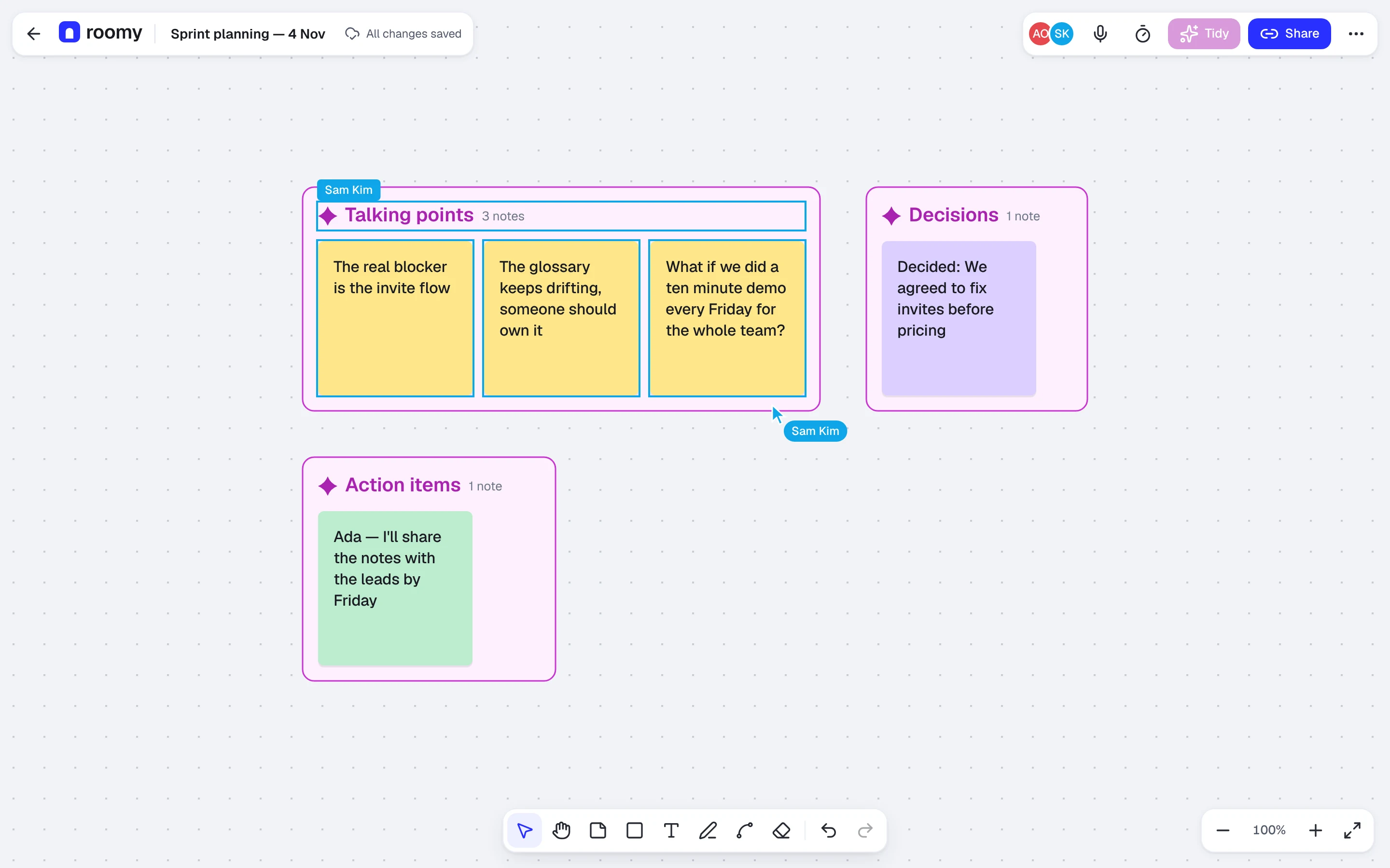
- Presence. Each person gets one of 8 presence colours for their cursor, name tag, selection outline and avatar. The colours are the same in light and dark, so a person keeps their colour when you switch themes.
- Follow. Every avatar is a button: choose it to follow that person's view. A banner says “Following Sam · Esc to stop”, and any pan or zoom of your own ends it.
- Bring everyone to me. Facilitators pull the whole room to their view in one click, instead of saying “scroll left, no, further”.
- Undo that respects teammates. ⌘Z only takes back your own changes. One person's undo can never erase another person's note.
- Offline and reconnecting. The status always says what's true: “Reconnecting…” while it retries, and “Offline · edits saved on this device” when it can't. You keep working, and edits merge when you're back.
- Listening is visible. When someone uses Listen, everyone sees “Ada is listening — talking points will appear as notes”. Nobody is recorded without knowing.
05 · Meetings to board, and the facilitation kit
Getting ideas in, running the session, getting decisions out
Most sticky notes start as talk, so the second half of the product covers the meeting itself: getting ideas onto the board, running the session, and getting decisions out.
Getting ideas in
- Listen turns talking points into sticky notes as people speak. Before it starts, a sheet explains that it uses the microphone and that everyone on the board will see you're listening.
- Import a transcript by pasting text or uploading a .vtt, .srt or .txt file. The dialog names the tools it works with (Zoom, Google Meet, Teams, Otter or plain text), so nobody has to guess.
- Photo to board reads a photo of a real sticky-note wall. You review every note before it's added: hard-to-read notes are outlined, and you choose whether to keep the photo's colours.
Running the session
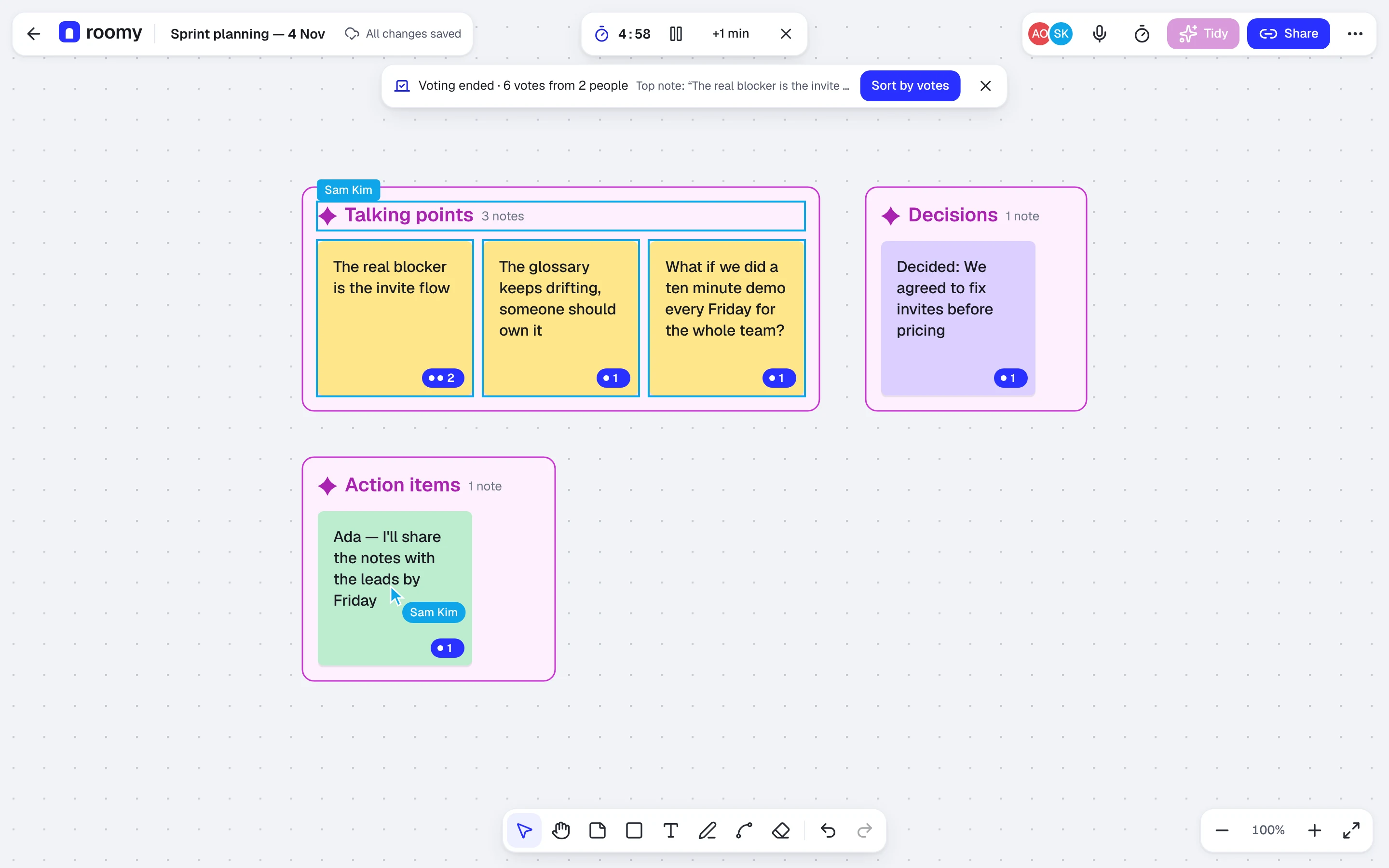
The facilitation panel holds four tools, each one row with a short promise.
| Tool | Promise on the row |
|---|---|
| Timer | “everyone sees it” |
| Dot voting | “3 votes each” |
| Hide notes | “Until you reveal” |
| Bring everyone to me | “Moves all views to yours” |
During voting, a banner counts down your votes and teaches the interaction in one line: “click a note to vote, again to take it back”. When voting ends, it reports the total and offers Sort by votes.
Getting decisions out
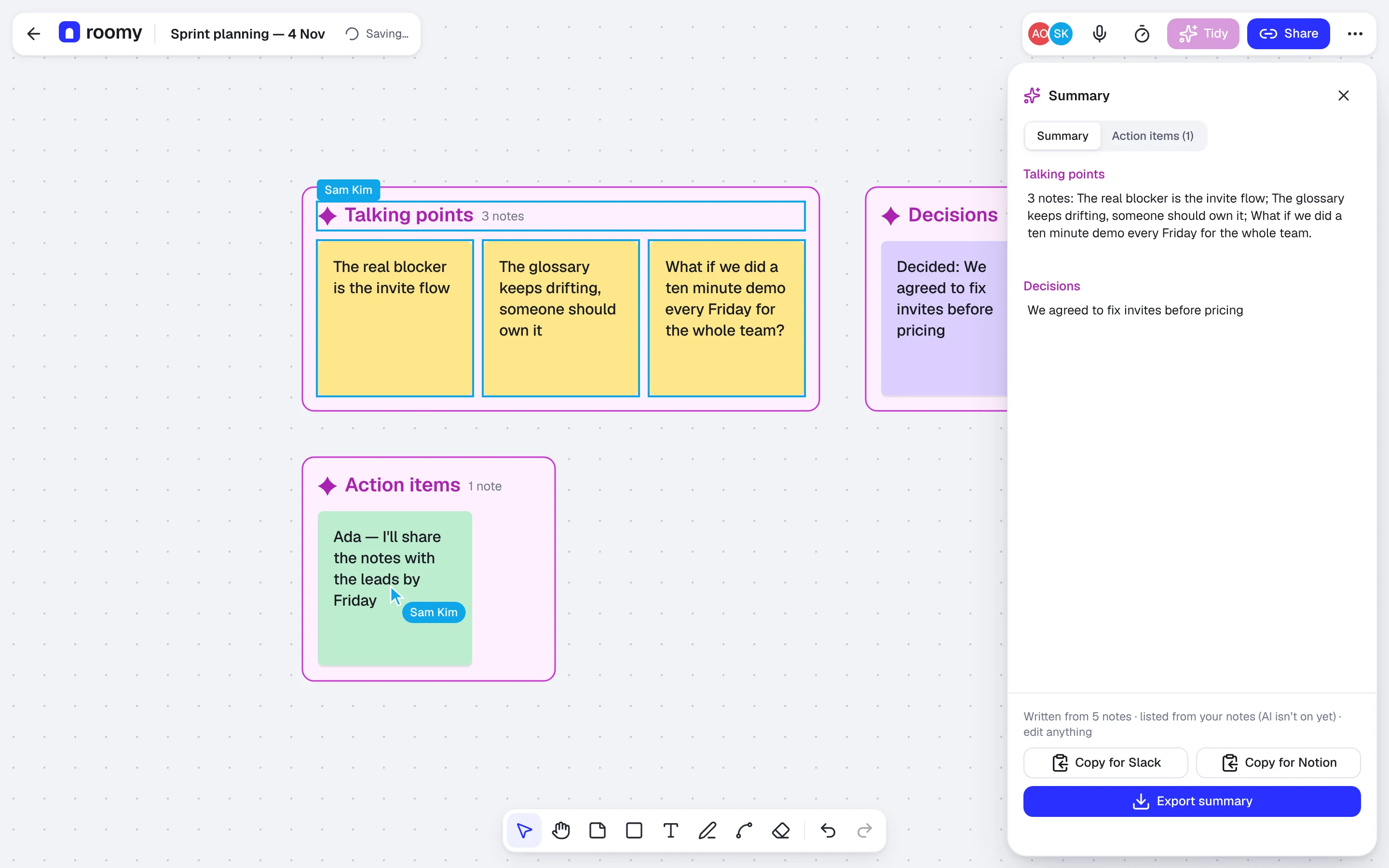
The summary panel splits into a summary, decisions and action items, all editable before you copy. Copy for Slack and Copy for Notion format the text for where it's going next.
06 · Visual system
The interface is quiet so the board can be loud
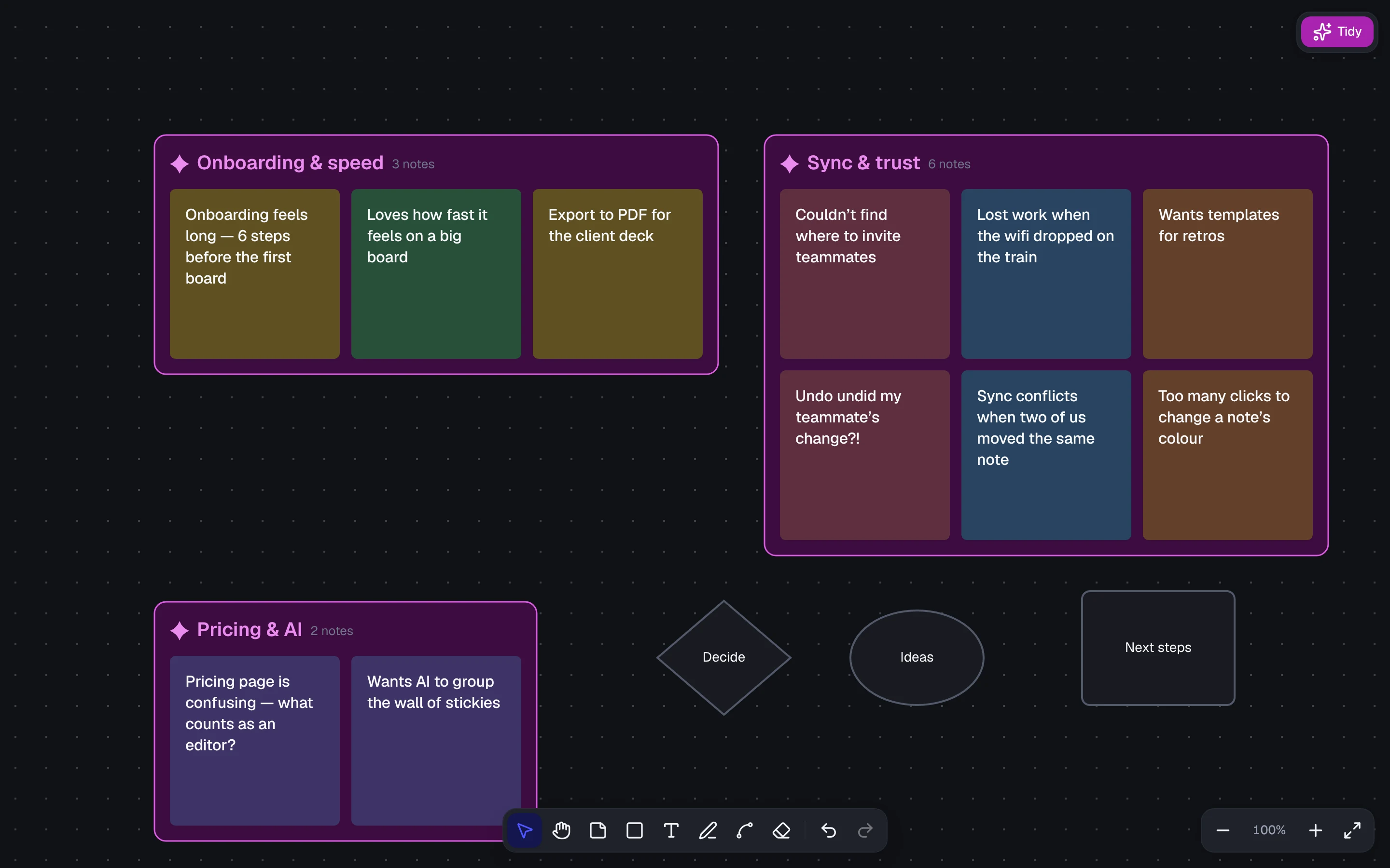
Sticky notes carry the colour, and the interface around them stays neutral.
Tokens first
The system lives in Figma variables, with CSS code syntax so names match the code exactly.
- Three collections: Primitives, Color (Light and Dark modes) and Space.
- 15 text styles and 3 elevation shadows.
- Semantic names everywhere. Components use bg-surface-raised or text-secondary, never a raw colour. The code has the same rule: no hex values and no one-off Tailwind values in the interface.
A rebrand that took minutes
The first direction used warm sand neutrals, a clay brand colour and violet for AI. Partway through, I picked a new brand colour: indigo #2930FF (indigo/500), with indigo/400 #4F55FF in dark mode. Neutrals moved to cool slate and the AI colour to orchid.
Because components only referenced semantic tokens, every screen updated at once, in Figma and in code. That was the strongest argument for tokens on this project.
Colour roles
- Brand indigo: primary actions and your own selection. White text on it passes WCAG AA in both themes.
- Orchid: AI only. If something is orchid, the machine did it.
- Presence 1–8: people, identical in light and dark.
- Ink focus ring. A brand-coloured ring disappeared on filled indigo buttons, so the focus ring uses ink instead.
Type
- Geist for the interface.
- Bricolage Grotesque for display moments: page titles, Tidy's theme labels and the wordmark.
- Geist Mono for keyboard shortcuts.
Icons and illustration
Compact UI (banners, toasts, the Tidy bar) uses Lucide icons at 20px. Full-screen states (empty, error, no access, welcome, 404) use spot illustrations instead. They're drawn only with tokens, so they switch with light and dark, and screen readers skip them.
07 · Every state designed
Every state has its own screen
Most of the Screens page in the Figma file is states rather than features: offline, reconnecting, empty, error, no access.
| Area | States designed |
|---|---|
| Board | Live, dark, following someone, offline, reconnecting, empty, loading, error |
| Tidy | Working, preview, error (for example out of credit), needs more notes |
| Home | Boards grid, empty, loading, error |
| Access | Sign in, check email, join via link, link no longer works, no access |
| Confirmations | Rename, delete board, remove person, per-user undo toast |
| Onboarding | Three tips, each placed next to what it's about |
A few decisions carried most of the weight:
- Say what's true, then what to do. Error copy names the cause and a next step: “Export didn't work. Try again, or export a smaller selection.”
- Removing someone is explained before it happens. The confirmation says they lose access right away, are disconnected if they're on the board now, and that their notes stay.
- Offline keeps working. You keep editing. Only Tidy pauses, because its AI call runs on the server.
- Calm loading. Skeletons pulse softly, and not at all with reduced motion.
- Spec notes for behaviour. Yellow “Spec” notes beside the frames describe what a still frame can't show: timings, focus order, what collaborators see.
08 · Accessibility and keyboard
Every canvas interaction has a keyboard path
A canvas is invisible to screen readers and keyboards by default, so every canvas interaction was designed with a keyboard path from the start, not retrofitted.
- Objects are reachable. Arrow keys move between and nudge objects, and key hints appear above the toolbar while you do it.
- Everything has a key. Alt+arrows resize by 8, Alt+[ and Alt+] rotate by 15°, Shift+F10 opens the object menu, and Enter on a toolbar tool places an object in the middle of the view.
- Screen readers hear changes. What's selected, a new size or angle, and the sync status are announced.
- Real text fields. Typing in a note uses a real text field laid exactly over the canvas, so spellcheck, IME input and screen readers work as they do anywhere.
- The toolbar is one tab stop (roving tabindex), and menus return focus when they close. The shortcuts list (press ?) shows only shortcuts that really work.
- Hidden notes stay hidden. During “hide until reveal”, screen readers don't hear other people's notes either.
An automated check (axe) passes on the board, Share and shortcuts, in light and dark. It caught two real issues: missing landmarks, and the faint grey “Skip tips” text (3.8:1), which now uses the tip's full text colour.
09 · Phone
The board stays as big as possible
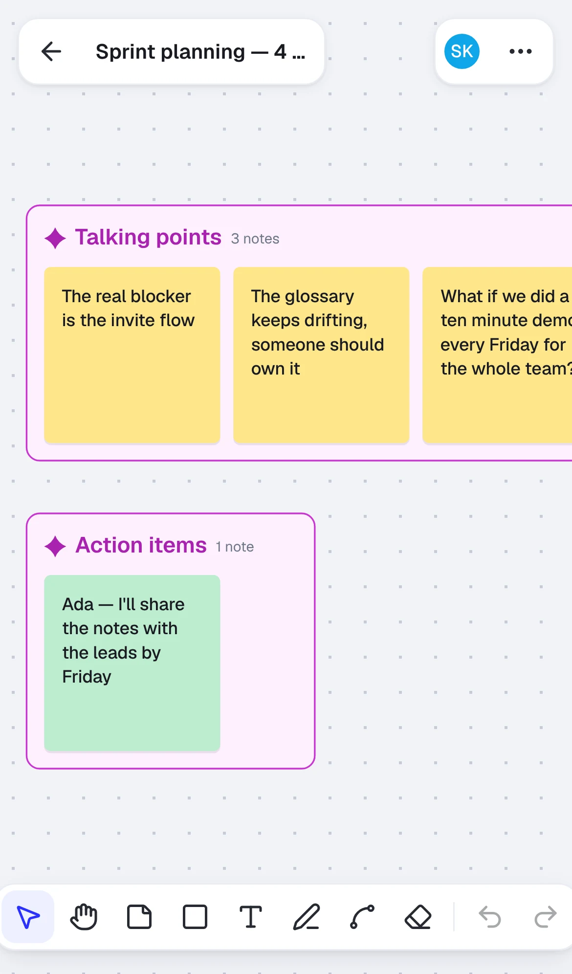
On a phone, everything else moves out of the way. The design assumes viewing, panning, sticky notes, pen and undo on phones, with the other tools desktop-first.
- A compact top bar under 640px keeps back, title, people and the menu. Tidy, Share, Listen and Facilitate move into the menu.
- Pinch replaces the zoom control, and the toolbar scrolls sideways, keeping every tool rather than hiding some behind “more”.
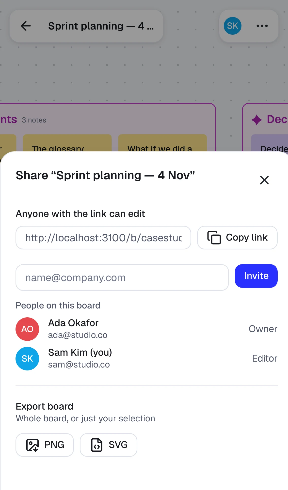
- Dialogs become bottom sheets, and side panels go full width.
- Banners sit under the top bar, and menus skip items you can't see, so the keyboard never lands on a phone-only item on a desktop.
The Figma phone screens cover sign in, boards, the empty board, the board itself, Tidy preview as a bottom sheet, the share sheet, the landing page and 404.
10 · From Figma to shipped
Where the build changed the design, it was written down
The build followed the Figma file closely, and where it didn't, the change was written down as an assumption in the code and in the decision log.
| In Figma | In the build | Why |
|---|---|---|
| Free and Pro plans, Pro badges, upgrade dialog | Everything free, no badges | Product decision: free for now |
| Transcript import previews, then you accept | Notes are added, with Undo | Same result with fewer steps |
| Microphone picker in Listen | Browser's default microphone | Browser speech recognition can't choose a microphone |
| Version history rows | Time and object count, not who edited | Assumption, still to confirm |
| Theme frames | At least as wide as their label | Fix made during the build |
| No close button on the Tidy error bar | Dismiss button added | Otherwise the bar can't be cleared |
| Grey “Skip tips” text | Full tip text colour | Grey measured 3.8:1, under the contrast target |
| Listen in every browser | Firefox users are pointed to transcript import | Firefox can't do speech-to-text |
The Tidy bar also changed shape slightly: its preview offers Revert and Accept, and Re-run appears only when someone edits during the preview.
11 · Reflection and what's next
Designing the system before the screens paid for itself
Semantic tokens made a full rebrand a same-day change, and designing states as screens meant the build had answers ready instead of guesses.
What worked
- Preview before change gave AI features a single, repeatable pattern: Tidy, transcripts, summaries and photo to board all let you check before anything is kept.
- Spec notes carried behaviour, timing and focus order that frames alone can't show, which kept the build close to the design.
- One colour for AI made machine-made changes recognisable everywhere without extra labels.
What I'd do differently
- Check presence colours for contrast with initials on top before locking the palette; it's the one open accessibility issue.
- Test with real facilitators earlier. Every flow here came from the brief. I haven't run a research session yet.
What's next
- Re-take the screenshots with the AI key on, so they show Claude's own theme labels.
- Resolve the presence-colour contrast.
- Usability sessions with facilitators running a real workshop.
- A meeting bot that joins calls, planned for after v1.
Gallery
Around the board
Home, sharing, facilitation, settings and the error screens. Open any of them full size.
Part 2 · Engineering
Built with Claude
I directed the build with Claude as the engineer: I set the brief, scope and rules, reviewed every change, and Claude wrote the code. These are the engineering decisions worth telling.
E1 · What I built
A collaborative canvas that sorts itself
- A collaborative canvas: sticky notes, shapes, text, pen and eraser, connectors, grouping, alignment, layers, rotation and resizing.
- Live collaboration: several people on one board, live cursors and selections, follow mode, and offline editing that merges when you reconnect.
- Per-user undo, which only takes back your own changes, never a teammate's.
- Tidy: themes found by AI (or by a built-in method with no AI key), animated into labelled frames, and nothing saved until you accept.
- Share and export (PNG, SVG), keyboard access throughout, light and dark themes, and reduced-motion support.
Stack: Next.js and React with TypeScript, Tailwind with design tokens, Yjs for sync, Cloudflare Durable Objects and D1, and Claude (claude-haiku-5-5) for Tidy.
E2 · Engineering decisions worth telling
Six decisions that shaped the build
- 01
Our own canvas renderer, outside React
The board is drawn on an HTML canvas by a plain TypeScript engine. React only renders the UI around it. Panning and dragging fire dozens of events a second, so the engine redraws at most once per frame, and only when something changed.
Result: with 500 objects, drawing takes about 0.5 ms of a 16.7 ms frame at the median (1.0 ms at p95), with no dropped frames. 2,000 objects still take about 2 ms.
- 02
One way to change the board
Every tool describes its edit as a list of changes and hands it to one function. That made the later steps cheap:
- Sync needed one place to write to the shared document.
- Undo records exactly those transactions.
- Board rules (no connector to a deleted note, no group of one) are checked after every change, from anyone.
- 03
A CRDT for sync, with presence kept apart
The board lives in a Yjs document, a CRDT: a data structure that merges edits made at the same time, or offline, without a central referee. Each board has its own Cloudflare Durable Object that relays and saves it, and every browser keeps a copy in IndexedDB so it opens instantly, even offline.
Cursors, selections and follow travel on a separate live channel, so they're never saved and never clutter the history.
- 04
Undo that respects teammates
A shared undo stack would let one person's ⌘Z wipe out someone else's work, so undo only tracks edits made in this browser.
One bug was worth fixing properly: a fast “move, then Delete” merged into one undo step. Now every pointer press, key press and typing session starts its own step.
- 05
Tidy: AI that previews before it acts
- Server only. The API key never reaches the browser.
- Structured output. The model answers in a fixed JSON shape, and we still check it: unknown IDs are dropped, missed notes go into “Other”.
- A fallback that costs nothing. With no AI key, a built-in method groups notes by shared words.
- Preview is local, and Accept is one transaction, so one undo takes it all back.
- Limits: request caps, daily limits, a spend limit, and a clear message for every failure. The board is never left half-changed.
- 06
Accessibility as a feature
- Every canvas object can be reached and moved with the keyboard.
- Screen readers hear what's selected.
- Dialogs trap focus and return it.
- The shortcuts list only shows shortcuts that really work.
- axe passes on the board and dialogs in both themes, with one known gap: presence-colour contrast.
E3 · Performance, before and after
Render time looked fine. The board didn't.
| Moment | 500 objects, render median / p95 | Dropped frames |
|---|---|---|
| Step 1 baseline | 0.4 / 0.7 ms | 0 / 300 |
| Pen strokes, first try (one big outline path) | 0.6 / 1.4 ms | 24 / 300 |
| Pen strokes, outlines drawn one by one | 0.7 / 2.6 ms | 4 / 300 |
| After sync, undo, Tidy and polish | 0.5 / 1.0 ms | 0 / 300 |
The lesson from the pen work: our code got faster while the board got jankier, because the browser was slow to paint one huge path. Render time alone would have hidden it, so we track dropped frames too.
Measured in headless Chromium in a cloud container, not on a mid-range laptop.
E4 · Where it stands
Everything in the v1 brief is built
Canvas, live sync, offline, per-user undo, Tidy, accounts and sharing, Listen and transcript import, summaries, the facilitation kit, photo to board, version history, the landing page and phone layouts. Roomy is free for now, so billing waits.
Still to switch on: the AI key (Tidy, transcripts and summaries use built-in methods until then; photo to board needs it), plus Google and email sign-in. Planned after v1: a meeting bot that joins calls.