Case study · Client work · Fintech · Android
Snuget
Turning receipts, bank SMS alerts, statements and cash into one honest naira picture of where the money goes.
- My role
- Lead Product Designer
- Platform
- Android · light & dark
- Scope
- Product, system, motion, content
- Languages
- English & Pidgin
01 · Overview
One place where the month adds up
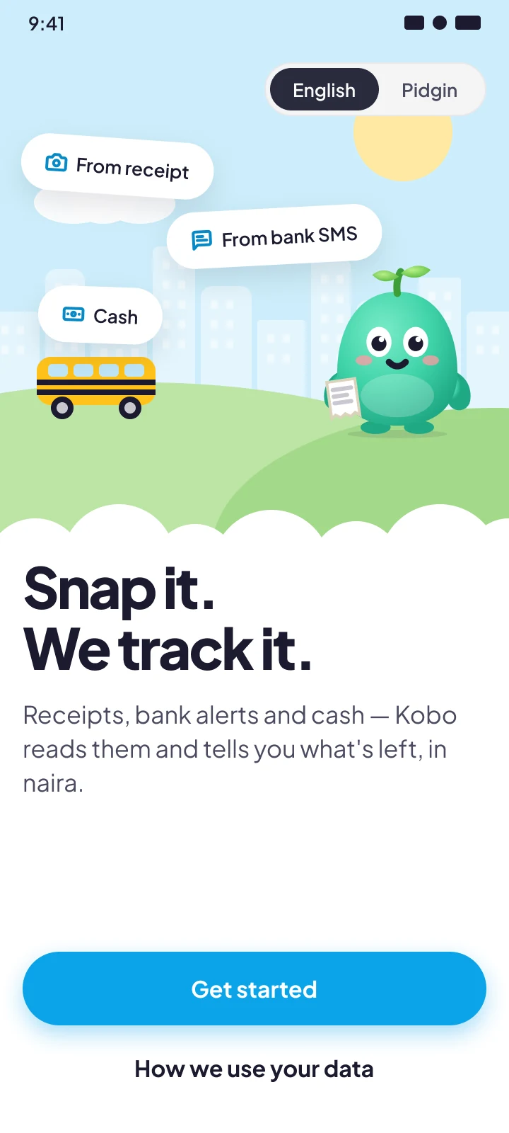
I led the design of an Android-first money app for a Nigerian fintech client. It turns the evidence people already have (receipts, bank SMS alerts, statement PDFs and cash) into one clear naira picture, with AI doing the sorting.
The work covered the end-to-end product and a production-ready design system: every flow, with its happy path, edge cases, errors, offline states, Pidgin and dark mode.
- screens across 10 flows
- 106
- screens across 10 flows
- library components
- ~40
- library components
- languages: English & Pidgin
- 2
- languages: English & Pidgin
- themes from one variable set
- 2
- themes from one variable set
- moods for Kobo, the mascot
- 8
- moods for Kobo, the mascot
02 · The problem
People don't lack money data. They lack one place where it adds up.
A typical month is split across two or three bank accounts, a fintech wallet, POS withdrawals, transfers to family and plenty of cash. Each leaves a different trace: a debit SMS, a crumpled receipt, a PDF statement, or nothing at all.
The client's bet: if capture is nearly effortless and the AI does the sorting, people will keep using it long enough for budgets and insights to matter.
Where existing budgeting apps fall down
- 01
They assume bank sync
Open-banking coverage is patchy, and many people won't hand over bank logins.
- 02
They ignore cash
If cash is invisible, the budget is fiction by the second week.
- 03
They demand manual entry
Typing every ₦500 keke ride is a habit nobody keeps.
- 04
They talk like a bank
Cold, guilt-driven copy doesn't land with people who joke about “soft life” spending.
The design challenge
Make capture effortless from four very different sources, make the AI's guesses trustworthy and easy to correct, and make a spending app feel warm instead of judgmental.
03 · Users & constraints
Designed for city earners, shaped by real limits
The primary user is a young salaried or self-employed Nigerian in Lagos or Abuja. Money comes in irregularly or once a month and leaves through many small channels. They want to know “where did my salary go?” without becoming an accountant.
| Constraint | What it meant for the design |
|---|---|
| Android-first, mid-range phones | 360 dp base layouts, light visual effects, no heavy blur or video backgrounds |
| Data is expensive | Offline-first capture, queued uploads and a visible Data saver mode |
| Bank SMS is the richest signal | An honest permission ask, and a complete path for people who refuse it |
| Many bank formats | Parsing confidence varies, so the UI shows certainty and invites correction |
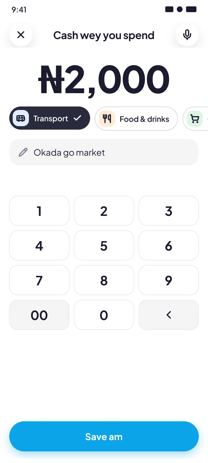
| Cash is common | Cash capture in seconds: a keypad and a voice note |
| Low trust with financial data | Plain-language privacy, easy export, delete everything in two taps |
| Two languages | Every string in English and Pidgin, layouts that survive longer Pidgin copy |
04 · Principles
What we agreed in week one
When we disagreed later, and we did, we came back to these four lines instead of arguing taste.
- 01
Capture in one gesture
Snap, allow, upload or say it. Sorting comes later, and it's the AI's job.
- 02
Show your confidence
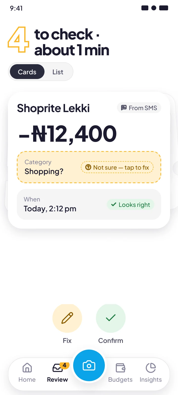
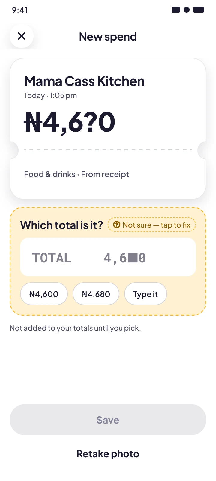
The AI never pretends to be sure. Low-confidence guesses wait for review instead of quietly entering totals.
- 03
Correct once, learn forever
A fix is a teaching moment. The app confirms what it learned and applies it next time.
- 04
A friend, not a bank
Warm, specific nudges in the user's own language. Never shaming.
05 · Key decisions
Five decisions carry most of the product
Each one names the alternative I didn't take, and why. Screens are from the final design.
Decision 1
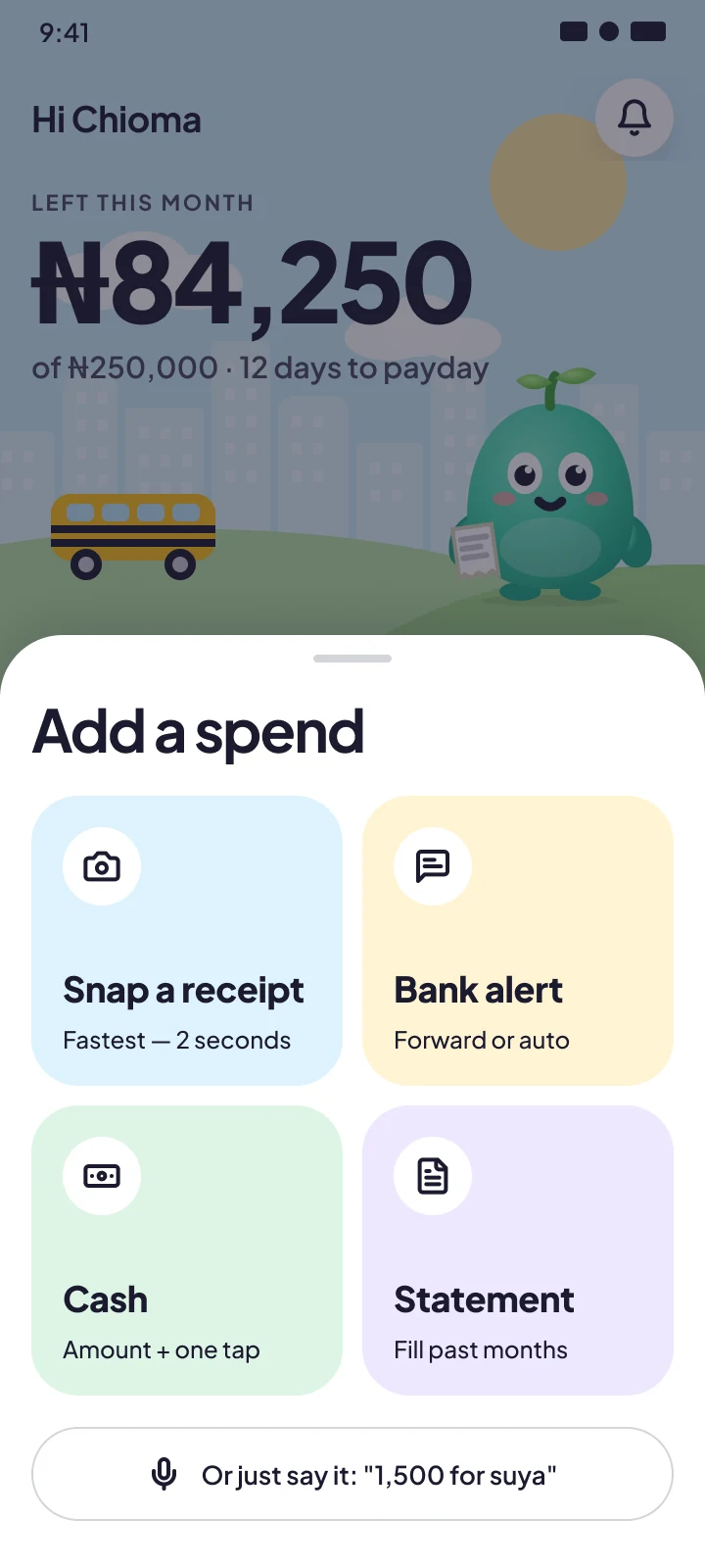
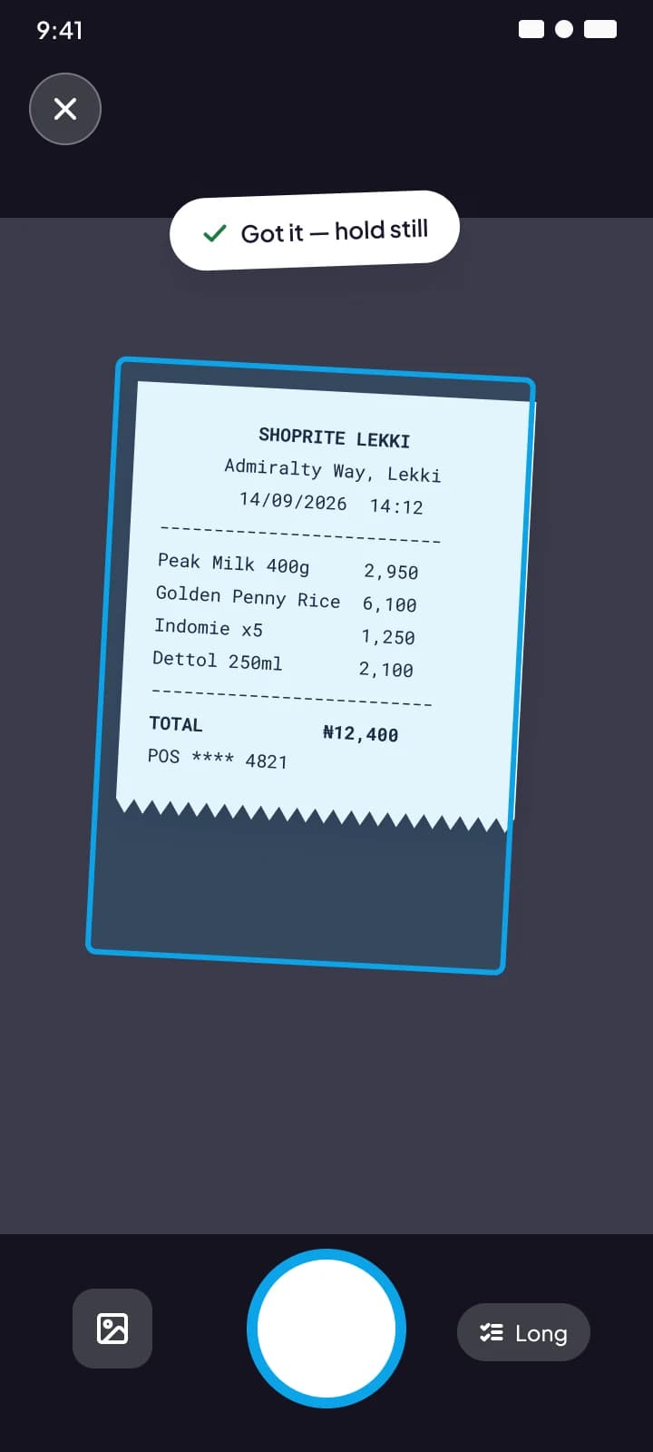
One capture button, four doors
- Decision
- A single centre action on the bottom nav opens a sheet with four doors: Snap receipt, Bank SMS, Statement PDF, and Cash or voice.
- Alternative I rejected
- Separate tabs per source. Users don't think in “sources”; they think “I just spent money”. One entry point keeps the model simple.
- Detail that mattered
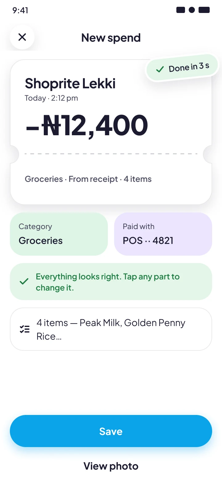
- The camera finds the receipt edges and captures without a shutter tap, so batch-snapping a wallet of receipts is fast.
Decision 2
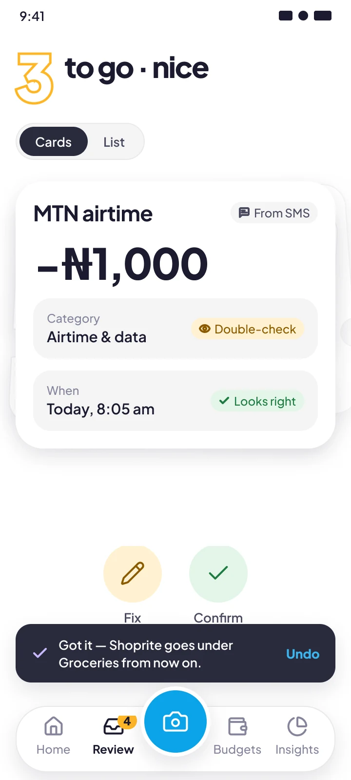
Confidence is visible, and it routes work
- Decision
- Every AI guess carries a confidence tag. High goes straight into totals, medium goes in flagged, low waits in the Review inbox.
- Alternative I rejected
- Hide confidence and let people fix mistakes when they notice. That fails quietly: a wrong category skews the budget and trust erodes without a reason.
- Detail that mattered
- Review is a swipeable stack: right confirms, left fixes. A count on Home and an “Inbox zero” badge make it a 30-second habit.
4 sources
Receipt photo · Bank SMS · Statement PDF · Cash or voice
AI categorises
and scores its confidence
High
straight into totals
Medium
in totals, flagged
Low
waits in the Review inbox → you fix it once → rule learned ↺
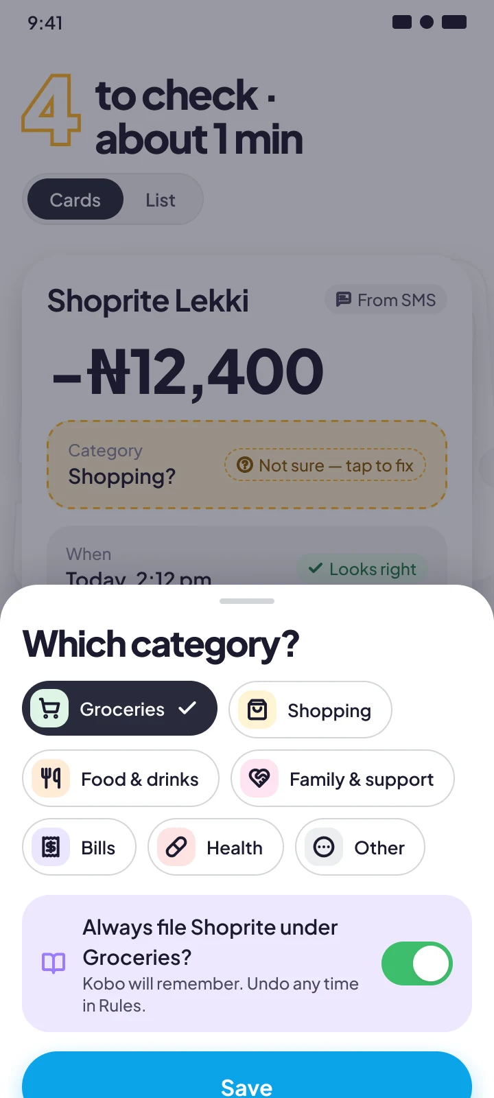
Decision 3
Teach the AI in the moment
- Decision
- After a correction, Kobo offers to apply the fix to every past and future transaction from that merchant. Rules stay editable in Settings.
- Alternative I rejected
- Silent retraining. It may be accurate, but people can't see why the app behaves as it does, so they don't trust it.
- Detail that mattered
- Showing the learned rule makes the AI explainable. Every fix visibly reduces future work.
Decision 4
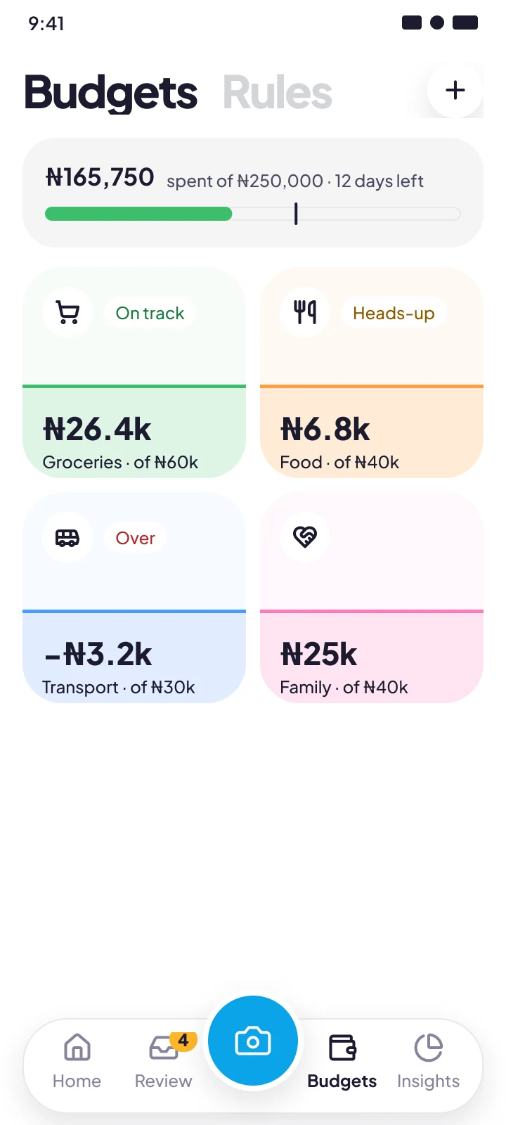
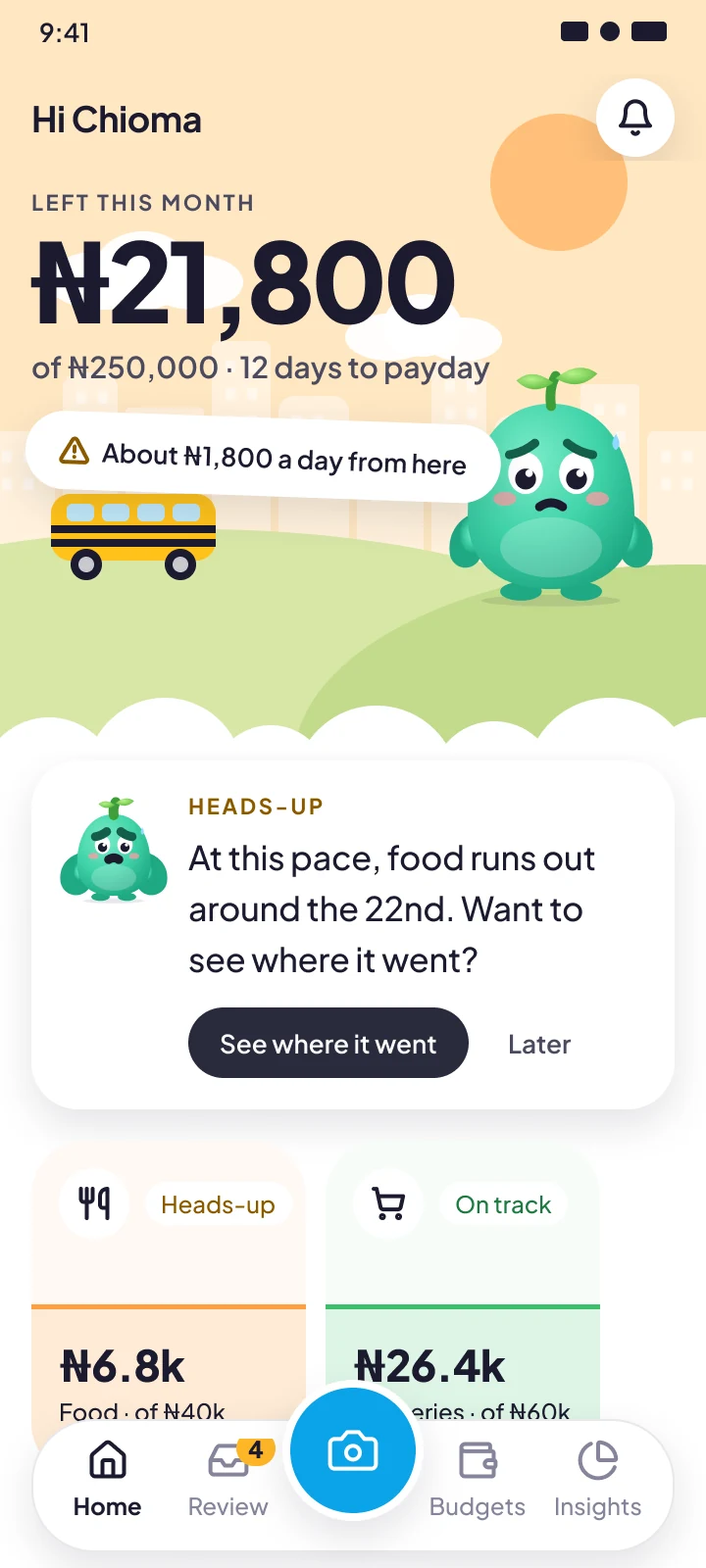
Budgets as pots, nudges as a friend
- Decision
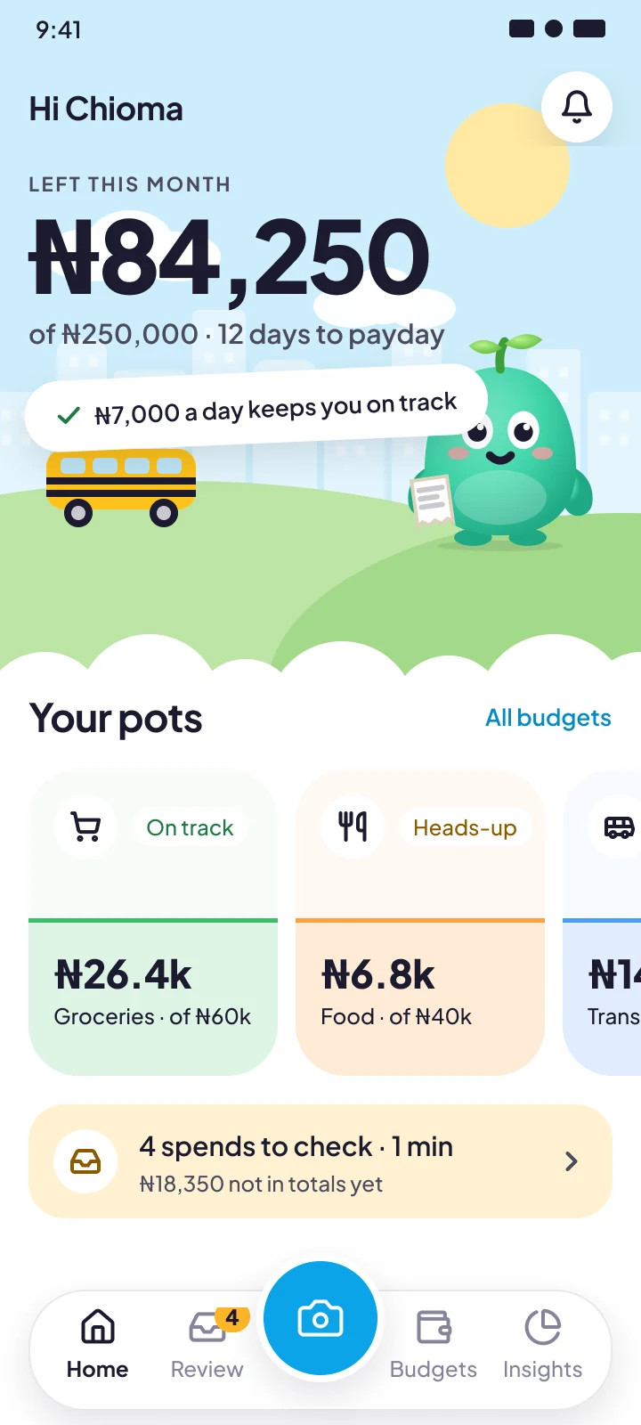
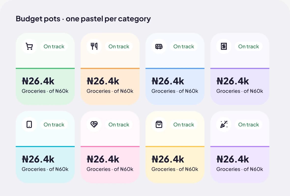
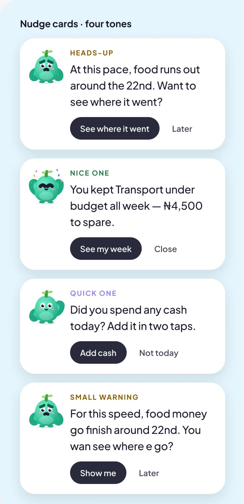
- Budgets are pots that fill as money goes out. Nudges come in four tones: Heads-up, Win, Reminder and Pidgin.
- Alternative I rejected
- Red and green progress bars with alert-style warnings. They read as scolding, and scolded users stop opening the app.
- Detail that mattered
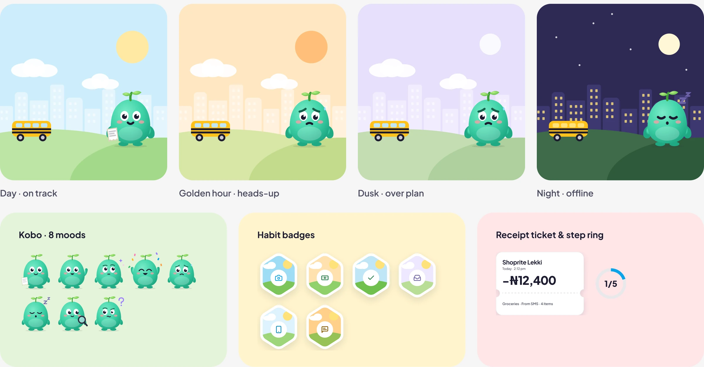
- The Lagos scene on Home changes with the month: day is on track, golden hour is a heads-up, dusk is over plan.
Decision 5
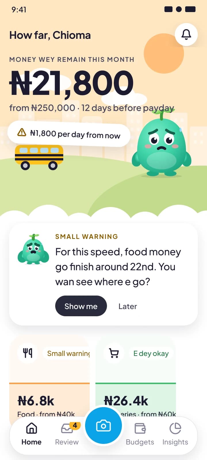
Pidgin as a first-class language
- Decision
- Every screen, nudge and error has a Pidgin version, and Ask Kobo understands questions in either language.
- Alternative I rejected
- A novelty “fun mode” skin. Money is emotional; the language people use with friends lowers the stakes, so it had to be real.
- Detail that mattered
- Layouts were tested against longer Pidgin strings. All Pidgin copy is flagged for native-speaker review before launch.
06 · Visual direction
Four rounds to the right kind of bold
The client's reference was Tolan, a companion app known for character-led illustration and lively motion. The goal was to bring that warmth to money, a category that is usually grey and anxious, without copying it.
The final look is a white canvas, one sans-serif typeface, soft pastel tints with one accent per screen, and a set of playful graphic devices. Each round with the client sharpened the brief.
Round 1
Shown
Warm off-white paper, serif display type, soft glows
Client said
“It looks like an AI-generated app.”
Changed
Pure white canvas, neutral greys, no gradients or glows
Round 2
Shown
Clean white UI with a serif voice
Client said
“No serif fonts.”
Changed
Plus Jakarta Sans throughout, one of few with a proper ₦ glyph
Round 3
Shown
Clean but plain screens
Client said
“Push the boundaries of visual design a lot more.”
Changed
Lagos scene, cloud edges, stickers, budget pots, giant numerals
Round 4
Shown
Bold, saturated screens
Client said
Loved the energy; the colour was overwhelming
Changed
Bento grids, tickets, hex badges, step ring, pastel tints, one accent per screen
What I learned
When the client said “creative”, I heard “more colour”. They meant more shape. Once colour moved into pastel tokens and the energy went into layout and illustration, they got personality and calm in the same screen.
07 · Design system
One library behind all 106 screens
I built the system as a separate, published Figma library, and every screen is assembled from it. That made the late visual changes cheap: moving the whole product to pastel took one token change and one publish.
| Part | What's in it |
|---|---|
| Tokens | Primitives, a semantic Color collection with Light and Dark modes, a pastel tint per spending category, spacing and radius scales |
| Type | One family, Plus Jakarta Sans, in Display, Headline, Title, Body, Label and Money styles; Roboto Mono for SMS and receipt text |
| Components | About 40 sets: Transaction Row, Budget Pot, Nudge Card, Confidence Tag, Source Badge, Receipt Ticket, Step Ring, Badge, Bottom Sheet, Amount Keypad, Kobo, the Lagos scene |
| Icons | 61 icons on a single stroke weight |
| Motion | Six animated specimens: Kobo idle, receipt scan, swipe to confirm, the “Learned” toast, budget fill, celebrate |
| Content | Voice rules, an English/Pidgin nudge library, and rules for how the AI explains itself |
Money has its own type styles
Naira amounts use tabular figures and fixed formatting rules, so numbers never jump as values change.
Dark mode is a variable mode
Any screen switches theme by changing one collection mode, so the two themes can't drift apart.
Components carry their states
Toast, Banner and Text Field ship default, error, success and offline variants, so engineers build from complete specs.
08 · Edge cases
For this product, the unhappy paths are the product
Real receipts are faded, networks drop, and banks change their SMS formats without warning. Every flow has its edge, error, empty and offline states designed next to the happy path, and each screen is tagged so engineering and QA can filter for them.
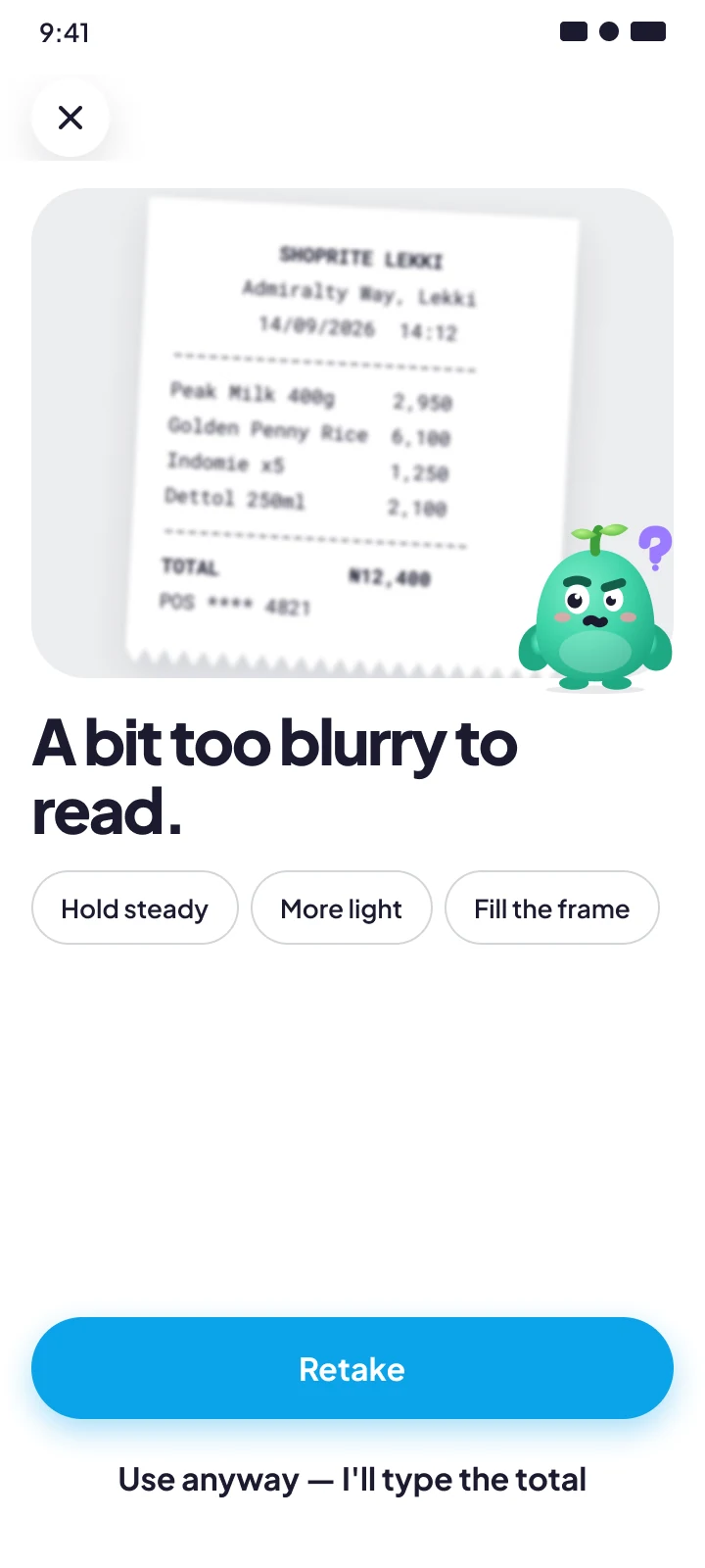
Blurry photo → specific retake tips
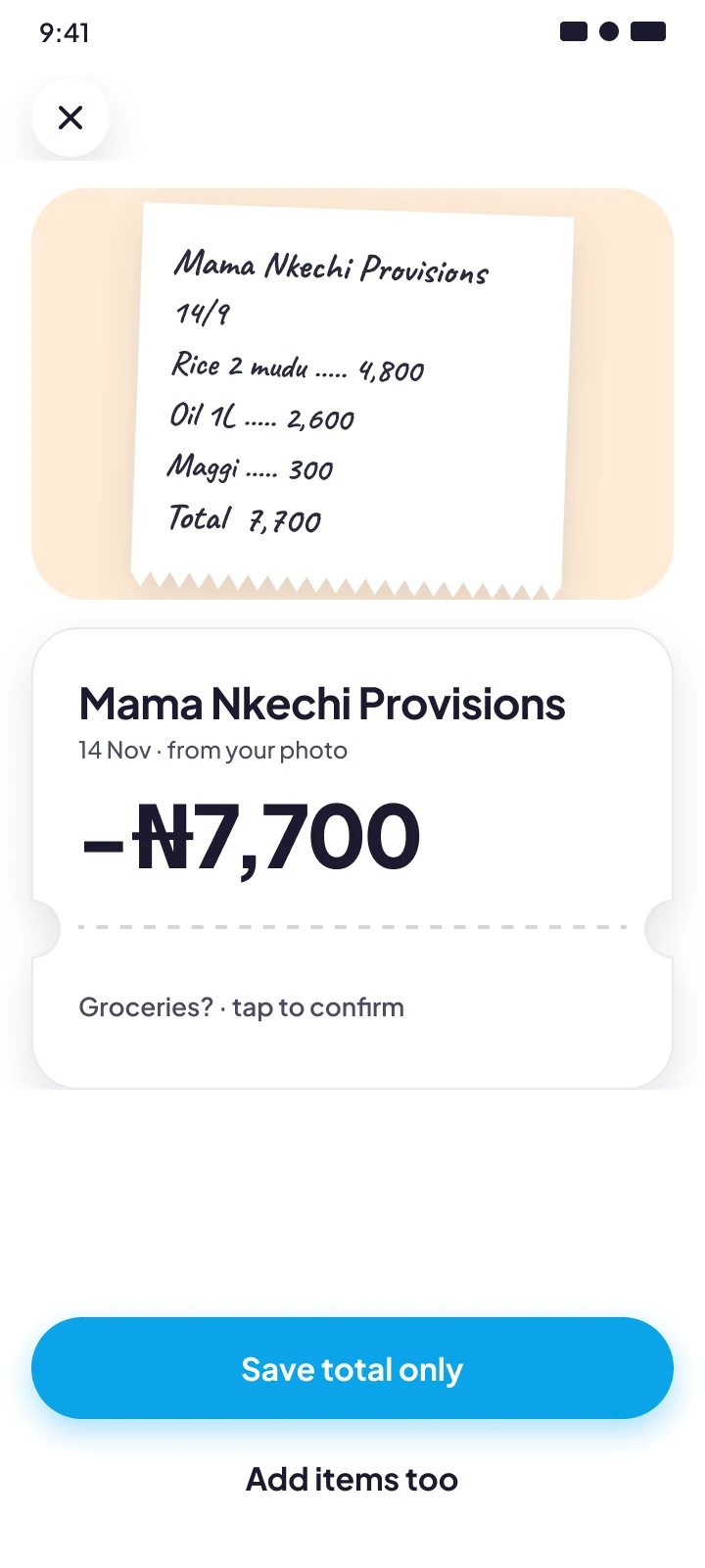
Handwritten market receipt
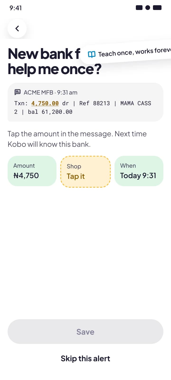
Unknown bank SMS format
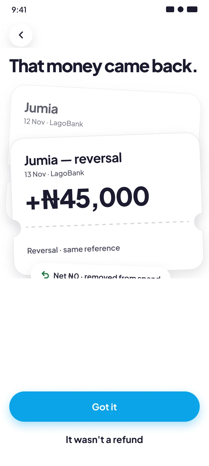
Reversal nets to zero
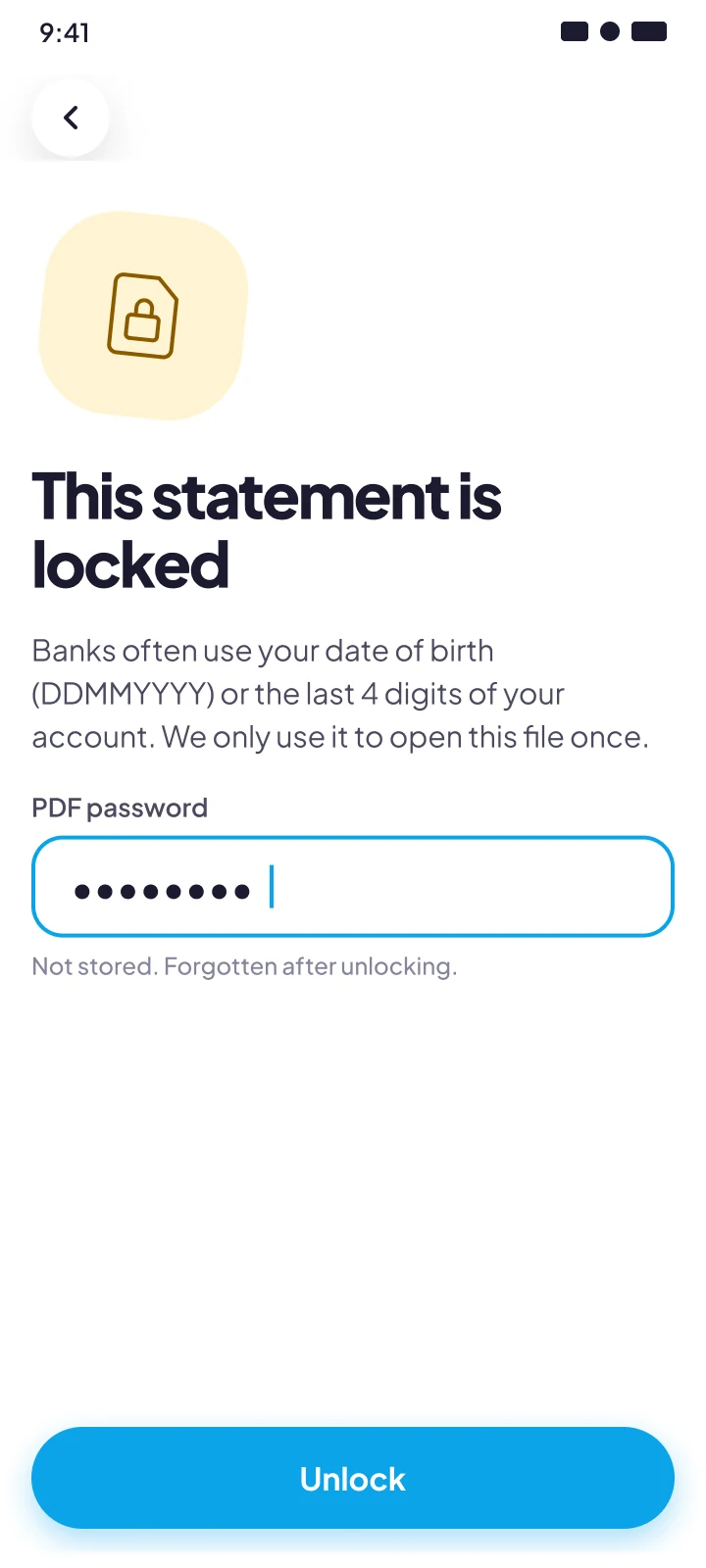
Password-locked statement
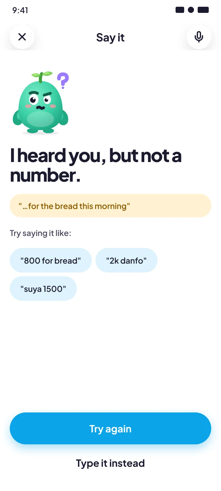
Voice note with no amount
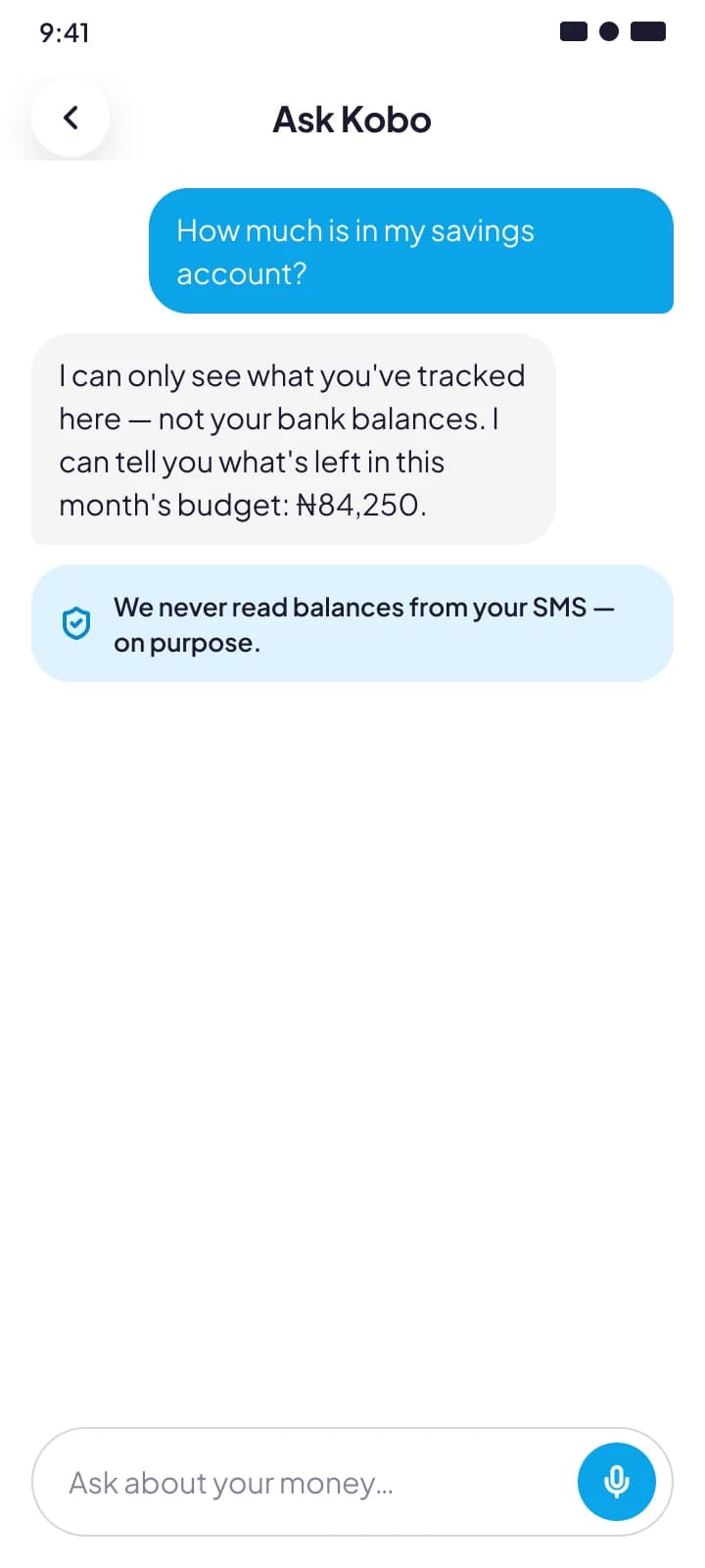
Ask can't see the answer
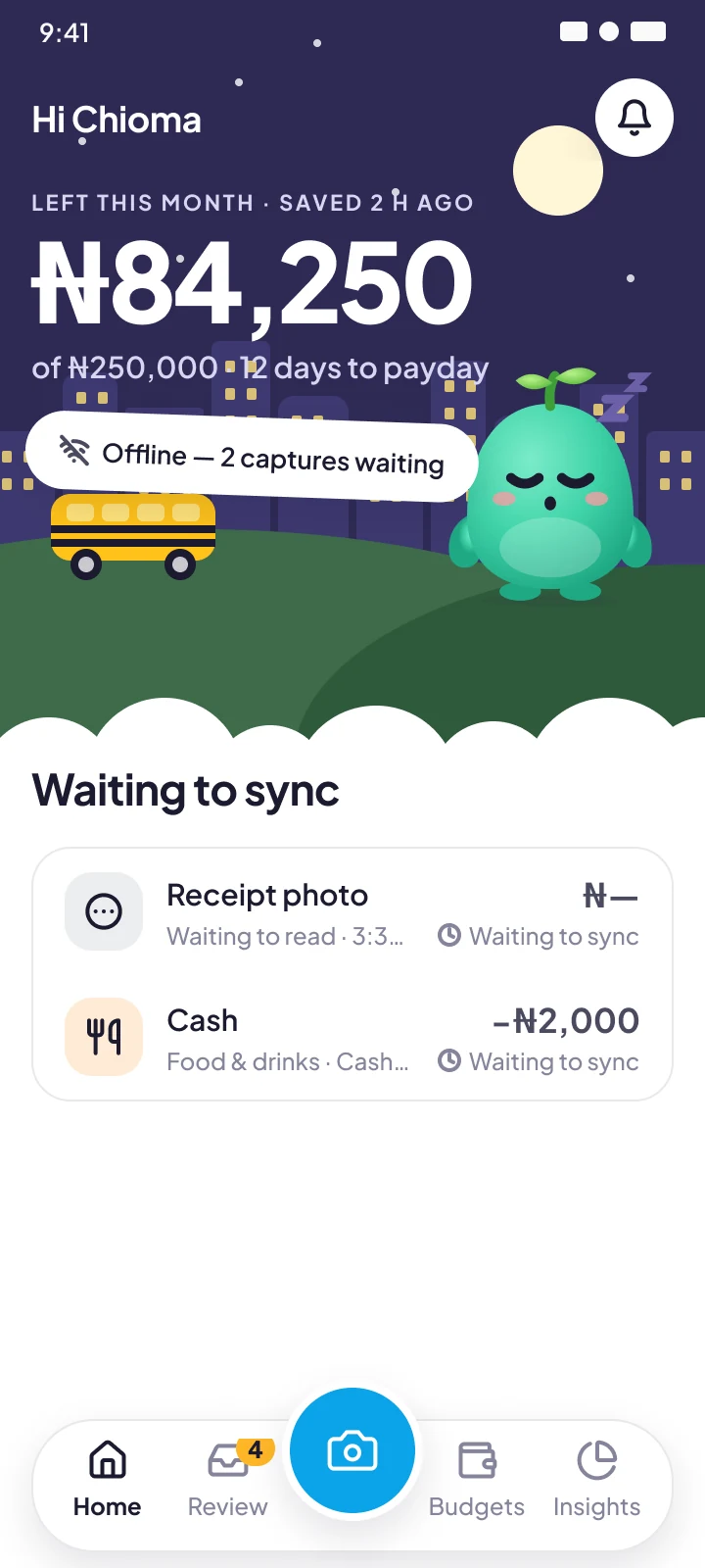
Offline, captures queued
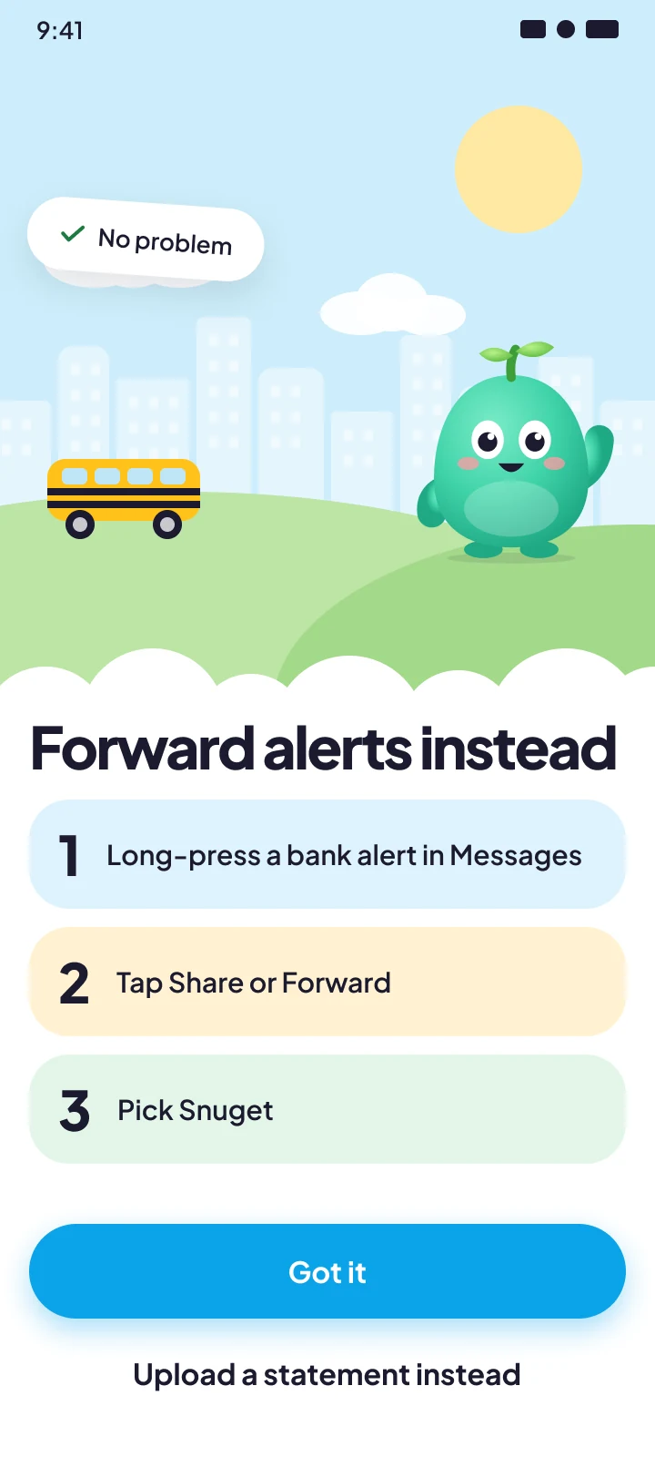
SMS refused → forward instead
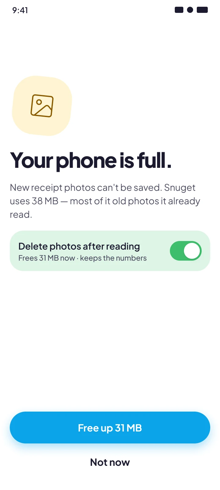
Phone storage full
Dark mode
Same variables, night scene
The rule behind all of these: never lose what the user captured, and never show a total the app isn't sure of without saying so.
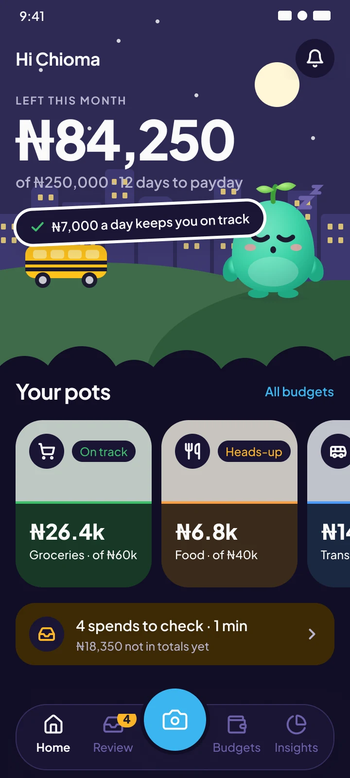
Home · night scene
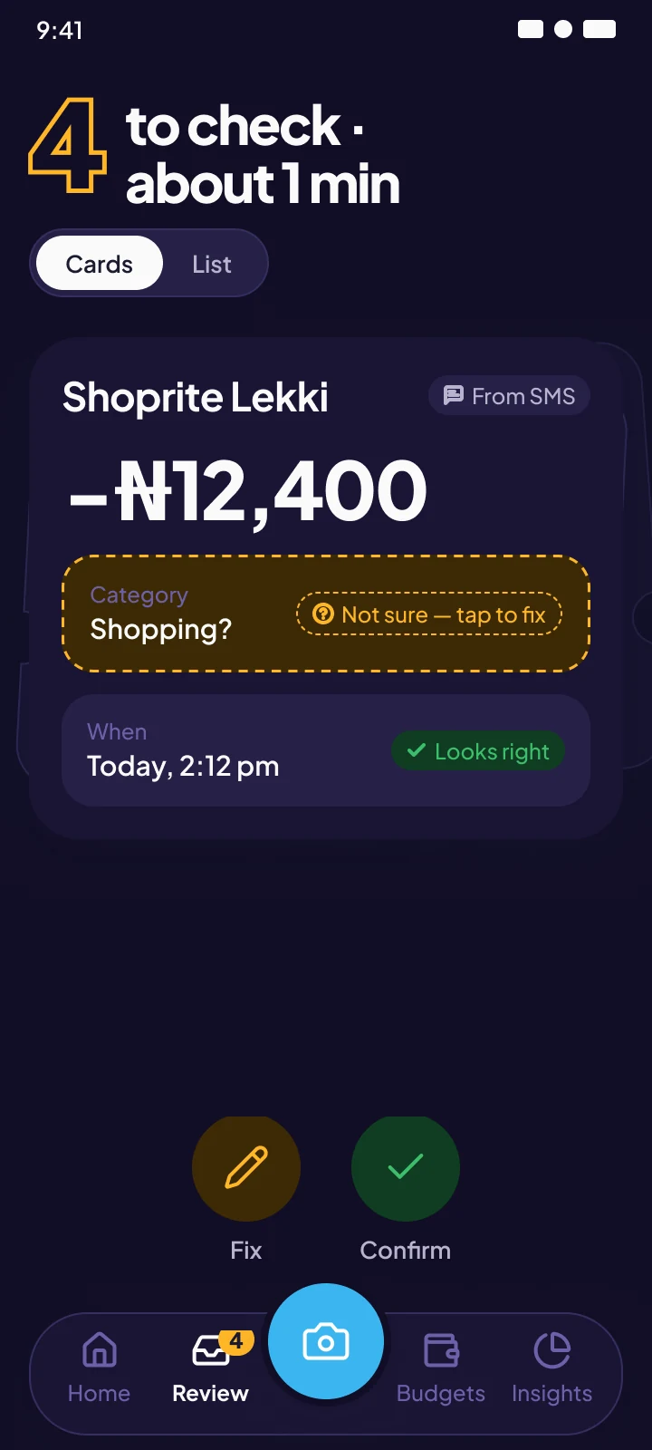
Review
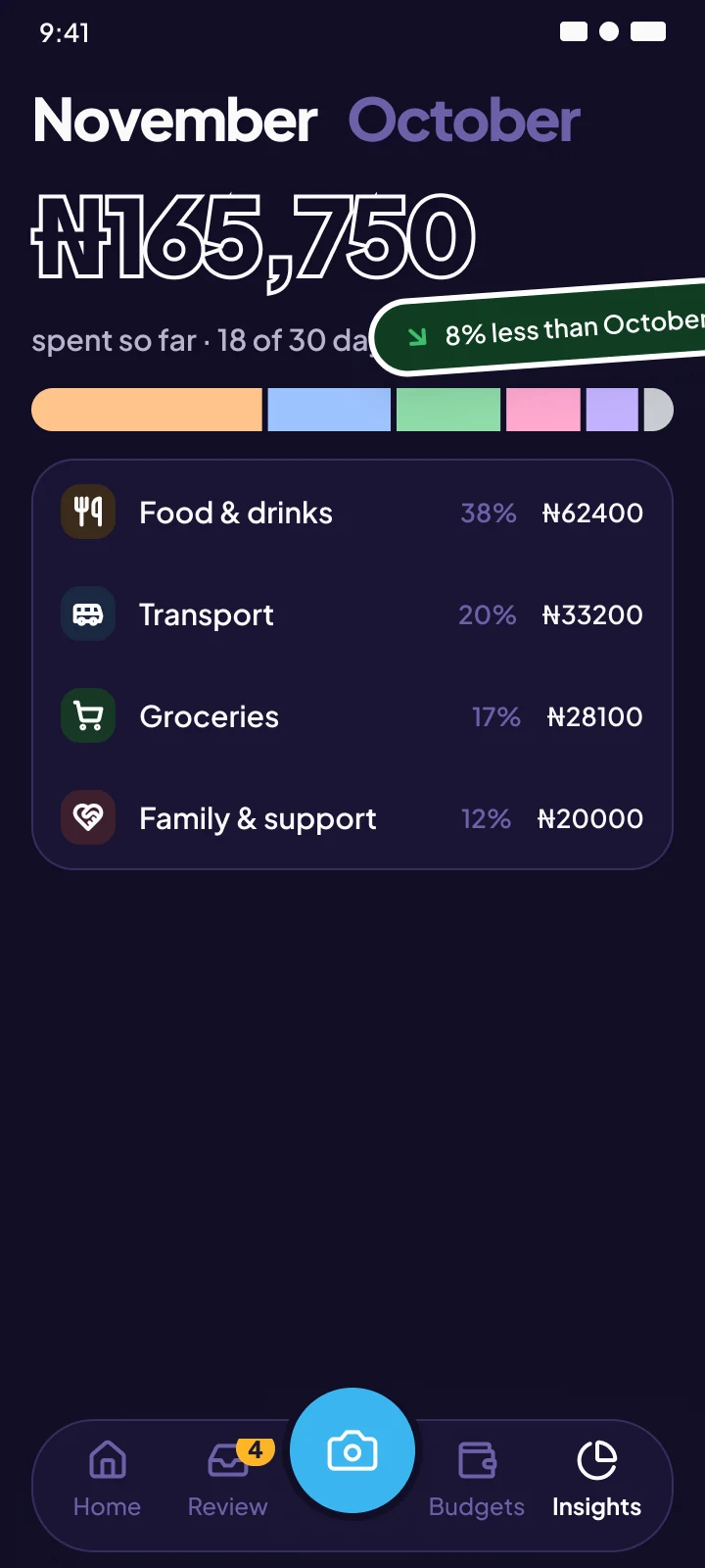
Insights
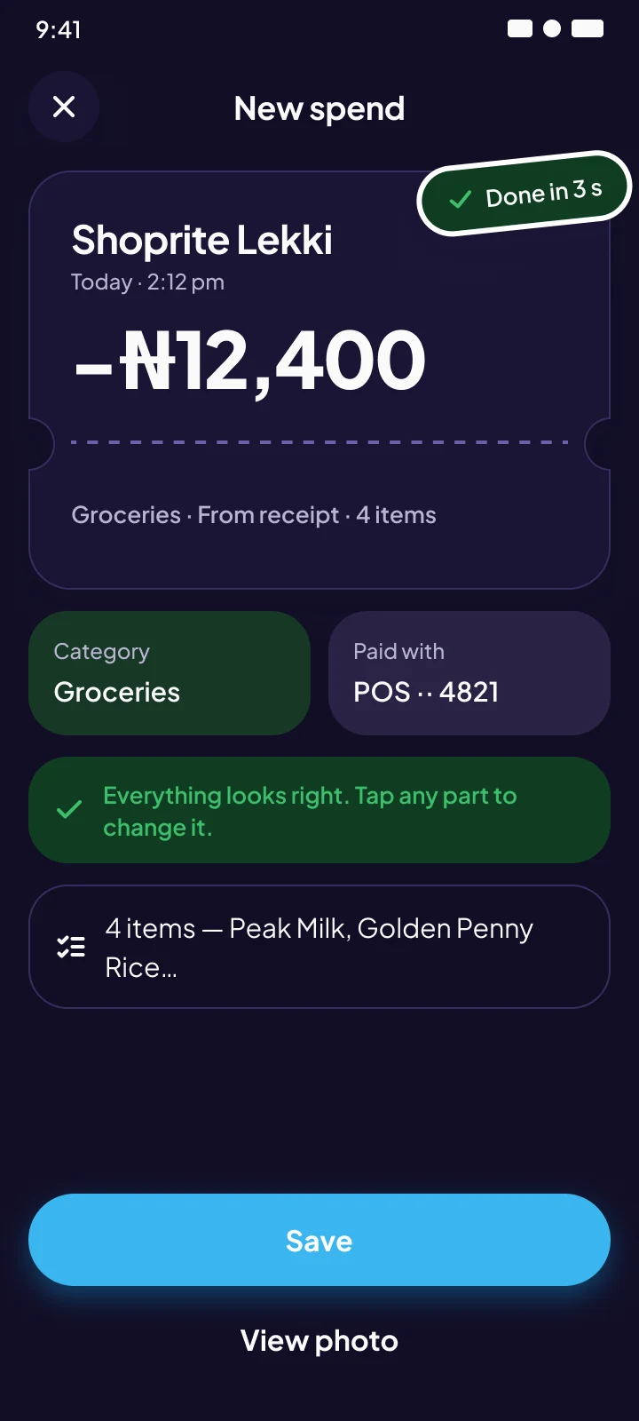
Receipt result
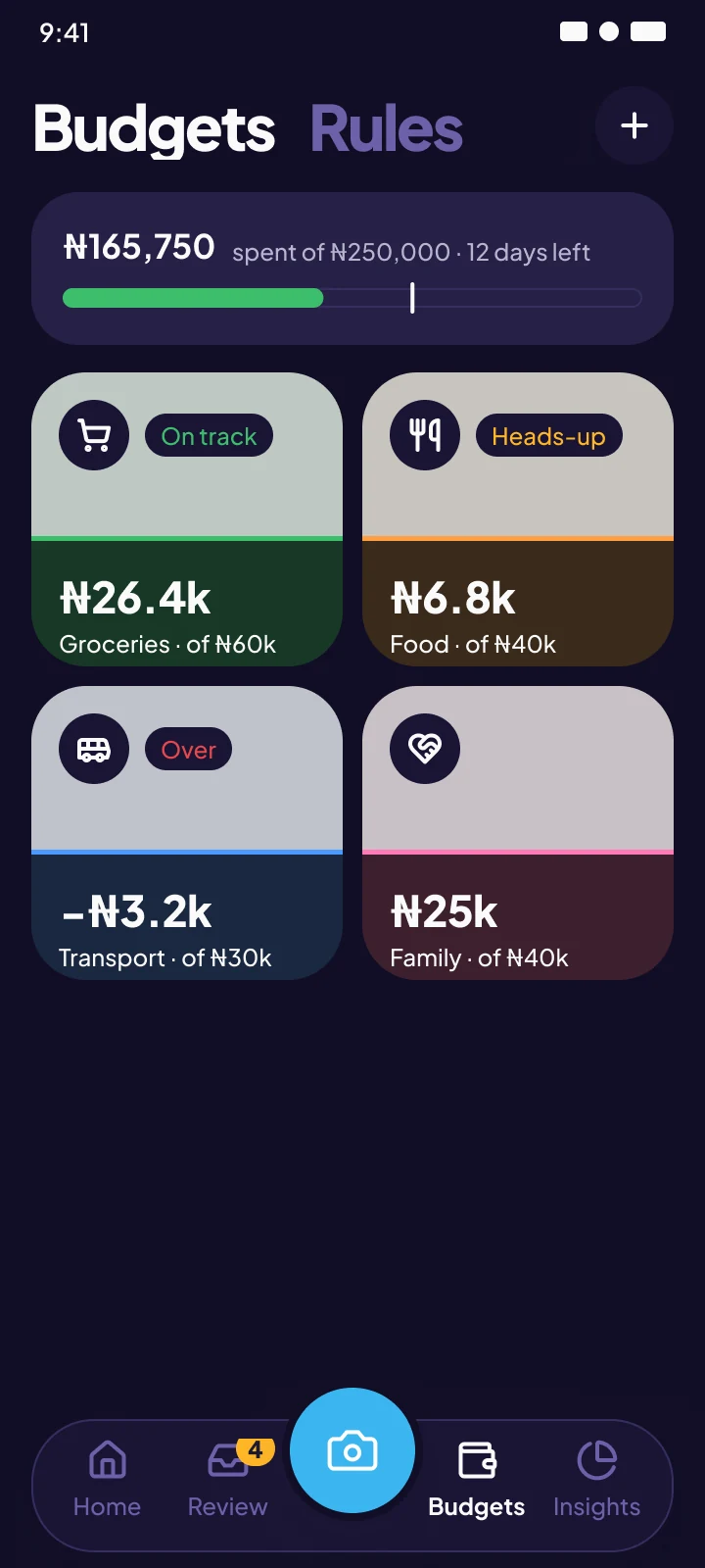
Budgets
09 · Outcomes
A build-ready product, and a system the team can extend
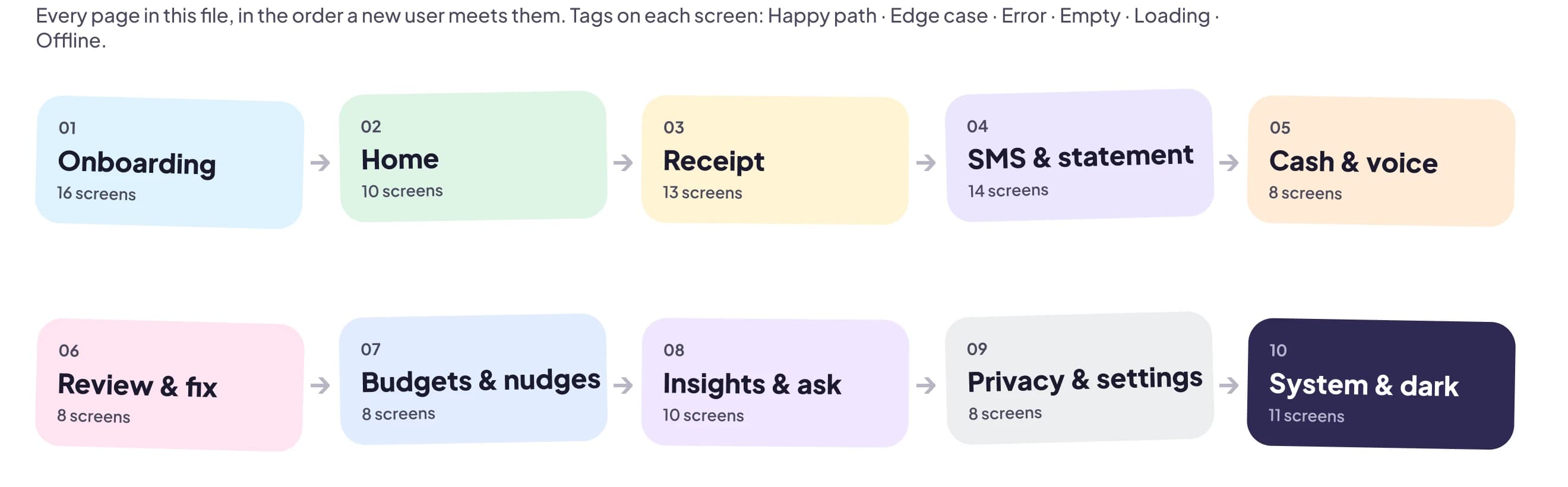
I delivered a complete design system and 106 build-ready screens covering every flow in the brief, organised by flow with a flow map and a state tag on every screen.
Published Figma library
Tokens, light and dark modes, about 40 components, motion specs and content guidelines.
106 annotated screens
Ten flows, each with its happy path, edge cases, errors, empty, loading and offline states.
Voice & nudge library
English and Pidgin nudges plus voice rules the client's team can extend without me.
Next steps I recommended
- 01 Prototype the three riskiest flows (SMS permission, the Review inbox, first budget) and test with 5–8 target users.
- 02 Have native speakers review all Pidgin copy.
- 03 Instrument confidence levels and correction rates from day one. They are the clearest signal of whether the AI is earning trust.
10 · Reflection
What I'd keep, and what I'd do differently
The project's biggest lessons were about process as much as pixels.
Building the system first paid off
The visual direction changed four times. Because every screen came from linked tokens and components, each round meant updating the library, and the screens followed.
Pin down “creative” earlier
My first rounds read personality as colour and decoration; the client meant expressive structure. Asking for their reference work at the start would have saved two rounds.
Designing for doubt is a different job
Most interfaces present data as fact. Here it's a guess that might be wrong. Making uncertainty visible, cheap to correct and rewarding to resolve was the hardest and best problem.
With more time
I'd run usability tests on the Review inbox and SMS permission flows before visual polish, and co-write the Pidgin copy with native speakers.
Gallery
The other flows
Onboarding, cash, insights and the screens in between. Open any of them full size.